| Author | Thread |
|
|
12/09/2002 10:17:16 PM |
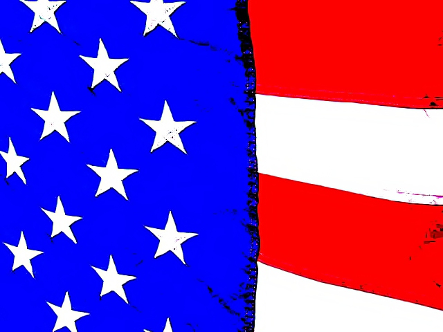
I love the subject. The colors are vivid and perhaps too vivid. The artsy look has an appeal but I'm not so sure it stands as straight photography. I'm not saying you should do it any differently, but for this site it's probably too artsy. The processing left marks that look like they don't belong, like on the stars.
The composition is neither divided into thirds or half. It is somewher in between and could stand to be shifted into thirds. The principle of thirds isn't right for every picture and is sometimes relied upon too heavily, and adhered to too strictly. But in my opinion, it would have worked well here. Show more of the stars on blue and a little less red and white stripes.
Great subject! |
|
|
|
12/09/2002 11:56:11 AM |
| Sigh - I thoguht (I still think) this picture was a ten! I like the post processing too. Is this a sign that American patriotism is out? Did it lose points because of the title? What happened? |
|
Comments Made During the Challenge  |
|
|
12/08/2002 03:30:42 PM |
| to be honest, i wasn't impressed by the thumbnail of this image, but i am by the actual picture. the look and style is very interesting. very abstract, and interpretive. i'm going to give you a 9, and only because: the half and half composition doesn't work too well (it's ok, but it'd work better closer to thirds). |
|
|
|
12/06/2002 02:59:47 PM |
| From the thumb nail I was ready to give it a 10. But at full size it's ruined by over sharpening it. The flag by itself, just as it is will hold its own. PTL 3 |
|
|
|
12/05/2002 11:59:54 PM |
| I do not know how to grade this one. Almost looks like a drawing. |
|
|
|
12/04/2002 08:02:54 PM |
|
|
|
12/04/2002 07:30:47 PM |
| I cannot believe that more people didn't do flags for this challenge - I certainly thought about it!! I'm glad now that I didn't because I couldn't have beat this. Very nice, I love the art feel of it. lhall |
|
|
|
12/03/2002 04:41:00 PM |
| Nice photo, but the color manip seems to have degraded the overall photo. 6 Swash |
|
|
|
12/03/2002 01:50:00 PM |
| The contrast seems a little overwhelming to me. |
|
|
|
12/03/2002 12:03:00 PM |
challenge -- met
techincal -- i'm assuming that you overexposed this one on purpose. personally, i'm not so fond of it, because of the 'smudges' left in the stars and the white and red stripes.
composition -- i would have included a tad more stars and less stripes (closer to rule of thirds), but, again, that's just my personal opinion. nothing wrong with the way you've done it, either.
-- gr8photos |
|
|
|
12/03/2002 01:22:00 AM |
|
|
|
12/02/2002 06:36:00 PM |
| Great colors, and like the technique. Fun work and it's fitting for our challenge. Justine |
|
|
|
12/02/2002 05:56:00 PM |
| Ummm...did some one USED IDEA ... 1 |
|
|
|
12/02/2002 04:52:00 PM |
| Almost looks like a Texas flag this way. |
|
|
|
12/02/2002 12:32:00 AM |
red white and yes blue... give me more blue! the red shares too much dominance in the photo
~anachronite |
|
Home -
Challenges -
Community -
League -
Photos -
Cameras -
Lenses -
Learn -
Help -
Terms of Use -
Privacy -
Top ^
DPChallenge, and website content and design, Copyright © 2001-2025 Challenging Technologies, LLC.
All digital photo copyrights belong to the photographers and may not be used without permission.
Current Server Time: 03/13/2025 07:54:17 AM EDT.