| Author | Thread |
|
|
08/08/2004 07:17:53 PM |
Hi Aleks and Greetings from the Critique Club
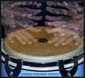
It is my pleasure to provide comments on this unique and wonderful image. You've done so many things right: composition, lighting, aperture selection, and placement of the text. (Many folks went way overboard on this challenge - especially with the multiple and gaudy fonts and colors.)
Your subject is simple - and your choice of depth of field adds mystery. I'd guess many did not realize what they were looking at but still liked the graphic colorful presentation.
I don't know whether you planned the black area for the placement of text when you set up ythe composition - or it just happened. In either event - it is perfectly placed. The fact that the words don't really mean anything - or if so - most peolple would not know the meaning - may have cost a point here and there. But "DPC" is not the easiest acronym to develop.
Improvement areas: I usually try to find something to leave as a tip - but I honestly don't think you could have done this any better.
Congratulations on a great entry.
I am a bit curious why you requested a cc critique as it doesn't appear you read comments - or else don't elect to mark any as helpful.
-Tom-
|
|
|
|
08/02/2004 12:28:03 AM |
| Congratulations on your 10th finish. A superb comp. |
|
Comments Made During the Challenge  |
|
|
08/01/2004 11:48:55 PM |
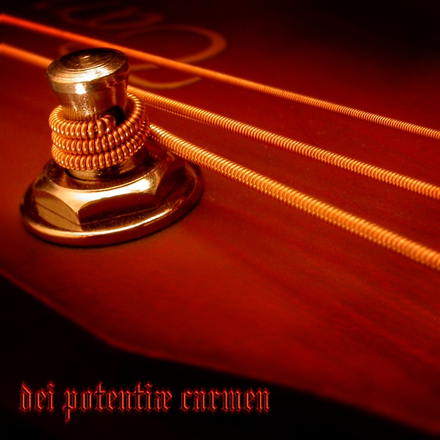
| A wonderful shot and convincing cover. |
|
|
|
08/01/2004 10:39:19 PM |
| Don't know what the title means, but the image works well. Beautiful soft lighting and focus. |
|
|
|
08/01/2004 06:27:59 PM |
| Nicley done - I love the colors; the reds and golds are excellent together. Good job with the type as well. |
|
|
|
08/01/2004 03:22:08 PM |
|
|
|
08/01/2004 01:39:16 PM |
| wonderful macro, nicely lit, excellent compostion - one of the best this challenge |
|
|
|
08/01/2004 01:29:33 AM |
| A neat macro, good subject, color and comp and cool name. I voted eralier and I am bumping you to next level. |
|
|
|
07/30/2004 01:55:10 PM |
| not sure about the text style but otherwise a great photo |
|
|
|
07/29/2004 06:27:43 PM |
| I like the deep red and the string textures - the macro quality is quite good in that respect. Nicely done |
|
|
|
07/29/2004 08:44:03 AM |
| Great theme, love the rich colouring, focus......very classy |
|
|
|
07/28/2004 10:32:07 AM |
| those strings look HOT !! great photo there mate! |
|
|
|
07/27/2004 08:49:10 PM |
| nice photo 10 text 7 font 6 over all 8 |
|
|
|
07/27/2004 04:15:43 PM |
| Very nice macro, something I'd expect to see on a jazz album although the font suggests something "metal-ish" :) (8) |
|
|
|
07/27/2004 03:41:11 PM |
| This is striking. I love the colors. |
|
|
|
07/26/2004 05:40:57 PM |
Very classy looking. Sophisticated feel to it.
Your font is difficult to read due to the soft effect...
scored this baby an "8" |
|
|
|
07/26/2004 05:33:39 PM |
| Didn't do a very good job of translating what I am only guessing is in latin but I'm thinking something to do with songs and poems. Love the image and the strong orange tint. Text works very well in colour, font and position. 9 |
|
|
|
07/26/2004 07:44:14 AM |
| Really nice shot. I love the warm red colours. 10 |
|
Home -
Challenges -
Community -
League -
Photos -
Cameras -
Lenses -
Learn -
Help -
Terms of Use -
Privacy -
Top ^
DPChallenge, and website content and design, Copyright © 2001-2025 Challenging Technologies, LLC.
All digital photo copyrights belong to the photographers and may not be used without permission.
Current Server Time: 03/14/2025 05:58:15 AM EDT.