| Author | Thread |
Comments Made During the Challenge  |
|
|
08/17/2004 04:39:56 PM |
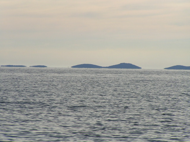
| I like the muted colours in this shot a nice overall tone. However the fundamental error is that the horizon is not level. Also having the horizon on or about the midddle of the shot does not usually work very well. Its generally better to have the horizon on the top or bottom third of the photograph, depending on what you what to emphasise, the sky, or the sea. |
|
 Photographer found comment helpful. Photographer found comment helpful. |
|
|
08/16/2004 06:18:49 PM |
| this is a nice shot but some easily fixed technical stuff is lacking. for instance, the horizon is crooked... can easily be fixed in the digtal darktroom and the water seems a bit underexposed which could have been shot with an ae finction. |
|
|
|
08/16/2004 03:21:11 AM |
| Not a parrallel ine in sight but I really like your take on the challenge. Great perspective and title and they do look like they're dissappearing especially the two on the left |
|
|
|
08/16/2004 01:14:30 AM |
| Where's the vanishing point?! And did you put the mountains in yourself?! |
|
|
|
08/13/2004 11:40:44 PM |
| The water is very dark. Not the blue I would expect to see in this type of photo. I also would have cropped it differently (this is only IMO, I have been reading about the rule of thirds lately). Sky seems kind of bleached out to. I gave you a 3. |
|
| Photographer found comment helpful. |
|
|
08/12/2004 12:15:25 PM |
| This shows a horizon line but it does not show a vanishing point. There should be parallel lines converging at an invisible point in the distance. Your horizon is a bit tilted. |
|
|
|
08/12/2004 12:07:37 PM |
| Tilted horizon, and not really meeting the challenge. |
|
|
|
08/11/2004 07:50:51 PM |
| Drab photo, want more color. Don't like the shot divided right in half like that. Prefer asymmetrical balance and no tilt - 5 |
|
|
|
08/11/2004 05:31:09 PM |
| Horizon needs to be level and 1/3 from top or bottom. |
|
| Photographer found comment helpful. |
|
|
08/11/2004 03:32:47 PM |
| Maybe a bit more detail and better focus would of given this more interest. Seems flat. |
|
| Photographer found comment helpful. |
|
|
08/11/2004 03:11:43 PM |
| I'd like to see you straiten the horizon, move it to a lower third, and adjust levels and contrast to make this a better photo. 4 |
|
| Photographer found comment helpful. |
|
|
08/11/2004 12:57:52 PM |
| A nice idea, but the picture's color isn't too attractive, and it's a bit soft. |
|
| Photographer found comment helpful. |
|
|
08/11/2004 12:30:24 PM |
I see a few problems with this photo
1. The horizon is crooked
2. The horizon runs throught almost the middle of the picture
3. There is no real focus (Subject)
4. Seems hazy / flat. Perhaps another time of day would give better results) |
|
| Photographer found comment helpful. |
|
|
08/11/2004 10:47:18 AM |
| I don't think it meet the challenge requirements. |
|
|
|
08/11/2004 03:22:40 AM |
| the vanishing point seems to have vanished |
|
|
|
08/11/2004 02:53:16 AM |
| sorry, i can't see how this meets the challenge, with the lack of parallel line the pic actually gives a feeling of expanse rather than convergence |
|
|
|
08/11/2004 01:07:55 AM |
|
Home -
Challenges -
Community -
League -
Photos -
Cameras -
Lenses -
Learn -
Help -
Terms of Use -
Privacy -
Top ^
DPChallenge, and website content and design, Copyright © 2001-2025 Challenging Technologies, LLC.
All digital photo copyrights belong to the photographers and may not be used without permission.
Current Server Time: 03/13/2025 05:01:33 AM EDT.