| Author | Thread |
|
|
12/26/2011 08:07:57 PM |
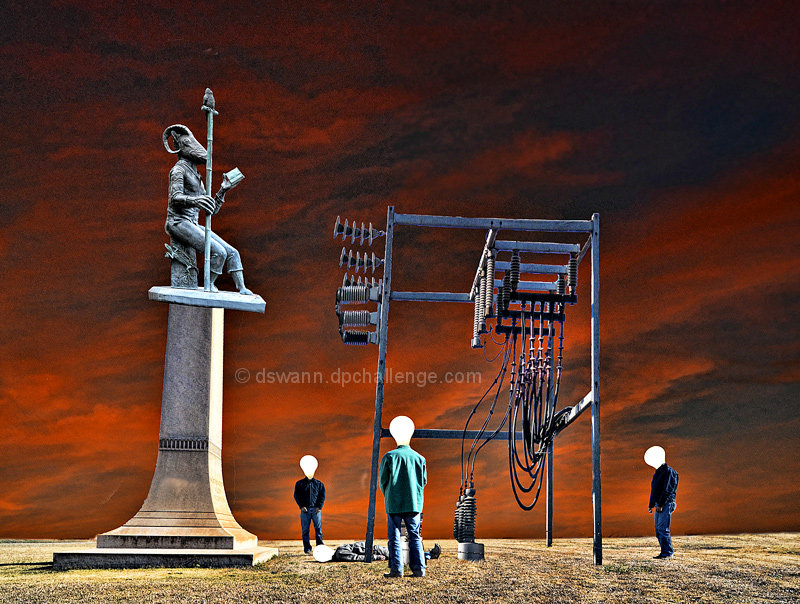
| Would make a great Black Sab album cover |
|
 Photographer found comment helpful. Photographer found comment helpful. |
|
|
12/23/2011 11:49:47 PM |
| Danny....good strong finish (it should have been higher in my opinion). Thanks for such a great season!!! |
|
| Photographer found comment helpful. |
|
|
12/23/2011 12:43:44 AM |
| Congratulations on a strong finish Danny! I think the concept here is awesome and I know you worked hours on this right up until the last minute and couldn't even do all you wanted to do with it. Still, it a great image that people appreciated and thanks so much for doing this one for the team. You have been an awesome hard worker for the team all season long :) |
|
| Photographer found comment helpful. |
Comments Made During the Challenge  |
|
|
12/22/2011 12:34:18 AM |
| Wow... this is well done. Fits the music too. I love the light bulb people. |
|
| Photographer found comment helpful. |
|
|
12/21/2011 04:09:20 AM |
| The guy on the ground should have had his light out for more impact. Nice interpretation though |
|
| Photographer found comment helpful. |
|
|
12/21/2011 12:27:42 AM |
| Oh how awesome this should've been the album cover!! |
|
| Photographer found comment helpful. |
|
|
12/19/2011 01:59:20 PM |
i just realised, the heads are 'pearl' light bulbs, not just abstract shapes. i think they needed a bit of the metal base screw-part showing and/or reflection on globe
Also, the 'victim' on the floor is the point of focus, but would be better if made more prominent in the composition. Also it's not obvious enough he's dead. Perhaps the victim's bulb head could of been darkened, like a burned-out lightbulb, but more exaggerated. |
|
| Photographer found comment helpful. |
|
|
12/17/2011 01:08:12 PM |
| Now this is creativity at its finest! |
|
| Photographer found comment helpful. |
|
|
12/17/2011 11:29:26 AM |
| I like this a lot, good cd cover |
|
| Photographer found comment helpful. |
|
|
12/17/2011 08:42:49 AM |
I am really impressed by this image. It maintains photographic fundamentals while still being filled with such obvious artistic editing and vision. The sky is so striking, subjects are clear, and the message is obvious. All of this is done tastefully and correctly, making this my favorite of the challenge.
Well done, 10/10. |
|
| Photographer found comment helpful. |
|
|
12/17/2011 04:17:07 AM |
| Another top entry and use of elements....8 |
|
| Photographer found comment helpful. |
|
|
12/16/2011 05:27:31 PM |
| I really love the concept, very clever! The colors are a bit weird, but they do work together. My only concern is about the noisy background, but I still really like your picture a lot! |
|
| Photographer found comment helpful. |
|
|
12/16/2011 01:14:48 PM |
| Creative. Love the ominous sky, that adds a lot to the photo. |
|
| Photographer found comment helpful. |
|
|
12/16/2011 08:32:15 AM |
|
| Photographer found comment helpful. |
|
|
12/16/2011 07:28:38 AM |
| just a little stark and cleaned edge for me, doesnt seem to fit togther as an image due to the different levels on ach element but i like the idea and a nice try. 6 |
|
| Photographer found comment helpful. |
Home -
Challenges -
Community -
League -
Photos -
Cameras -
Lenses -
Learn -
Help -
Terms of Use -
Privacy -
Top ^
DPChallenge, and website content and design, Copyright © 2001-2025 Challenging Technologies, LLC.
All digital photo copyrights belong to the photographers and may not be used without permission.
Current Server Time: 04/25/2025 08:50:48 PM EDT.