| Author | Thread |
|
|
07/03/2004 07:29:38 AM |
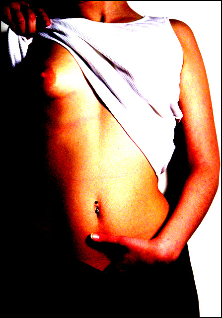
| I really like the blatant pose, harsh contrast and exposure here. Way underrated by the 'CleanMachine Crowd'. |
|
|
|
03/26/2003 11:26:06 PM |
too burned
for those who dont know if its a boy or girl just think about this...do boys have belly rings? |
|
|
|
03/26/2003 12:49:57 PM |
| far to much red in this pic |
|
Comments Made During the Challenge  |
|
|
12/29/2002 09:17:59 PM |
|
|
|
12/29/2002 01:34:19 PM |
| i cant tell if this is a male or female????? its too oversaturated for my taste. |
|
|
|
12/27/2002 11:23:39 PM |
| Well, to be frankly honest, this shot does nothing for me, and I actually see no artistic value in it what so ever. The red levels are way out of sync, it's too grainy for my personal taste. The hand in the pants is pretty tasteless to me, and the "pose" isn't even a pose, looks like an excuse to get your tits on the internet. Sorry if I don't see this the way you do. Good luck in the challenge. |
|
|
|
12/27/2002 05:44:21 PM |
| It's like "Girls Gone Wild" right here at DPC. LOL. I love this image. Great, high-contrasty shot. Very good lighting and detail and really just wonderful. |
|
 Photographer found comment helpful. Photographer found comment helpful. |
|
|
12/27/2002 12:17:49 AM |
| Cool! I love the overexposed, oversaturated look. Very bold and brash. Refreshing and unique after all the subtlety of most of the other photos in this challenge (including mine). I'm giving it 10. |
|
| Photographer found comment helpful. |
|
|
12/24/2002 07:12:40 PM |
| I don't really care for the adjustments that were made in photoshop(or equiv.). It makes the pic way too harsh. |
|
|
|
12/23/2002 09:41:17 PM |
| photo quality is poor, pose an lighting are not attractive to me. |
|
|
|
12/23/2002 07:37:09 PM |
| i like this grainy burned out look. very arty. |
|
| Photographer found comment helpful. |
|
|
12/23/2002 01:28:10 PM |
| This feels like a cheap magazine ad, trying to get buyers by exploiting the old concept that sex sells... The quality of the picture leaves something to be desired, it's far too grainy and the colors have been pushed a little too far. |
|
|
|
12/23/2002 11:51:48 AM |
| I don't like the over-processing on this - not here anyway. Would be better off in a Photoshop challenge IMHO. Can't say a great deal about the photography because it's been obscured by the over-harsh filters. |
|
|
|
12/23/2002 09:42:13 AM |
| I think the effects are bit overdone but I still like the shot |
|
|
|
12/23/2002 09:13:06 AM |
| Don't care for the post-processing. Think this would have been a good shot without the increased saturation (?), and maybe without the hand at the bottom? |
|
|
|
12/23/2002 06:16:21 AM |
| Nice nipple, don't care for the saturation of the picture. Jacko. |
|
Home -
Challenges -
Community -
League -
Photos -
Cameras -
Lenses -
Learn -
Help -
Terms of Use -
Privacy -
Top ^
DPChallenge, and website content and design, Copyright © 2001-2025 Challenging Technologies, LLC.
All digital photo copyrights belong to the photographers and may not be used without permission.
Current Server Time: 03/12/2025 02:03:52 AM EDT.