| Author | Thread |
|
|
02/24/2012 05:25:46 PM |
Originally posted by mike_311:
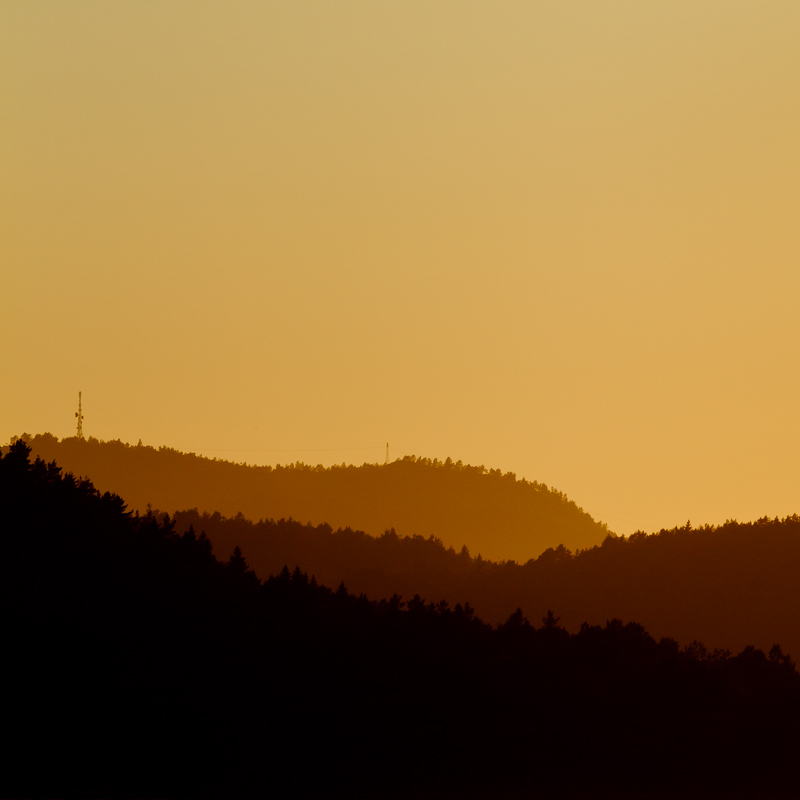
...if you clone out the radio towers you'd have a very nice natural abstract on your hands. |
Nyet. |
|
 Photographer found comment helpful. Photographer found comment helpful. |
Comments Made During the Challenge  |
|
|
02/23/2012 10:14:23 PM |
| I like the layers...nicely done and well seen. |
|
| Photographer found comment helpful. |
|
|
02/22/2012 08:48:41 PM |
| Simple but quite nice i think.. though i don't like the square crop which shows us too much sky IMO.. would have preferred a rectangle landscape crop. |
|
| Photographer found comment helpful. |
|
|
02/19/2012 09:38:57 PM |
| Almost looks like cut paper. Love the four-tone picture. Not sure the towers are a favorite - suppose you couldn't get them to take them down so you could get a clean picture. ;-p |
|
| Photographer found comment helpful. |
|
|
02/17/2012 02:10:17 PM |
| Excellent. Conservative, but perfectly executed. |
|
| Photographer found comment helpful. |
|
|
02/17/2012 07:27:08 AM |
| I really like depth created this way, I always found it fascinating and try to use it whenever I can. Beautiful tones in this picture. |
|
| Photographer found comment helpful. |
|
|
02/15/2012 10:41:54 PM |
|
| Photographer found comment helpful. |
|
|
02/14/2012 01:19:38 PM |
|
| Photographer found comment helpful. |
|
|
02/14/2012 01:08:54 PM |
| nice use of layering, simple yet effective. the colors complement each other nicely. if you clone out the radio towers you'd have a very nice natural abstract on your hands. |
|
| Photographer found comment helpful. |
|
|
02/13/2012 07:55:07 PM |
| A little risky for DPC, but I really like it. Photography meets art. |
|
| Photographer found comment helpful. |
|
|
02/13/2012 06:46:26 PM |
| beside the shades the picture is a bit dull to me .. Sorry! |
|
| Photographer found comment helpful. |
|
|
02/12/2012 02:59:32 PM |
| The cocoa tones are beautiful, i personally think the masts detract from the image. Having said that it's still in my top 3. Good luck. |
|
| Photographer found comment helpful. |
|
|
02/11/2012 06:25:26 PM |
| very cool, I wonder how this would look if some of the top was cropped off, concentrating more on the very cool bottom |
|
| Photographer found comment helpful. |
|
|
02/10/2012 08:31:39 PM |
| A four color landscape. And, oh, THANK YOU for not cloning out the pylons. They are the composition. |
|
| Photographer found comment helpful. |
|
|
02/10/2012 08:10:12 AM |
| I love the diffent shades. Well composed. |
|
| Photographer found comment helpful. |
|
|
02/10/2012 04:04:35 AM |
|
| Photographer found comment helpful. |
|
|
02/10/2012 01:14:59 AM |
| Love it. Simple and effective. Depending on your sense of fair play, but those man made towers either make the image or break it. I'd clone them out if I was to hang it on a wall. |
|
| Photographer found comment helpful. |
|
|
02/10/2012 12:59:55 AM |
|
| Photographer found comment helpful. |
|
|
02/10/2012 12:26:12 AM |
Oh.
Lovely.
(just commenting on a great image... not voting) |
|
| Photographer found comment helpful. |
Home -
Challenges -
Community -
League -
Photos -
Cameras -
Lenses -
Learn -
Help -
Terms of Use -
Privacy -
Top ^
DPChallenge, and website content and design, Copyright © 2001-2025 Challenging Technologies, LLC.
All digital photo copyrights belong to the photographers and may not be used without permission.
Current Server Time: 04/02/2025 05:29:59 AM EDT.