| Image |
Comment |
| 06/17/2002 07:27:00 PM |
We Three Treesby elemessComment: (Golf course?) A bit overly dark, it's hard to make out the three from the forest (there's a joke in there someplace!) I like the lake/pond, it adds extra punch! Photo 7 Creativity 6 Shadows 7 total 7 |
 Photographer found comment helpful. Photographer found comment helpful. |
| 06/17/2002 02:48:00 PM |
Nothing But Netby kathleenmComment: Good title! To fit the title to your photo, I think you should have cropped closer to JUST the subject, IMO. (Is your house number supposed to represent your score/career points type thing?) Photo 6 (less than "exciting") Creativity 7 (your title helped here) Shadows 8 total 7 |
| Photographer found comment helpful. |
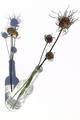
| 06/17/2002 03:08:00 PM |
Bad Hair Day by FranziskaLangComment: Cool flowers, I really like the starkness of this shot. Why the stem on the table (not in the glass)? Photo 10 Creativity 9 Shadows 9 total 9 |
| Photographer found comment helpful. |
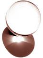
| 06/21/2002 01:12:00 PM |
Crystal Shadowsby ClubJuggleComment: Cool effect. I like how the light radiates like a sunflower. This reminds me of a sylized sun rising over a mountain top. Really nice. Photo 9 Creativity 9 Shadows 9 total 9 |
| Photographer found comment helpful. |
| 06/21/2002 01:37:00 PM |
Ellie Phunt's Shadowby David EyComment: Nice shadow, small nit: light is a little overly bright on his head, back half of it. Photo 8 Creativity 7 Shadows 8 total 8 |
| Photographer found comment helpful. |
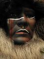
| 06/18/2002 12:55:00 PM |
Eyesby BAMartinComment: Nice mask. Overall a bit dark, were you going for foreboding? Photo 9 Creativity 7 Shadows 7 total 7 |
| Photographer found comment helpful. |
| 06/17/2002 01:16:00 PM |
Shadow Playby stephanComment: I thought about doing this, but not co-ordinated enough. Technically good as far as it goes, but a bit empty. Nit: left edge could have been cropped more, look at the corners. Photo 6 Creativity 6 Shadow 7 total 6 |
| Photographer found comment helpful. |
| 06/17/2002 12:51:00 PM |
Shadow as Silhouetteby indigo997Comment: Very nice. I like how the color gradiates up the frame, but to pick nit, I would have like the upper arm to continue this vein. You are going to get grain comments, don't let them bother you. In this case, you get a bespeckled look that others would have to achieve in Photoshop. The grain is very consistant and reminds me of the painting style (can't remember the name) that was popular at the turn of the century, using paint dots, you know. Photo 8 Creativity 7 Shadows 9 total 8 |
| Photographer found comment helpful. |
| 06/17/2002 06:25:00 PM |
La Florby GotchaComment: Very interesting shot. This shadow challenge created some difficult photos to suggest/comment. I think I would have liked seeing the flowers (I think they are red, maybe) and lose the magazine, no help. Very artsy, but dark. Photo 7 Creativity 7 Shadows 8 total 7 |
| Photographer found comment helpful. |
| 06/19/2002 05:37:00 PM |
LINKS by DigipixerComment: Powerful colors! This makes for interesting patterns, but a bit tedious. (Try a dandelion flower or the like in one of the links, as an idea) Photo 8 Creativity 6 Shadows 6 total 6 |
| Photographer found comment helpful. |