| Image |
Comment |
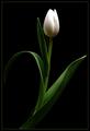
| 02/05/2003 03:01:23 AM |
Happy Valantine's day, dear! by miracComment: Yup! That's cliche. :) Nice job. Good focus and lighting on the front petal. I'd prefer a little more dof as the other petals seem to blur slightly. 8 |
 Photographer found comment helpful. Photographer found comment helpful. |
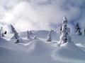
| 02/05/2003 02:58:49 AM |
The Cliché Color: White by a1leyez0nm3Comment: Winter wonderland. It sort of has a dreamlike quality to it. Snow is tough to expose properly. Nice job. The horizon is a bit too centered vertically maybe. 9 |
| Photographer found comment helpful. |
| 02/03/2003 09:45:24 PM |
Door In The Floorby magnetic9999Comment: OK. I'm sure you wanna know what I think so... The door on the floor is just too cool. The room is just way too cluttered and distracting. It wouldnt have been that hard just to straighten up a few square feet. That's also some blinding light coming from the right side off frame. It burned all the white objects in the top part of the shot. I think it's kinda funny that you're dressed so preppy and wearing sandals while sitting on a ladder :P Awesome score though! You did a good job w/ the photoshopping. I do like your floor btw. On my monitor it also looks like there are some diagonal jaggies, but that's probably just me. It is a fun shot. Very creative and well done. |
| Photographer found comment helpful. |
| 02/03/2003 09:03:35 PM |
The Fire Engine Signby AnnidaComment: HEY! I gave this an 8. I love the colors. Biggest complaint is that it goes off the left side of the frame. I like that it isnt centered but it should all be inside the shot. It's a cute sign. Very simple shot but it works for me. Yellow & Blue are Sweden's colors and my bf is swedish so ... :D
Use the full file size!! There's no reason not to, and make sure that you don't repeatedly save as jpg or you will get more artifacting b/c it loses info every time you save. Save as something else until you're all done editing. (you might know that but anyway) |
| Photographer found comment helpful. |
| 02/03/2003 08:23:34 PM |
Sound Worksby ManicComment: Hi, Manic!! Here are my thoughts. Of course my square shot stank so feel free to ignore me.
*lol* at some of your comments. You got a lot of them! This photo isn't very easy on the eyes. It's simple and straight forward. It fits the challenge. All those holes and that bright glare just turns me off. I do like the color, but it's too bright. I also think it's a little weird to see a bg on just 3 sides and have the 3rd cropped like it is. I have to agree that it's just a little boring. If you're gonna have such a simple subject then it's gotta be presented in a really interesting or different way. Maybe an abstract but definitely different lighting. I really don't know what else to say about it. The focus and quality seem good. I don't really think that many people COULD take a much better picture of this subject so... It all goes back to coming up with a good idea in the first place. Just don't come to me for ideas cause I don't have any :P Message edited by Manic - fixing an annoying typo ;o). |
| Photographer found comment helpful. |
| 02/03/2003 02:42:26 PM |
Graceby FranziskaLangComment: Beautiful colors! Excellent lighting. I like the composition tho I think I'd rather see a perspective from a bit lower or a bit higher instead of right from the side. Perfect exposure. 10 |
| Photographer found comment helpful. |
| 02/03/2003 02:40:14 PM |
The Early Birdby jitamsComment: hahaha! What a great capture! You can just sense the jealousy of that bird next to him. Harsh lighting conditions. The feathers are hot in places. Also not quite as cliche as some of the other subjects 9 |
| Photographer found comment helpful. |
| 02/03/2003 02:38:31 PM |
Innocenceby magnetic9999Comment: Very very nice. Perfect crop. The leaves moving out to the edge of the frame are great. Excellent lighting. I don't think you need the water - is that what all the white spots are? Petals are a tad hot, but everything else is so great that you get a 10 anyway. |
| Photographer found comment helpful. |
| 02/03/2003 02:36:42 PM |
Two Classics by JackoComment: Yup. That's cliche! The refraction in the droplet is awesome! If you have enough resolution I'd try a closer crop of just that (for a variation) since it's so cool. Good, even lighting. Really neat that the droplet is right in the middle of a square too. 8 |
| Photographer found comment helpful. |
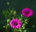
| 02/03/2003 02:34:50 PM |
Stagesby rcrawfordComment: Great dof. Love the colors. I like the lighting - how it fades as you go into the shot. Almost looks like it was sharpened too much. On my monitor the front petals dont seem as smooth as they should for some reason. It might also work as a vertical shot without all the space on the left and some off the top. 8 |
| Photographer found comment helpful. |
Home -
Challenges -
Community -
League -
Photos -
Cameras -
Lenses -
Learn -
Help -
Terms of Use -
Privacy -
Top ^
DPChallenge, and website content and design, Copyright © 2001-2025 Challenging Technologies, LLC.
All digital photo copyrights belong to the photographers and may not be used without permission.
Current Server Time: 04/21/2025 06:32:09 AM EDT.