| Image |
Comment |
| 01/20/2003 01:01:51 AM |
Romeo & Juliet Love Theme (A Time for Us)by KarenBComment: Just a quick thought on why I didn't score this a 10. Excellent composition. Perfect focus and DOF. The color cast bothers me though. I don't think I'd really like it with bright white, black, and red, but I'm not crazy about the pinks either so... |
 Photographer found comment helpful. Photographer found comment helpful. |
| 01/20/2003 12:48:24 AM |
look rightby neoathematrixComment: Loved those signs in London - very helpful b/c I ALWAYS look left!! Great idea .. coulda been executed a bit better as I can't really read it like this. |
| Photographer found comment helpful. |
| 01/20/2003 12:37:04 AM |
Avenueby mciComment: love how different this is from the rest. cool, simple, black and white. think i'd rather have white and then black on the border. |
| Photographer found comment helpful. |
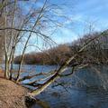
| 01/15/2003 01:37:25 AM |
At the Rivers Bendby dodobirdComment: Tough competition on this challenge AND it isn't the best season for landscape shots around here. I think you found a decent location but maybe not the perfect composition. I like the blue in the sky. I'm sure you know about the silly rule of thirds and I think that it would help if you had something in one of those intersections. There isn't really a focal point for me. The bank and river lines go back into the shot and the point where they converge - far down river - would be a good point to place in one of the intersections. You'd have to change your location/perspective though. Basically, you have all these nice lines created by the trees, but they are all just leading out of the frame instead of leading you TO something. I don't see any obvious technical problems though. That's good. Once you have the technical aspects down, you can focus more on the creative and compositional side of photography. |
| Photographer found comment helpful. |
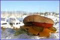
| 01/14/2003 11:06:14 PM |
A Parrot Heads Delightby GotchaComment: f8.5 gave you a surprisingly good blur on the background. I actually thought of this song but, since I don't live anywhere near paradise, decided I couldn't do it justice. I WOULD rather see more light on the burger since it is the subject. The BK wrapper is very annoying. I imagine it more with a little tropical umbrella drink and a really nice plate.
My first thought when I saw this was "where's the beef"? That's a LOT of cheese, and I'm not really sure that you needed that much extra to make it a cheeseburger. I like the crop and the placement of the burger. I don't think you need the frame.
My mom loved JB.
Good grief! I just checked to see where you placed and am really surprised how low it is. I should be able to find more wrong with this shot, huh? :oP Maybe the moral is that hamburgers don't have a lot of wow value with dpc voters (apparently neither do worms by the way). I think you shoulda used the song title as the photo title for sure. Those "does not meet challenge" votes will kill ya. *lol* Read the other comments & I'm not the only one wondering if there's more than just cheese on that burger. |
| Photographer found comment helpful. |
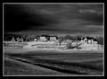
| 01/14/2003 10:22:11 PM |
The Hill In Infraredby DavenitComment: Love the lighting. It's such a dramatic, strong image of (what I consider) rather boring subjects. They ARE very nice houses but ... I wouldn't mind living there anyway. |
| Photographer found comment helpful. |
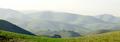
| 01/14/2003 10:18:28 PM |
The Ridgeby autoolComment: Very pretty. I really like the hills and the inclusion of the green in the foreground is great. A little less light, giving more definitiion to the hills, would be nice. |
| Photographer found comment helpful. |
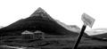
| 01/14/2003 10:14:56 PM |
Place of stillnessby vjozComment: If you're gonna stick that sign in there then I think you shouldn't have cropped up so high so that it's just floating. The mountains are really cool. I think maybe you could have used a perspective from more to the right that would show the ridge better and the mountains in the distance. |
| Photographer found comment helpful. |
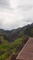
| 01/14/2003 10:12:10 PM |
My townby monrfComment: This looks like a cool place. I'd like to see more of the repeating roof lines in the bottom of the shot and a little less sky. |
| Photographer found comment helpful. |
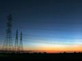
| 01/14/2003 10:04:11 PM |
Sunset on the horizonby xertionComment: Interesting contrast between natural beauty and man. Lovely colors. Could stand a tad more exposure or light. |
| Photographer found comment helpful. |
Home -
Challenges -
Community -
League -
Photos -
Cameras -
Lenses -
Learn -
Help -
Terms of Use -
Privacy -
Top ^
DPChallenge, and website content and design, Copyright © 2001-2025 Challenging Technologies, LLC.
All digital photo copyrights belong to the photographers and may not be used without permission.
Current Server Time: 04/21/2025 10:31:00 PM EDT.