| Image |
Comment |
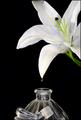
| 11/28/2003 07:56:07 PM |
Scents of Smellby EddyGComment: Nice, with that little added something to make it outstanding. Arrangement and set-up are good. I guess if I would change anything, it would be to desaturate the blue channel to lessen the impact of those highlights on the lip and stopper. But that's just my take on the photo. |
 Photographer found comment helpful. Photographer found comment helpful. |
| 11/28/2003 07:51:47 PM |
Onionsby katlynComment: Nice arrangement and composition. A tripod is a wise investment. The camera shake in this picture makes it less pleasing to view than it would have been if it was in sharp focus. |
| Photographer found comment helpful. |
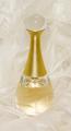
| 11/28/2003 07:34:48 PM |
Perfume: Makes' beady perfectby birgirComment: The title is a little too clever. Excellent shot. The feathers add such a nice soft touch to the photo and the high key approach reinforces the female theme. There is nothing not to like about this except the bead on top, I wish it was more defined to bring it out from the background, You have some heavy competition! |
| Photographer found comment helpful. |
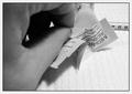
| 11/28/2003 07:06:00 PM |
Isopropylby GeneralEComment: A different smell, and a strong one at that. You made a good choice. I don't know about the composition. The hand seems to take up more of the space than it needs to and the syringe might have been better placed somewhere more visable? |
| Photographer found comment helpful. |
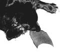
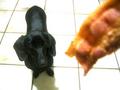
| 11/28/2003 07:01:34 PM |
Dog and Footby SMW409Comment: Cute idea. I think I would have liked to see more details. The brightness/contrast is pumped too much for my tastes, but I can see that you might have wanted them isolated to give more meaning to the title. |
| Photographer found comment helpful. |
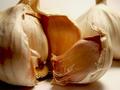
| 11/28/2003 05:03:05 PM |
Garlicby HavokComment: What happened to your red channel? It's well set up and I like the composition and lighting, but the red, in my opinion, lowers the quailty of the shot. |
| Photographer found comment helpful. |
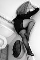
| 11/28/2003 04:49:16 PM |
eau de toiletteby grigrigirlComment: I have to say this is the most unique one of the bunch. I've been putting it off because I don't know what to say or think. It has an appeal, but it's so unusual. I like the diagonal that the wall forms and the b/w treatment. I guess it's good because it certainly causes one to stop and consider, but instead of thinking about the picture, I'm thinking about the photographer. And the word is why? |
| Photographer found comment helpful. |
| 11/28/2003 04:42:41 PM |
Breakfast Offeringsby amyheartsjapanComment: Good idea that wasn't done 100 times! If the bacon was a little lower or if it was more in focus, it would have been more fun. It looks like you maybe adjusted the brightness/contrast too much. You might want to try histogram adjustments or levels. They are not as harsh. |
| Photographer found comment helpful. |
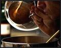
| 11/28/2003 09:43:52 AM |
Feeding The Sensesby ToddhComment: I like it. This is one that I had to look at for a while to "get". But now it makes me smile. I don't know if I like it this grainy but I like the lighting and composition. The reflection in the lid is a really nice touch. This is one of the best cooking images I've seen on this site or elsewhere. Now that I've stayed a while, I can say I really don't like that much grain. |
| Photographer found comment helpful. |
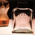
| 11/28/2003 09:37:27 AM |
Just For Men!by agwrightComment: Very well done. I like the toning. Sharp. This is the second border I've actually noticed this challenge. I'm thinking it's out of place because this looks like an ad and they are usually not framed. |
| Photographer found comment helpful. |
Home -
Challenges -
Community -
League -
Photos -
Cameras -
Lenses -
Learn -
Help -
Terms of Use -
Privacy -
Top ^
DPChallenge, and website content and design, Copyright © 2001-2025 Challenging Technologies, LLC.
All digital photo copyrights belong to the photographers and may not be used without permission.
Current Server Time: 04/18/2025 07:06:32 AM EDT.