| Image |
Comment |
| 12/29/2003 01:57:13 PM |
|
 Photographer found comment helpful. Photographer found comment helpful. |
| 12/29/2003 01:55:18 PM |
|
| Photographer found comment helpful. |
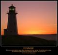
| 12/29/2003 01:53:43 PM |
Stand Tallby GeneralEComment: Nice idea, though could have been more dramatic if you could have found a better-lit subject. Photographically, it seems to just be a metering error - unless you were going for this look. The titie is a little too small to work effectively. |
| Photographer found comment helpful. |
| 12/29/2003 01:52:08 PM |
Celebrate life by timmiComment: Overall it's well presented, but the image should be powerful enough to stand on it's own, and I don't think that this one is. You're verging on too much text as well - the message should be more succinct. |
| Photographer found comment helpful. |
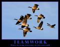
| 12/29/2003 01:50:21 PM |
Teamworkby dan_pendletonComment: Nice image and simple message. It's a minor point, but there's no clear idea of which is the lead goose here. Typically they will take turns to lead, and if you had been able to capture that it may well have been a more powerful image and concept. |
| Photographer found comment helpful. |
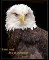
| 12/29/2003 01:48:56 PM |
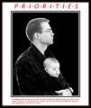
Prioritiesby Spanish_GreaseComment: Tha baby looks really freaked out! I'm sorry, it just distracts from everything else. It also looks like a cut and paste job of the portrait onto the background, resulting in a very artificial image. For a motivational poster, this has too much text. |
| Photographer found comment helpful. |
| 12/29/2003 01:46:54 PM |
Imaginationby magnetic9999Comment: Nice image. I'd have liked to have seen more of her face though. The overall concept is a little vague though, where a motivational poster needs to be instantly understandable. |
| Photographer found comment helpful. |
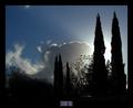
| 12/29/2003 01:45:20 PM |
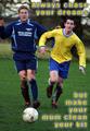
Always chase your dreamsby PaulMdxComment: A little too opaque to be motivational. The choice of font and style is interesting, but not 'serious' enough for a motivational poster. As far as the image is concerned, it's well compsosed, but it would be great if one of the figures was closer than the other to allow you to use DOF to your advantage and focus on one of the two players. |
| Photographer found comment helpful. |
| 12/29/2003 01:43:20 PM |
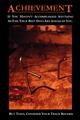
Achievementby sleekrComment: Too much text, and the idea is copied directly from a similar image at www.depair.com. The photo could do with having more detail, and the upper part of the image is a bit messy. Nice strong colors though. |
| Photographer found comment helpful. |
| 12/29/2003 01:41:41 PM |
Rise Above The Rest..by buzzrockComment: Reasonable image, though you should have revisited your submission when the rules were changed to allow text. |
| Photographer found comment helpful. |
Home -
Challenges -
Community -
League -
Photos -
Cameras -
Lenses -
Learn -
Help -
Terms of Use -
Privacy -
Top ^
DPChallenge, and website content and design, Copyright © 2001-2025 Challenging Technologies, LLC.
All digital photo copyrights belong to the photographers and may not be used without permission.
Current Server Time: 03/12/2025 03:12:25 PM EDT.