| Image |
Comment |
| 11/12/2003 08:12:11 PM |
The Name Of The Rose by Umberto Ecoby ShannonComment: Nice composition, though on my monitor it;'s a bit dark and I can't see as much detail as I'd like to. In fact, it's so dark that I didn't immediately identify it as a rose. |
 Photographer found comment helpful. Photographer found comment helpful. |
| 11/12/2003 08:10:41 PM |
|
| Photographer found comment helpful. |
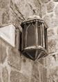
| 11/12/2003 08:10:04 PM |
The Lamplighterby lbWhaplesComment: You really need to include a lamplighter to make this one work. That lamp looks like it hasn't been lit for centuries. Composition is good, and it you're going for a historical feel the choice of toning is also good. I would suggest straightening the verticals and a little bit of unsharp mask to bring out more detail. |
| Photographer found comment helpful. |
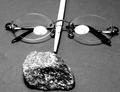
| 11/12/2003 08:08:00 PM |
"Bell, Book and Candle"by SMW409Comment: If it weren't for the good use of lighting this one would have been pretty dull. You managed, however, to get good shadows and highlights. Looking closer, it may have been more challenging to try to conjure up something to fit the title of the book you used here... |
| Photographer found comment helpful. |
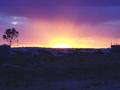
| 11/12/2003 08:06:19 PM |
Prospecting for goldby Pop_in_OzComment: Nice colors. Unfortunately tbough, the foreground (i.e. the thing which relates the subject to your chosen book title) is a bit too dark so the whole thing loses impact and relevance. It's possible, however, that shadow detail could be recovered using contrast masking - or you could have used a graduated neutral density filter when taking the shot to darken the sky and reveal more detail in the foreground. |
| Photographer found comment helpful. |
| 11/12/2003 08:04:20 PM |
Harry Potter and the Sorcerer´s Stoneby cimarron98Comment: Are the white oval reflections part of the image, or just reflections? This one is a bit flat - it may have worked better if you'd set it up in such a way as to create more of an impression of depth. I'm not sure that B&W suits this one, because there isn't a great tonal range. Given that it's a recent book color would have probably been more appropriate anyway. |
| Photographer found comment helpful. |
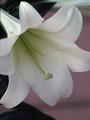
| 11/12/2003 07:50:48 PM |
"Where the Lilies Bloom"by bruskiComment: For me it's a little to grainy, though your angle and lighting is good. A more anonymous background would have helped focus attention on the flower as well. |
| Photographer found comment helpful. |
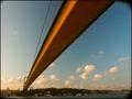
| 11/12/2003 07:49:27 PM |
Turkey, between east and westby frankhComment: Niceuse of perspective, and good colors. From a technical standpoint, it's pretty noisy, and you should consider cropping out the vignetting in the corners. |
| Photographer found comment helpful. |
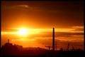
| 10/20/2003 02:04:51 PM |
Dark Industryby KonadorComment: You've unfortunately been a victim of flare here. Even though it's 'de rigeur' these days, it doesn't really help your shot. The colors are wonderful though, but the horizon isn't very attractive. With these great conditions, another vantage point may have given you a better composition. |
| Photographer found comment helpful. |
| 10/20/2003 02:01:02 PM |
claireby MadMordegonComment: Overexposed unfortunately, unless of course you were going for a 'high key' portrait. If not, this can be easily corrected in post-processing. |
| Photographer found comment helpful. |
Home -
Challenges -
Community -
League -
Photos -
Cameras -
Lenses -
Learn -
Help -
Terms of Use -
Privacy -
Top ^
DPChallenge, and website content and design, Copyright © 2001-2025 Challenging Technologies, LLC.
All digital photo copyrights belong to the photographers and may not be used without permission.
Current Server Time: 04/26/2025 08:11:22 PM EDT.