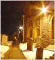
Spirits continue to visit their resting place.by
RulerZigzagComment: Greetings from the critique club!!!!
Initial impact: ahh prety standard shot.. like the stars though..
Meet the challenge: It takes a momment to notice the ghost. While this meets the challenge it takes a beiwer a while to see what is surreal about it.
Lighting: I feel that the lighting is pretty good in the shot. Not much I would change or could change with lighting.
Color: I tend not to like the orange hue that street light at night tend to give off. I constantly get it in my onw shots. I do feel that dosn't work to bad in this particular shot it tends to add to the surreal feeling. I do think that this would have been a bit more enjoyable if you were to desaturate the orange a bit and bumb up the blues a little until you reached somthing of a gothic feeling blue grey. I think this would have worked well with the stones in the photo.
Focus. Dead on I have no complaints at all with the shrpness of the image. It is a nice clean, crisp, in focus shot.
Background: The street lights in the distance are a bit distracting however, due to the basic editing rules there was pretty much nothing to do about those. (short of maybe geting arested for shooting them out with a b.b. gun.)
Composition: Not to bad but I feel that you would have done better if you had shot this from the side and closer up on the ghost. This would have bought out your ghostly subject a bit more. I also feel that having the ghost in summer clothes from a past erra would have realy added to it's ghostly apearance. The modern clothes at the old tomb do little for me. I also realy don't care for the hood shot from the back it pulls all of the character and emotion out of your subject.
Conclusion: Not a bad shot but the composition realy hurt the high emotional impact that this shot should have had. I feel that as is I would have given this around a 5. However if this same shot had been composed differently I can see a 9 or 10 as bieng completely possible. Great concept, nice execution, but the composition is a little weak. Overall pretty standard in a very demanding DPC challenge. I look forwrd to seeing more from you in the future. Good luck in the future challenges.
Tristalisk