| Image |
Comment |
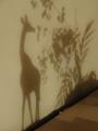
| 06/27/2002 01:03:00 AM |
Let's go to the moviesby CreativeFlyPhotoComment: I really like the middle of this image, but not so much the top and the bottom... a horizontal crop of just the markee and the upper 3/4 of the building would be awesome. |
 Photographer found comment helpful. Photographer found comment helpful. |
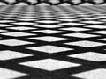
| 06/17/2002 09:12:00 PM |
Diamonds In The Roughby pnichollsComment: The _slight_ rotation to the right is just a little distracting, though I think the curves of the fence magnify that more than is actually the case. Great use of crisp lines and shapes. |
| Photographer found comment helpful. |
| 06/17/2002 08:56:00 PM |
Bad Hair Day by FranziskaLangComment: Great shot. Your wonderful textures and lighting have acheived the sense of depth that reallly makes the shot. |
| Photographer found comment helpful. |
| 06/17/2002 09:13:00 PM |
Strung Outby millerComment: Wonderful photograph. I love the simplicity, the use of texture and lighting, and the solid overall feel of the composition. Nice job. |
| Photographer found comment helpful. |
| 06/17/2002 08:55:00 PM |
|
| Photographer found comment helpful. |
| 06/17/2002 09:07:00 PM |
|
| Photographer found comment helpful. |
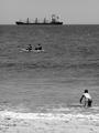
| 06/03/2002 01:38:00 PM |
Life at the Beachby langdonComment: I told you I liked "feel the heat" better, but I really do love how the kid almost seems to be diving into the picture. You're hot. |
| Photographer found comment helpful. |
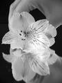
| 06/04/2002 10:09:00 AM |
Photoshoot Setupby FranziskaLangComment: The movement on that bottom flower is pretty distracting, and it makes the photo look blurred/out of focus at the bottom. I love the top of the image, though, so I know if that bottom part hadn't been blurred, I'd really have liked this image. I think you might have gone for a little more symmetry, though, with how much hand is showing at the top/bottom. |
| Photographer found comment helpful. |
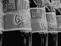
| 06/04/2002 12:08:00 PM |
Have a Drinkby karmatComment: This image is lacking the contrast and excitement that the color version would have offered, so I don't feel you've used black & white to the advantage of the photo. If it had to be black and white, I'd probably push the lighter levels further towards light to increase the impact of the photo. It might also have been interesting to play with other focal points -- did you? |
| Photographer found comment helpful. |
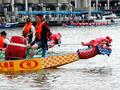
| 05/28/2002 02:05:00 PM |
Dragon Boat Raceby BAMartinComment: I think an angle just a little closer down to the water would have made this shot much more exciting and made the off-centeredness seem very intentional. The current angle almost puts you in a documentary-style mood. |
| Photographer found comment helpful. |
Home -
Challenges -
Community -
League -
Photos -
Cameras -
Lenses -
Learn -
Help -
Terms of Use -
Privacy -
Top ^
DPChallenge, and website content and design, Copyright © 2001-2025 Challenging Technologies, LLC.
All digital photo copyrights belong to the photographers and may not be used without permission.
Current Server Time: 04/09/2025 03:19:25 AM EDT.