|
|
|
Showing 861 - 870 of ~1136 |
| Image |
Comment |
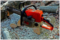
| 12/09/2005 12:36:12 PM | Power Toolsby msdoubletroubleComment: Composition:
The composition here is a bit static, but very colorful. I'm not exactly sure of how you accomplished it, but the saw indeed seems to be suspended, which I believe is an intentional effect. Doing this without "an adult", has left you with a perspective that only shows the saw, rather than "adulthood." I think the overall idea of the picture would have benefited from the saw being nearer to the bottom instead of off-centered toward the top.
Background:
The background appears very flat. I think this is a lighting and perspective issue, but it almost appears as flat as a sheet of paper.
I'm not certain of how you intended this to look, but that's the effect I get from the picture. It is also a rather "busy" background, with perhaps too many distracting elements.
Camera Work:
As I don't have information as to your camera settings, I can only guess, and I'm betting this was handheld with a fast shutter speed. The focus and sharpness is good, but a large aperture should have given better background blur with a 20D. A 1.8 or 2.0 would have been a good value to use, if you have a capable lens. The lighting appears natural.
Post-Processing:
I honestly don't detect a lot of post processing here, but you've definitely made the saw stand out. I think there's a little too much saturation, making the orange a bit unnatural.
My Opinion:
This is a neat idea, but somehow the shot feels uncomfortable. The colors are slightly distracting, and the background is busy and confusing. I think it would work better with less wood in the background. Overall, nice effort and a good idea.
I do see this as a great shot, and I hope my comments are constructive and informative. Thanks for entering!
If you've got any questions about this critique, please feel free to contact me via the PM system. |  Photographer found comment helpful. Photographer found comment helpful. |
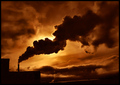
| 12/09/2005 12:02:38 PM | chocolate by ursulaComment: This is gorgeous, ursula, and you have inspired me to pay more attention to the mundane factories that are around me. Thanks, and congrats. | | Photographer found comment helpful. |
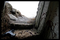
| 12/09/2005 11:53:34 AM | The Adult Viewby sverrirjComment: Greetings from the Critique Club!! :)
Composition:
This image obviously carries the potential for a lot of emotion. I believe you intend it to be slightly mysterious, but I find it perhaps a bit TOO mysterious. I am drawn to it because I simply cannot settle in my mind what the message of the photo is. My eye is clearly drawn to the gun, and the message of "waiting" comes to mind. The bloodstain makes me believe that the shooter has been terminated, but I find the idea of a dead shooter looking outward to be confusing. There's a lot of tension in this, and I believe you intended it to be.
Background:
You have intentionally blown out the background, I believe, and that further adds to the mystery. That's a good technique, assuming you intend to be mysterious, again.
Camera Work:
It would appear you did this with a wide angle, and probably a small aperture. I see the f/8, which is usually the "who cares" aperture setting. DOF is pretty deep. My opinion is that a larger aperture would have softened the transition into the background and made the image a little less harsh. Lighting is good, assuming the intentional blowout of the background.
Post-Processing:
This appears to have only been minimally processed. I suspect you cranked up the contrast, possibly with curves. This has made for a pretty stark, in your face image, but a bit of color manipulation could have possibly given more impact to the cartridges beside the gun. They are almost camoflauged by the color of the sill. Or, it may have been better to attempt to light them differently, but that would have been difficult with the (intentional) blowout of the background.
My Opinion:
I do think there is perhaps a bit TOO much mystery. If we had a clue as to the message you mean to send, I think the image would have a great deal more impact. With the title, it definitely meets the challenge, but I have a hard time reconciling my conflicting interpretations. Was this a fight? A fugitive on the run? Is this a war in the middle east? Apocalyptic end of the world? I'm just not sure of how to read it, and that leaves me perhaps asking more questions than you intended.
I do see this as a great shot, and I hope my comments are constructive and informative. Thanks for entering!
If you've got any questions about this critique, please feel free to contact me via the PM system. Message edited by author 2005-12-09 11:56:19. | | Photographer found comment helpful. |
| 11/14/2005 10:49:49 AM | American Horseby Man_Called_HorseComment: This would have been GREAT, but something is wrong with the resizing??? Everything looks like it's shaped wrong. | | Photographer found comment helpful. |
| 11/04/2005 05:22:30 PM | aaronoutside2_filtered.jpgby trobergeComment: Looks like you might have done just a little too much contrast addition and then used Neat Image, which spread the "overexposure" on the face out even more.
I bet the original shows more detail in the face, right? Obviously, with a little guy like this, you'll NEVER get the opportunity to reshoot this exact shot, so I would try to redo the processing and keep some more detail, if I were you. If you need to eliminate noise, I recommend Imagenomic's Community Edition (Free) over Neat Image because it lets you select the type of noise you want to filter and leaves more detail.
Just my thoughts - I hope this helps!
| | Photographer found comment helpful. |
| 05/11/2005 01:56:58 PM | | | Photographer found comment helpful. |
| 05/11/2005 01:35:13 PM | Sisterby eggvComment: This is deep, and it's good art. I just don't like the photo, sorry. Indeed, emotionally provoking, but the thoughts are not clear. The message doesn't grab me, it just makes me curious. What are you trying to tell us about here? | | Photographer found comment helpful. |
| 04/28/2005 12:25:45 PM | | | Photographer found comment helpful. |
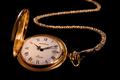
| 04/28/2005 12:25:28 PM | "Timeless" Classicby ZapperzacComment: Very well done. Is this jewelry?? :) I'm judging watches as jewelry but betting you are getting slammed. 8 | | Photographer found comment helpful. |
| 04/28/2005 12:24:44 PM | | | Photographer found comment helpful. |
|
Showing 861 - 870 of ~1136 |
Home -
Challenges -
Community -
League -
Photos -
Cameras -
Lenses -
Learn -
Help -
Terms of Use -
Privacy -
Top ^
DPChallenge, and website content and design, Copyright © 2001-2025 Challenging Technologies, LLC.
All digital photo copyrights belong to the photographers and may not be used without permission.
Current Server Time: 04/08/2025 04:28:37 PM EDT.
|