| Image |
Comment |
| 09/13/2006 08:39:20 AM |
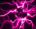
Unobtainium by MickComment: Nice abstract way of meeting the challenge, I like it! :) |
 Photographer found comment helpful. Photographer found comment helpful. |
| 09/13/2006 08:37:29 AM |
|
| Photographer found comment helpful. |
| 09/13/2006 08:32:54 AM |
New idea!by DjabordjaborComment: Is this the same shoot as the other one? Well I'll repeat my comment then. The light bulb/electricity is physics rather than chemistry, but I do like how the backlighting catches the hair. I think this photo's composition is better than the other one too. |
| Photographer found comment helpful. |
| 09/13/2006 08:29:45 AM |
I have an idea!by tumitumiComment: Light bulbs/Electricity are really Physics rather than chemistry. Still, the backlighting catching the hair is nice here. |
| Photographer found comment helpful. |
| 09/13/2006 08:27:50 AM |
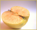
Oxidationby snowleopard10101Comment: I think the border spoils the photo here. The colour choice on it was bad imo and its a major distraction. The apple also seems too close to the edge on the left and bottom. |
| Photographer found comment helpful. |
| 09/11/2006 08:25:08 AM |
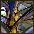
Golden Stemby sherpetComment: I really like the curves and colours here, which are really nicely complimented by the black lines. These darker lines really give the shot a nice substance and make it look like a painting :) Message edited by author 2006-09-11 08:25:27. |
| Photographer found comment helpful. |
| 09/02/2006 09:27:54 AM |
Parkedby MelethiaComment: Composition: 6 - The shapes and crop you've chosed show interesting patterns, but perhaps more of an angle would add more drama?
Technical: 3 - The high contrast works to some extent, especially well at the bottom of the frame, but the top it causes all the whites to blend and just look a bit "mish-mashed".
Creativity: 6 - A risky shot for DPC but the patterns and repetition were well spotted :)
Appeal: 4 - The high contrast black and white is normally something that appeals to me, but this goes a little too far in my opinion.
Overall Calculated Average Score: 5 |
| Photographer found comment helpful. |
| 09/02/2006 09:21:44 AM |
Row Boatby robsComment: Composition: 4 - Interesting, but doesnt really show the subject very well.
Technical: 5 - Nice exposure and good contrast. Nice colours in the sky too. Could have used a larger image size in this challenge to show the detail better, which a sharpen would also help.
Creativity: 5 - A different angle would add more uniqueness to the shot.
Appeal: 4 - Doesn't hold my interest for long because there is not enough of the row boat shown.
Overall Calculated Average Score: 4 |
| Photographer found comment helpful. |
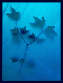
| 09/02/2006 09:19:35 AM |
Spirit of a treeby timmiComment: Composition: 7 - In this case the centeredness works I think.
Technical: 6 - Nice appealing colour gradient, and teh silhouette looks good. I'm not sure if the texture is natural or post processed in, but either way I find it a little distracting. The whole thing could be a little sharper too.
Creativity: 7 - Nice idea and executed well :)
Appeal: 6
Overall Calculated Average Score: 6 |
| Photographer found comment helpful. |
| 09/02/2006 09:17:25 AM |
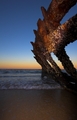
Here comes the sun.by zardozComment: Composition: 6 - The crop at the top seems a little tight, but the leading lines of the shore work well to guide the eye. Shame there's nothing at the end of them.
Technical: 6 - Seems oversharpened to me, and a bit on the bright side, but not too bad.
Creativity: 5 - I think with something in the shot to give it a point of interest it would look more unique.
Appeal: 5
Overall Calculated Average Score: 5 |
| Photographer found comment helpful. |
Home -
Challenges -
Community -
League -
Photos -
Cameras -
Lenses -
Learn -
Help -
Terms of Use -
Privacy -
Top ^
DPChallenge, and website content and design, Copyright © 2001-2025 Challenging Technologies, LLC.
All digital photo copyrights belong to the photographers and may not be used without permission.
Current Server Time: 04/13/2025 07:56:57 AM EDT.