|
|
| Image |
Comment |
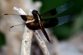
| 08/20/2006 09:32:56 PM | Dragon Flyby andrea22_alsComment: *Critique Club*
My first impression of this photo is that the focus seems kind of soft. We don't get much details in the wings or the body. The color is nice, but I think he blends in too much with the background. The upper right corner of the photo is dark, and we almost lose his right hand wings in the darkness of the background right there. The sticks blend in with the white area of the background.
I think the lighting looks tricky. the body is dark, but the sticks look a little blown out. Especially near the tips of the stick.
I like the placement of the dragon fly and sticks. The crossed sticks witht he dragon fly off center a bit really works compositionally.
As for the challenge, the dragon fly looks like he's landed already, which may be a reason for some of the lower votes. He looks more like a still life than a stopped motion. As I read your details, I see that he's 'just about' to land, but to US, it appears that he already has, so I don't think that message got across with the photo. Definately a hard choice for a stopped motion pic, but with that cam, I think you could have gotten more focus for sure. I think that using a quick shutter speed and better lighting could have improved this shot a bunch.
Having the background out of focus would work well, had not been for the colors of the background distracting from the dragon fly.
Would have been a stunner if you could have gotten him in a more of a 'flight' position.
~Heather~ |  Photographer found comment helpful. Photographer found comment helpful. |
| 08/15/2006 03:25:37 AM | | | Photographer found comment helpful. |
| 08/08/2006 02:00:28 AM | hayday reflectionsby crayonComment: Thought I'd stop by to make up for that 'missing comment'.
I personally don't prefer the grain, however, I pictured it without the grain, and had you not put the grain in, I think I would have said something like 'lacks something to add visual appeal'. Sooo... I supose this needed a little 'something'.
At first the image was a little confusing. Looked a shot of a roof with a light pole behind it, but then part of the roof is floating in mid air? But After looking at it for a minute, it's obvious. I think this is important. It draws my attention, and holds it. So while I don't really prefer the effect, and the image is simple in nature, it really does hold my attention.
I like the color...or lack there of. I think it fits in the challenge perfectly.
I also like the way you have the light positioned in combination with the tiles. The photo is balanced nicely.
Focus and clarity are good, Doesn't appear that you added the grain to try to cover up something.
Lighting also appears to have been ok. The small dark bottom left draws some attention, but does not harm the overall photo in my opinion.
Hope this helps...if not, lemme know and I'll just come back and write 'Great job'. :-p
| | Photographer found comment helpful. |
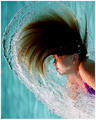
| 08/07/2006 01:58:24 PM | mighty aphrodite by SkipComment: Great job with the stopped motion. The vertical orientation of the photo is bugging me though. I keep turning my head to the side to view it. I'm sure I'll be the only person that it bothers, but it does have a huge impact on the photo for me.
Focus and clarity are amazing. Great detail in the water and hair. I love the colors too. Excellent stopped motion, perfect for the challenge.
Lighting on her face could be a little more even but it doesn't distract from the photo at all.
Congrats.
~Heather~ | | Photographer found comment helpful. |
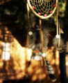
| 07/15/2006 01:36:30 AM | Dreamcatcher - Stephen Kingby AlainComment: Hmm...I'm thinking that the background is distracting because it's hard to even tell what it is. Even after you've said what it was, it's still hard for someone who hasn't seen the actual sight to envision. I am a huge SK fan, and do think that it would work nicely with a cabin in the background, however, I think it might be a bit too abstract to work here. I saw your post in the most misunderstood thread, and just wanted to let ya know my opinions.
~Heather~ | | Photographer found comment helpful. |
| 07/08/2006 04:03:33 PM | Disco Bowlingby rishinicolaiComment: *Critique Club*
I really like this. The motion blur works, it's in a setting and not set up, and the color is very nice as well.
Someone made the comment that they didn't appreciate all the negative space, but that's the only suggestion I could think of is that I'd actualy like to see MORE negative space. Just a bit to the right side of the image. The ball and the main bowler seem a little cramped and my eyes are really drawn to the guy in the blue shirt. I think that if there were a bit more space to the right, that maybe he would seem like he were located in a more 'main area' of the photo. If that makes sense. Looking at it though, I realize that there were probably ball return units or something to the right, and that might not have been very attractive as far as visual appeal goes, however, I still think that I'd like to see the guy in the blue shirt in a more important location within the photo.
The color is great, I think the lighting probably played a huge part in that. Great way to use the lighting to your advantage here.
I think the background works very well. Very clean and non distracting. Did a great job of not getting other people/stuff in the background and that makes the overall photo have a clean look to it.
I'm thinking this didn't score higher because there was a lot of great competition and maybe the viewers couldn't personally connect with the photo. Technically though, you did a great job with this one.
~Heather~
P.S. Might I make a couple personal suggestions? I notice you've been around over a year, and have only made 1 comment in return to the almost 80 you have received. I learned more giving comments on other's photos than I did receiving them. You don't have to be a professional to tell people what you like/don't like and why you like/don't like it. You'll find that once you start picking apart others photos, you'll be more critical of your own.
Also, you put N/A in the camera details sections in order to get this critique, next time, don't fudge the info. It is helpful to CCers when writing in depth critiques of your work. Message edited by author 2006-07-08 16:09:48. | | Photographer found comment helpful. |
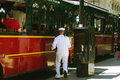
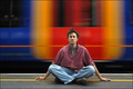
| 07/08/2006 02:41:07 PM | Meditating on platform 17by olbolComment: *Critique Club*
First off, Congrats on your high score and great finish. This photo is well deserving of that.
Second, I see you have never marked a comment as Helpful, so you either don't find any of the information provided helpful (in that case, I'm afraid I wont be of much help either, since I tend to agree with most of the comments) or you just have no intentions of acknowledging people for taking the time to offer words on your photos.
Either way, it's kind of discouraging.
Anyway, about the photo...
I love it. I think you did a wonderful job with the motion blur. The focus is excellent on the man. Very nice and crisp, great detail.
I like the colors in the background, I think that despite the bright background colors, the man still stands out nicely against the background.
I like that he is in the center of the photo. I think that works very well here in my opinion. It doesn't always work, but in this case, I like it.
Lighting also appears good. Editing works great too.
Not really much else to say about a 7th place 6.56 scoring image but great job.
~Heather~ | | Photographer found comment helpful. |
| 07/07/2006 02:20:32 PM | Porch Lightby 777STANComment: *Critique Club*
My 500th Critique Club Critique! Yay.
Anyway, I'm not a huge fan of abstract images, so this doesn't impress me on a personal level, and since you didn't post your intentions for the photo in the photographer's comments section, I can only offer my critique based on personal opinion alone, since I have no clue what your intentions were.
You state that it was 'practice'. Practice for what? What were you trying to achieve here? If you were ONLY trying to achieve Motion blur, well, I think you got got it, but motion blur might be one of the easiest things to photograph. It's making it look good that's hard.
I think that not having anything in the image to really hold our attention hurts it. We look at it, say 'oh, some blurry lights' and move on.
I do like that the subject is not directly in the center of the photo. That I think was a plus for this image. Although I'm not sure what was outside the photo on the top, I assume that it was better cropped the way you have cropped it. However, I think one commenter mentioned the blue color at the bottom as being distracting, and I'm going to have to agree. With all the negative space at the bottom, my eyes want to see it all one solid color. The only way it would work, is if the blue tied in with the subject somehow to help enhance it, but I don't feel that the blue adds anything to the photo as is. At this point, it is just a distraction. Not sure cropping it out would work though, since then it would be almost panoramic. So I think the only reasonable solution there would be to reshoot and make sure that blue light wasn't there. Cover it up maybe? Put something over top of it?
The motion blur is nice and crisp. Haha. If that makes any sense at all. What I mean is that the light trails are sharp, and not fuzzy, which is also a bonus. For an abstract, I think you did an ok job. I mean, while it's not really my thing, it IS better than some I've seen.
Kind of hard to critique an abstract, since the technicals kind of go out the door, but I hope this helps in the event of a reshoot, and remember, this is just my personal opinion. If you like it, that's all that matters.
~Heather~ | | Photographer found comment helpful. |
| 07/07/2006 01:03:46 PM | Land Rovingby Len ScapComment: *Critique Club*
Put me in the group that thinks this is a great shot but would like to see the negative space in front of the vehicle.
The focus and clarity are really good here. I think you did a great panning job and the focus of the vehicle is very good, while the blurred background contrasts it perfectly. I like the patterns that the blur creates in the background. Color in the background is very nice as well.
Color on the vehicle however seems odd. There is a blue cast on the vehicle, and on the person as well. I could say 'oh, it's just their shirt' but it's their face that is blue too, and that strikes me as very odd. Actually, once I notice it (almost right away) it's where my attention is drawn every time, so it's a huge distraction for me.
Not sure what caused this blue tint, so not sure how to fix it other than going in and manually spot editing it to fix it.
The lighting is very good, I think the lighting is what really helps the focus to be right on and the vehicle to stand out so weel on the background.
You did a very nice job with this. The subject doesn't really make me jump out of me seat with excitement, however, technically, it's well done with the exception of the cropping/framing. This is all just my opinion of course.
~Heather~ | | Photographer found comment helpful. |
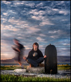
| 07/06/2006 06:01:15 PM | In a Well Balanced Worldby DjabordjaborComment: *Critique Club*
This is an amazing photo! I really like it. The only thing actually that stands out to me as odd in this photo is the large dark object to the right of the photo. It seems out of place, and while I realize you probably couldn't move it, I still wish that maybe it hadn't been there. Just the smaller rocks would have been awesome.
I love the sky and the balance between the sky and the ground. The focus on the grass is great.
Focus and clarity throughout the image is perfect. I think you did a wonderful job technically with everything.
The editing is great. The detail in both the sky and the ground is amazing.
You did a great job of getting the horizon line nicely levelled and I like how the horizon line is down low within the photo. I like how you have put so much sky in ths shot, I think that it helps enhance the peacefulness of the photo.
My first impression of this photo was that the kid was still able to maintain sanity even in a hectic world. My nitpic would be that I would have Siggi not smiling. Maybe have a more relaxed look on their face. otherwise, I think this shot fits the challenge well and is technically well done, and has that visual appeal that viewers love.
Overall great job, not much more to say! Congrats.
~Heather~ | | Photographer found comment helpful. |
Home -
Challenges -
Community -
League -
Photos -
Cameras -
Lenses -
Learn -
Help -
Terms of Use -
Privacy -
Top ^
DPChallenge, and website content and design, Copyright © 2001-2025 Challenging Technologies, LLC.
All digital photo copyrights belong to the photographers and may not be used without permission.
Current Server Time: 04/01/2025 09:58:11 PM EDT.
|