| Image |
Comment |
| 04/26/2005 07:55:08 PM |
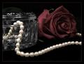
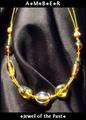
Simple Eleganceby ShannonComment: Wow! Doesn't need text. Great Comp. Necklace Needs to be a touch crisper to be fully effective as an ad. Outstanding job and the borders a nice touch |
 Photographer found comment helpful. Photographer found comment helpful. |
| 04/26/2005 07:52:30 PM |
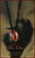
The Oneby jperez1690Comment: I love it but the supply would be limited, no? Great comp and lighting and shadows! Very creatve! I like how you placed the text to contrast. You'd do well in advertising. |
| Photographer found comment helpful. |
| 04/26/2005 07:48:17 PM |
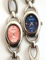
One Gucci is never enoughby SteveinnzComment: Great photo and ad! Masterful shots like this are so well composed that they don't need text. This tells me exactly what you're selling and it's an image builder as well. To nit pick, the reflection is a bit distracting as I can see you. But one of the most professional in the comp. Outstanding! |
| Photographer found comment helpful. |
| 04/26/2005 07:43:51 PM |
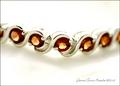
Garnet Tennis Braceletby shutterflyComment: I almost passed this as I didn't see any text, which leads to my only revise I would suggest (enlarge the text!). This is a great shot and well composed. The marketing in me loves that there's a price listed! This Dof works if the photo were crisper or had more contrast. However, I prefer a deeper one. (DOF) |
| Photographer found comment helpful. |
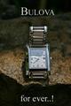
| 04/26/2005 06:57:58 PM |
Bulova for ever..!by joaquinComment: Wow! very nice. Attention to detail as I believe that you've found the "official Bulova Font" Nice comp and clarity. One small revision i'd suggest is the text on the bottom needs to be larger, capitalized and one word! |
| Photographer found comment helpful. |
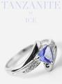
| 04/26/2005 06:55:20 PM |
Iceby bruskiComment: Nice layout and comp. It needs a different DOF that accentuates the whole ring. Font needs to be in contrast with background to stand out more. Minor revisions that would bring a smile to most ad people. Nice job. |
| Photographer found comment helpful. |
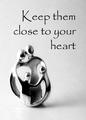
| 04/26/2005 06:52:35 PM |
Keep them close to your heartby dsa157Comment: This is a nicely presented ad. Nice comp and font. However I don't get that this an ad for jewelry, maybe family values or religion. |
| Photographer found comment helpful. |
| 04/26/2005 06:50:40 PM |
Highlighting Beautyby Travis99Comment: The desat makes the Piece stand out nicely, but I'd like the jewelry to a stronger feature of the ad (I.E. larger, more detailed. |
| Photographer found comment helpful. |
| 04/26/2005 06:49:02 PM |
Amberby DustDevilComment: The comp is great and you chose excellent fonts to make the ad. A different backdrop with less reflection would make this a viable professional ad. |
| Photographer found comment helpful. |
| 04/26/2005 06:46:54 PM |
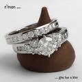
a diamond is forever by hopperComment: I really like the idea here, its very original and crisp.(Incredible photo!) Presentation of the rings is from a great angle. But, the text needs different palcement and a different font. Maybe a larger size too. But this is one of the best in the comp! (my Opinion with the usual disclaimers) |
| Photographer found comment helpful. |
Home -
Challenges -
Community -
League -
Photos -
Cameras -
Lenses -
Learn -
Help -
Terms of Use -
Privacy -
Top ^
DPChallenge, and website content and design, Copyright © 2001-2025 Challenging Technologies, LLC.
All digital photo copyrights belong to the photographers and may not be used without permission.
Current Server Time: 04/19/2025 08:41:46 AM EDT.