|
|
| Image |
Comment |
| 05/12/2005 09:14:56 PM | A Brother's Loveby SnapperLComment: Greeting from the Critique Club. Thank your for entering your photo to the DPChallenge, Moods.
A good portrait shot of two siblings. They appear happy, healthy and show a great relationship bond between the two. It looks like brother is really showing his affection for his sister. The physical similarities are striking. They both have the same eyes. It looks like a great candid moment, not staged prior, which gives it more appeal.
I am guessing that this was shot outdoors. The natural light hitting the subjects make some parts of the frame a bit light. The afternoon shadows on the faces also hide some detail highlights. Fortunatley, the shadows and highlights were spread over the subjects well. The background is very wash out. It almost has no point of reference as to where they are.
Technically giving this image a black and white conversion, makes it a classic family type photo. The tight crop on the boys head, works well. Also the slight lean of the girl on the boy is very sweet.
I am sure that this photo will be very popular with our voters.
Good luck in your next DPChallenge. |  Photographer found comment helpful. Photographer found comment helpful. |
| 05/12/2005 02:35:55 AM | An Incandescent Worldby madhatterComment: Greeting from the Critique Club. Thank you for entering the Moods, DPChallenge.
Great capture of the beautiful sunset. There are many shades of brown and yellow. The lines on the beach are very striking. The big rock looks like some type of "monolith" or structure. The shadows or reflections from the big rock is very appealing. I guess the actual sun is behind the big rock. This is probably a great position to take this shot. Sometimes sunsets are difficult to frame and compose. The sun shining in the center of the frame actually blocks your view.
Again great shot of the sunset and your buddy's shadow in the foreground.
Technically this is a well done shot. You can't really go wrong on sunsets. Much of the shot is getting the sun and the other elements in the frame. The factor here is trying to figure out the "mood" of the shot. I am not sure how you are relating this image to a mood. It does communicate a sense of calm, and serene. But with your buddy in the center I wonder what the message is. He looks more like he is trying to get out of the shot.
By the way great title "Incandescent World". "Let there be light". This photo would have been a great image for shadows, and or silhouettes.
Great colors and composition. You will probably get a mix reaction on this entry.
Good luck in your next DPChallenge. | | Photographer found comment helpful. |
| 05/10/2005 07:21:37 PM | Tiny spiderby rameviComment: Greetings from the Critique Club. Thank you for entering the DPChallenge, Minimalism.
A green spider in the flower, is a good capture. The tiny spider is almost hiding from view. You can see some of its features, slowly crawling into its own world. Probably looking for food or shelter.
Good details on the spider. Its a bit hidden though, some of its body is out of view. It would have been better to see the front body parts, especially more of its eyes.
Technically the focal point is the green spider. However, the flower that surrounds him is out of focus. A better depth of field shot would have been less distracting to the viewers. I am not sure what type of lens you used, but sometimes on "macro" and closeups, the camera acts funny. It does not know what to do. It looks like this shot is very close, probably less than 8 inches.
Another factor to consider is your aperture settings. I see that its on F/5. A photo attempt like this one would be better with small aperture. The smallest as possible on your lens. Most of todays lens go down to 1.8 and average about 3.5- 4.0. At F/5.0 your depth of field will not be good.
The smaller the aperture the (larger f/number), the wider the depth of field (range of acceptable focus). The larger aperture (smaller f/number the narrower the depth of field.
Overall a great capture of Mr. Spider. It certainly met the criteria for a minimalism shot. It would have been better image if you had gotten the eyes in the frame. I can see one eye open, and the other would have made this photo more appealing.
| | Photographer found comment helpful. |
| 05/10/2005 12:31:28 PM | Disturbed by PedroComment: Disturbed by Pedro, (Peter Marlin), was an excellent entry challenge.
Pedro is very imaginative and skilled at finding ways to enter the DPChallenges. And through his own admission, he states that he thought that this photo would not win him a ribbon.
Like all unique artists, you make art for your own challenges and hope others will agree with your work. If this disturbs anyone, how about the nudes that appear every once in a while in our forums and challenges.
Look the other way if digital art "disturbs" you. | | Photographer found comment helpful. |
| 05/08/2005 10:35:53 PM | | | Photographer found comment helpful. |
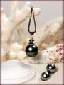
| 05/08/2005 01:44:39 PM | Fijian Black Pearlsby dkubinComment: Greetings from the Critique Club.
Thank you for entering your photo to the DPChallenge, Jewelry Advertisement.
Very nice capture of the black pearls displayed on sand and seashells.
Great compositional idea's. I am sure that many voters will find this presentation appealing.
Technically a hard shot to pull off. Their is a lot white balance issues to work with. This creates a struggle for contrasting one element to the other. There is also the flash area's that get hit in the foreground. I am assuming that you used a flash, because the pearls have a flash bounce on them.
The use of a more diffuse light and some fill in reflectors might have created a more even exposure and contrast.
Again a difficult shot if you only use normal ambiant lighting. Some of the background area's also lose detail. The ISO 800 settings sometimes gives off a grainy look. But you did a good job here, and those noise and grainy results are not visiable.
Overall a great image. The focal point and background elements make this photo very appealing. The use of some USM, in certain area's of the photo would have made it pop. The use of the white elements against the dark pearls was a great idea. It is also making a statement about where they originate in sea. The title and your framing left no question as to what you are selling. Great job.
Good luck in your next DPChallenge. Sincerely, Zagman.
| | Photographer found comment helpful. |
| 05/07/2005 12:38:01 PM | | | Photographer found comment helpful. |
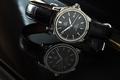
| 05/07/2005 12:17:23 AM | Omega DeVille Automatic Chronometerby fplouffeComment: Thank you for entering the DPChallenge, Jewelry Advertisment.
Wow, what a pleasure to critique this photo. Very well done. I have done many critiques so far and this one is a breath of fresh air. As soon as I saw it, I can tell that a lot of work went into this submission.
Yes one of the hardest photos to do is the jewelry display photography. The glare, lights, often take away valuable details from the jewelry that is being marketed and sold in the print media.
First of all looking at your notes I can see that you thought this well through. You knew your objective, even if it was intimating. You did not have all of the "pro light gear" but you forge through. Your determination paid off.
Technically its a beautiful image of a Omega wristwatch. Photographing a black and silver watch with a black face is a challenge. The reflection came out very well. The back light is well placed. The focus is spot on. I can see that this was an arduous attempt. Looks like f/11 at three seconds was the key setting. Also if you were not so honest about your shot, most people would not even notice the gray area's.
Some tips anyway. Most clocks when advertised show or read the time; 10:10, or 8:30. This shows area's of the watch better. This is especially true when you have a second hand, and a date calendar feature. Although your time displayed comes close. The other factor is the unfortunate angle of the image. Its almost leaning to the right too hard. It feels slightly precarious on the edge of the piano. It also forces the viewer to lean and refocus to enjoy the photo. Another suggestion that many members did, was to use type to promote their photo. Sometimes this helps or hinders the image, depending on the typeface that you use.
The yellow streak on the right hand side and some of the back white light is distracting but not enough to detract from a super job.
Great success, and good luck in your next DPChallenge. | | Photographer found comment helpful. |
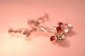
| 05/06/2005 11:45:40 PM | L'amour Éternelby fotodudeComment: Thank you for entering the DPChallenge, Jewelry Advertisement.
Great idea and composition. The color and mood this image presents is worth looing at. Sounds like you did a lot of preparation for this challenge, and thought out the details. You have some good material to work with.
The jewelry is primarily out of focus. It is right in the middle of the frame and it distracts from the beauty of the jewelry. You needed to experiment with some better "Depth of field" options. You seemed to have the equipment, lens, camera, etc.
The entire jewelry piece is hard to see. It is blurry from back to front. Very unfortunate, since it has lots of potential for displaying well. You picked some great color combinations. Your light source also went well. Somehow between the execution and the final image, it came out blurry.
Technically looking at your camera settings. You say you shot this manually. You have a very fast shutter speed 1/400 of second. That's pretty fast for still life. Try experimenting with a much slower time and using a tripod. Also use the Nikon's auto timer, with the tripod. This should eliminate much of the blurness.
In jewelry advertisement, its very important to exact details. Its the details that sell product. People want to see all of the jewelry, as they imagine themselves wearing it.
Good effort, work on the DOF, and try different camera settings.
Good luck in your next DPChallenge.
| | Photographer found comment helpful. |
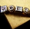
| 05/06/2005 02:30:33 AM | From the Gold Boxby loveComment: Thank you for entering the DPChallenge, Jewelry Advertisement.
A good capture of jewelry on a corner of a gold box. The jewelry looks like an older design, possibly from more than a few years ago. It's a good idea, trying to photograph your subject on the edge of the gold box. Your composition balances with the two elements on the frame.
There are some distracting factors however. One is the harsh light from the rear right side. The harshness of the light takes away valuable details of the jewelry. It also makes some the pieces lackluster, or dull. The area around the box on the top side is also wash out. Again the light which is providing a nice golden glow is also affecting the top half of your frame. The bottom portion of the box shows the actual texture of the box material.
It is still unclear what type of jewelry article it is. "From the gold box" could mean, rings, ear rings, bracelet. Sorry I can't tell.
Technically another approach could have been to try and shoot this on a manual mode if possible. Sometimes the auto settings are tricked by room light and temperatures. Flourecent lighting is very difficult to use as a light source as well.
But what you have here is a combination of strong lighting and very dark image contrasts. This gives the image a very uneven appeal. You created a very good layout with the jewelry and the gold box. Next you have to try different shots to generate more details from the available light.
Photographing jewelry is very hard to do. Its either too light or too dark. Its all about the lighting. Professional photographers use light meters, dome boxes, strong lighting equipment. And even those are not always perfect.
Good effort, good layout. Work on lighting resources.
Good luck on your next DPChallenge. | | Photographer found comment helpful. |
Home -
Challenges -
Community -
League -
Photos -
Cameras -
Lenses -
Learn -
Help -
Terms of Use -
Privacy -
Top ^
DPChallenge, and website content and design, Copyright © 2001-2025 Challenging Technologies, LLC.
All digital photo copyrights belong to the photographers and may not be used without permission.
Current Server Time: 04/15/2025 07:25:28 PM EDT.
|