| Image |
Comment |
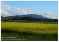
| 05/08/2003 05:07:29 AM |
Geneva countrysideby jjbeguinComment: Now this is a postcard. I haven't seen too many that are that convincing, but this is one of the best. Great colors, scenery, framing, balance to this shot. Nice work -9 |
 Photographer found comment helpful. Photographer found comment helpful. |
| 05/08/2003 05:06:07 AM |
Welcome to Portlandby justineComment: Not a bad photo. I think the colors of this one are a little weird, which may be the case for real. The trees seem a little to yellow and I think the overall photo is just a little bright. I wish it were just a fuzz sharper too. |
| Photographer found comment helpful. |
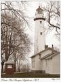
| 05/08/2003 05:01:18 AM |
Pointe Aux Barques Lighthouse, 1949by WesComment: Good old looking photograph. It really does have that '50s feel to it with the black and white/sepia look to it. It doesn't really seem like one o the other definitely. Nice balance to this photo with the framing but I think I'd like to see all of the building under the lighthouse. Good pic despite. |
| Photographer found comment helpful. |
| 05/08/2003 04:59:18 AM |
|
| Photographer found comment helpful. |
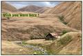
| 05/08/2003 04:57:37 AM |
1910 Hand Colored Postcardby autoolComment: The differing textures of the hills is really cool. This looks like a nice remote getaway. I think the cloudy sky is pretty fitting too with this rough looking terrain. |
| Photographer found comment helpful. |
| 05/08/2003 04:54:30 AM |
|
| Photographer found comment helpful. |
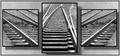
| 05/07/2003 11:30:31 PM |
On Trackby CLarson557Comment: Greetings from the Critique Club
By Inspzil
Composition - I like the single source with divergent lines coming off the common line. I like the background with the shadows of the pictures showing as well. I think it fits with the photos very well. The only thing that I'd like to see different about this picture is the middle frame being asymmetrical. I think if it were symmetrical with lines leading to the other 2 frames it would be a little more balanced. But really as is it works really well.
Technical - these are 2 very well taken photos that have a nice common theme. The greater DOF works well since the pieces of track are not trying to show an infinitely long path. The tops of all the frames are sort of blurred, but relatively clear compared to a shot with very shallow DOF.
Overall - Nice shots and a really well designed triptych. I really like the choice of background and the shadows behind the images. This is well conceived and well done. I think you've really done as well as this subject will allow, as its not the most compelling subject on earth. You did a really great job. Good work and good luck - Inspzil |
| Photographer found comment helpful. |
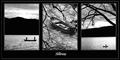
| 05/07/2003 03:19:59 PM |
Stillnessby NatashaComment: Greetings from the Critique Club
By Inspzil
I think this will generally focus on my comment during the challenge, so it might not be real long. This is genuinely 3 very good pictures. I'm just not sure I like them together. I'm not going to follow my normal format either. I'm just going to ramble until I feel I've made my point. Or until I figure out that you know better than I do and then I'll just give up :)
I felt like the middle image disrupted the continuity of the other 2 images. The other 2 images are awesome silhouettes of some landscape and 2 fishing boats. The center image is an unmanned boat thru a tree or two. The branches in that picture oppose the ones in the rightmost picture and I feel that kind of makes the pictures do the same. It might have been better placed in the first or last frame instead of the middle. I'm trying to picture it that way, but at least in my head, it still doesn't fit. I think the best example of "stillness" is the third pic. I think it's in the spot it needs to be to fulfill the title and leave the viewer with that image. The leftmost image is pretty good, but the water looks a bit choppier and there are 2 guys in the boat.
I keep having this odd sensation about the middle image, like the guys have fallen off the boat and it's washed up to shore here, under this tree. It's kind of morbid and all, but it's the picture in my head that this keeps reminding me of. Maybe if there were a man fishing in it quietly it would not make me think of that. Well for what it's worth, these are my thoughts on this photo. I hope it doesn't offend you at all and I'm not saying it sucks or anything. You beat me :)
Keep taking these wonderful pictures the rest of your time in Nippon and good luck with moving. - Bob
(It was you who said in the forums they were moving right?) |
| Photographer found comment helpful. |
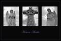
| 05/07/2003 03:01:15 PM |
Heaven Awaitsby sherComment: Greetings from the Critique Club
By Inspzil
Composition - I think this is a good image, but there are a couple things that I think would've helped you score a little better. Firstly I will say that the idea is very good and I think the picture as a whole works. The first picture has a pretty light colored background with the clouds. I would rather have seen that be a little less clouded as I think it would provide a little more contrast with the angel and been a little more consistent with the right angel. The center pic could also use a little more contrast with the background. The third one is good as is I think because his head is a little darker than the left one so he has enough contrast.
Technical - All well taken photos. The other thing that I think would've made this score better is that the pictures are so small and the black area around it is really large and heavy. The details would've shown up much better if the individual pictures were all substantially bigger with the title down at the bottom and thinner lines between the photos.
Overall - Well done as it is, but I think some slight changes could have made significant improvement to your score, not that you did poorly by any means. Bringing the figures closer to the viewers makes the photos that much more poignant and emotive. I would understand more if the photos were small to show insignificance or some other characteristic associated with that, but I don't believe these figures or the cross are meant to show insignificance by any means. Well I hope that helps some. Great pic and keep shooting. Good luck in future challenges. - Bob
|
| Photographer found comment helpful. |
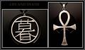
| 05/07/2003 02:49:55 PM |
Two Different Languagesby AnnidaComment: Greetings from the Critique Club
By Inspzil
Composition - I really like the 2 charms on the necklaces. It's not a photo I would have even thought to do, but it really works. The little symbol on your computer case worked well as a common background for both. They both look like they are supposed to be there. That was a great idea. Good strong composition for both images, but especially together.
Technical - I like the greyscale idea. That makes them look classically old. The only thing is I wish they were sharpened one more time before you submitted. I do fear it a little though. You may have tried it and it didn't work well for you. The reason I fear it on the first one is because there is a little too much light on your background and that can really play hell with the sharpen feature in PS as it will bring all the little tiny white dots of light on the case and bring them to the forefront, making them look like a heavy coat of white dust on the background. Other than that, I think the exposure and framing and all that look good.
Overall - This is a nice image as is. But what I would've tried to do is put a little gleam of light or something on the "life" symbol to make it a little more symbolic and to catch the viewer's eye a little more. As it is, it's a bit flat. The ankh I might darken down a little for the symbolic thing, but it looks pretty good as is. I like this picture and I'm glad it made it in your top 4. Nice job and good luck - Bob |
| Photographer found comment helpful. |
Home -
Challenges -
Community -
League -
Photos -
Cameras -
Lenses -
Learn -
Help -
Terms of Use -
Privacy -
Top ^
DPChallenge, and website content and design, Copyright © 2001-2025 Challenging Technologies, LLC.
All digital photo copyrights belong to the photographers and may not be used without permission.
Current Server Time: 04/25/2025 03:03:16 AM EDT.