| Image |
Comment |
| 05/07/2006 11:13:29 AM |
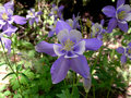
The Welcoming Committeeby RebeccaComment: since Im such a flower nut myself i thought i would return your comment on one of your flower shots. you have a great work posted here.
I love the subject you chose here. for me it has alot of interest plus its my fav color(besides pink). good focus and great color saturation. one thing i think i would do is crop off the left of the photo. the bright flower there only pulls the eye away from your main subject. Just by doing that it will make this wonderful photo fall right into the "rule of thirds" i think. I like the the flower on the right too as it gives a different view of the same flower and for me it adds even more interest to the main one. very well done here...keep up the great work
~~Cher~~ :o) |
 Photographer found comment helpful. Photographer found comment helpful. |
| 05/05/2006 05:56:30 AM |
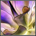
Negitive Mauveby sherpetComment: Who would of thought this would be great inverted too! another fav to add to my list!
I agree with tuckersmom on the bright white at the bottom.only real nit pick for ya on this. another awesome photo! |
| Photographer found comment helpful. |
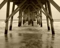
| 05/02/2006 11:33:38 AM |
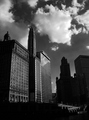
The View from Yesterdayby liebeComment: hello from the critique club, Im Cher and I will be your critiquer today :o)
I see a few things wrong with this photo and I will try to not sound like Im picking on your work but i want to be honest and help you improve.
the B&W you chose to edit this as was a very wise decision for this subject. it gives it the "old" feel and met the challenge this way. While I tend to lean twords darker editing myself I find this photo to be exceptional dark. There arent many midtones to be found in this which I feel is the primary reason that this scored the way it did. While I think your main intended subject is the buildings on the left of the photo my eyes are drawn to the bottom right where the exit/entrance ramp(i think it is) is. for me that is the point of interest you should have exploited better. the darkness of the bottom hinders this for me and leaves me wanting to see alot more detail.good job on not getting the sky over exposed, thats a hard thing to do.
If you have any questions about this critique please PM me. Good luck in future challenges and have a great day!
~~cher~~ :o) |
| Photographer found comment helpful. |
| 04/18/2006 08:15:59 AM |
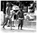
Threatenedby amberComment: this is a great photobut in my opinion it has way too much Neat Image used. I would rather have seen this with alot more skin textures. B&W tones look great and placement of subjects is good. good luck
~~Cher~~ :o) |
| Photographer found comment helpful. |
| 04/18/2006 07:20:12 AM |
flyredo.jpgby dahkotaComment: YES!!!! This is exactly the look i saw for this! Wonderful! I got a new fav!!! thanks :o)
edited to add: the 3 added birds really completes this image! nice Message edited by author 2006-04-18 07:21:48. |
| Photographer found comment helpful. |
| 04/17/2006 02:01:05 PM |
Naveby SJCarterComment: i agree with alfresco...Fabulous! love the dreamy glow u gave this but i think theres way too much Neatimage(noiseware/noiseninja) thats my only nit pick here
~~Cher~~ :o) |
| Photographer found comment helpful. |
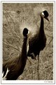
| 04/17/2006 01:57:10 PM |
Bronze Cranesby SJCarterComment: i love the bronze color you did to this one. focus is spot on too! the BG is a bit busy for my taste but it shows them in a more natural setting. very well done as always jimmy
~~Cher~~ :o) |
| Photographer found comment helpful. |
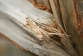
| 04/17/2006 08:55:36 AM |
Splinterby mandyturnerComment: just my opinion again.....I think the narow focus is what really hurt this one. the shallow focus actually takes away from the interest factor of this image making the viewer see only the one spot(splinter) I think this wouldve done better with a wider focus, giving the viewer's eyes room to roam and settle on several different spots in the image. This also lacks a good "pop" of color which DPC is so very fond of. Your colors are spot on( as they look natural to me) and I think the crop is good. |
| Photographer found comment helpful. |
| 04/17/2006 08:49:31 AM |
Together...by mandyturnerComment: ok...just my opinion...but I think this might have done a bit better it it wasnt so cropped. your B&W tones look great and I love the texture of the hands. thats really the only problem i see with this. It was a hard challenge to compete in and I think this shouldve scored better than what it did. This shouldve also got alot more comments for the amount of low baller votes it recieved.
~Cher~~ :o) |
| Photographer found comment helpful. |
| 04/17/2006 08:13:41 AM |
Fearlessby yankoComment: Decided to come leave ya some constructive comments from your comment thread. Its been awhile so i might be a bit rusty.....
While i love the colors, editing and focus of this i noticed a few things that need a bit of work. first is the flower: I dont like that you cut off the very top and bottom of the petals. I would rather see the whole flower or a macro of it. second, the flower petals onthe top are a bit blown out. A higher shutter speed would've helped this completly or maybe a color burn will fix this (but Im not to famiular with it myself). Third i would have cloned out the leaf sneaking in from the left of the photo and the shadow (or vase) at the bottom left.
I think you did an excellent job of placement, focus and editing. And i love the strong colors you have going here. The red BG really sets off the wonderful yellow flower!
Hope this is more what ur looking for and I really hope it helps ya.Just my opinion of this and feel free to pm me if ya have any question or wish to chat about it
~~Cher~~ :o) |
| Photographer found comment helpful. |
Home -
Challenges -
Community -
League -
Photos -
Cameras -
Lenses -
Learn -
Help -
Terms of Use -
Privacy -
Top ^
DPChallenge, and website content and design, Copyright © 2001-2025 Challenging Technologies, LLC.
All digital photo copyrights belong to the photographers and may not be used without permission.
Current Server Time: 04/17/2025 11:43:30 PM EDT.