|
|
|
Showing 3731 - 3740 of ~4217 |
| Image |
Comment |
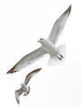
| 10/27/2005 07:08:41 AM | flight by tateComment: 8 - Whilst no expert on 'highlight control' re the Challenge, seems to me you have done very well to not 'blow' any surface. I had to 'double check' with this shot, so similar to the 'other'. Criticism; not much, if possible (depending how many shots/angles you got), perhaps a tighter crop, especially with just one bird, and being able to 'zoom in' on especially the tailfeathers and also the head, may have made this an even better (albeit different) shot in my opinion. |  Photographer found comment helpful. Photographer found comment helpful. |
| 10/27/2005 07:05:35 AM | New life²by hannekeComment: 7 - Whilst no expert on 'highlight control' re the Challenge, seems to me you have done very well to not 'blow' any surface. It is a 'weird concept', the plastic (or maybe I just don't 'get it'-unless it is a giant slingshot), but it does have create a certain impact here. Criticism; not much, obviously an 'artistic' type take, so it is pretty much your own thing, but 'technically', maybe a little different lighting, not sure. I mainly concentrated on the skin tone of the hand and the highlights v the white background there and seems 'well done'. | | Photographer found comment helpful. |
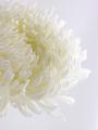
| 10/27/2005 07:00:56 AM | oneby bryantbusComment: 8 - Very nice. Whilst no expert on 'highlight control' re the Challenge, seems to me you have done an excellent job to not 'blow' any surface. Criticism; not much at all, perhaps a different crop, to not cut off the top part of the flower, not sure, as I do like this angle, especially to show the detail in the petals/color for the Challenge. Maybe a little more space on the right, again not sure. edit:typo Message edited by author 2005-11-02 00:16:41. | | Photographer found comment helpful. |
| 10/27/2005 06:55:49 AM | White Pumpkinby LKMoteComment: 8 - Very good. Whilst no expert on 'highlight control' re the Challenge, seems to me you have done very well to not 'blow' any surface, and still retained the 'outline'. Criticism; although having just said that, I would still like to be able to decipher more texture on the skin. The shadow is good, compositionally I like it (although wonder about more space 'somewhere' or even a tighter (more square) crop). The only other thing I could say would be, technically, had the background/lighting been more 'even' this would have been even more 'challenging' to photograph, and/but possibly made this 'pop' more and have more impact, in my opinion. | | Photographer found comment helpful. |
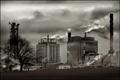
| 10/26/2005 10:41:33 PM | Global Warming ... Can you ignore it?by banditComment: 7 - Good use of the grain/effect for this shot in the Challenge. Do not like the 'forced title' (agenda/political/etc). 'Dirty scene', for which the grain works well. Criticism; besides the title (and I have chosen to disregard it), I think that the 'smoke' billowing emphasized more, somehow, would have really made this shot have more impact. Perhaps a slightly sharper (ground up) angle may have also made this better in my opinion. Perhaps a tighter crop/different angle, if possible, especially as that 'swirly tower' on the right adds interest, and pairs well with the 'shape' of the smoke, etc. | | Photographer found comment helpful. |
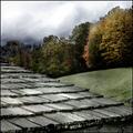
| 10/26/2005 10:26:14 PM | Applique'by KaDiComment: 8 - Good use of grain for the Challenge. Like the 'composition' and the colors and toning. Criticism; not much, want to say more 'vivid' in the greens/reds, but difficult I imagine with contrast issues, especially with the roof. The 'texture', dramatic 'effect' (especially from the 'grain') on the roof, really makes this shot of 'a roof', very nice, so well done. Perhaps a slightly different crop/angle, to cut out that bottom right 'eave', not sure. | | Photographer found comment helpful. |
| 10/26/2005 10:22:30 PM | Thoughtfulby srugoloComment: 8 - Good use of grain for the Challenge. Good 'wistful' catch. Clothing is subtle, toning is nice. Criticism; to really 'nitpick', perhaps an even more subtle/bland choice of clothing, maybe some more space 'left', may have made this better in my opinion. | | Photographer found comment helpful. |
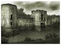
| 10/26/2005 10:19:46 PM | Newport Castleby postoakinversionComment: 8 - Great effect(s). Good use of grain for the Challenge. Criticism; not much, I like the effect the grain has achieved in this shot, and while tempted to say I'd like to see the 'surface'(?) more - I can't actually discern where it is/starts. A little 'more' (dependent) to the left of frame may have made this better in my opinion. Maybe a different frame, not sure. | | Photographer found comment helpful. |
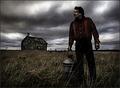
| 10/26/2005 10:16:58 PM | Desolationby Joey LawrenceComment: 8 - Good use of grain for the Challenge, adds to the 'drama' and 'story'. Criticism; not much, perhaps an even sharper angle (ground up), giving the man more 'dominance' and setting the 'house' back a little perspective wise, may have made this a better shot in my opinion. Maybe even a bit more sky, as it adds such a great 'effect'. Good shot open to a few 'story interpretations', 'desolation' being just one. | | Photographer found comment helpful. |
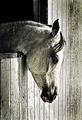
| 10/26/2005 10:07:31 PM | Horses love grainby BrennanOBComment: 8 - Good use of grain for the Challenge. Criticism; difficult given the coloring of the horse, but perhaps a different 'contrast', also perhaps a little more 'space' to the right, or at the bottom, may have made this better in my opinion. | | Photographer found comment helpful. |
|
Showing 3731 - 3740 of ~4217 |
Home -
Challenges -
Community -
League -
Photos -
Cameras -
Lenses -
Learn -
Help -
Terms of Use -
Privacy -
Top ^
DPChallenge, and website content and design, Copyright © 2001-2025 Challenging Technologies, LLC.
All digital photo copyrights belong to the photographers and may not be used without permission.
Current Server Time: 04/23/2025 02:49:12 AM EDT.
|