| Image |
Comment |
| 03/28/2006 08:44:17 PM |
Curvesby MelethiaComment: I do like this a lot; it has a nice balance to it. I think it is a great shame the highlights on the jug are as blown as they are. |
 Photographer found comment helpful. Photographer found comment helpful. |
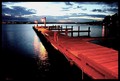
| 03/22/2006 08:22:49 PM |
The Dock at Duskby BanksonComment: Remarkable. I would never have thought to do low-key on water. Very effective, although I do find some aspects of the image too out of focus, especially by comparison to the high sharpness on the water. |
| Photographer found comment helpful. |
| 03/15/2006 09:05:54 PM |
I Love to Readby debitiptonComment: Very good execution. Wish I could achieve a background like that - it really causes your subject to jump out. Only complaint it the reflection on the cover of the book, shame about that. |
| Photographer found comment helpful. |
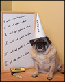
| 03/15/2006 08:39:01 PM |
Dunceby ShutterPugComment: Poor Pug. No trademark shots next week. Not much to say really. No major technical flaws; just a few compositional points. I dislike the corner line of the wall (although not sure what you could have doen about it). The colors are all similar so it lacks contrast and 'pop'. |
| Photographer found comment helpful. |
| 03/15/2006 08:25:07 PM |
Class of Artby fannsiComment: Nice composition. I think this will do well, especially as the competition isn't that great. What could make this better? I think the curve of the background is too abrupt, it would have been nice for it to be less noticable. The texture of the paper/cloth in the forebround is distracting. I'm no pro on the subject, but I guess you would have to elevate your subject to get rid of this. The hard shadows are also distracting. Again, I'm no pro, but I guess you would want to diffuse your lighting. Keep practising and you'll get it. |
| Photographer found comment helpful. |
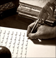
| 03/15/2006 02:18:23 AM |
Old fashioned learningby alexgarciaComment: I sure hope that text was printed out.... Nice shot. I especially love the sense of texture. Shame about the blowout in the botton left corner. |
| Photographer found comment helpful. |
| 03/12/2006 09:55:05 PM |
Not Bifocalsby fotomann_foreverComment: almost wish I was a member just to give you a ten. I feel honour bound to try make up for the biased votes that will got he other direction. Sadly it's a member challenge. and I'm going to have to let you down. Nice beard.... |
| Photographer found comment helpful. |
| 03/09/2006 01:28:28 AM |
|
| Photographer found comment helpful. |
| 03/09/2006 01:26:27 AM |
Excuse me! What are YOU looking at????by JudiComment: ???? Who me?
Not sure how this is disguise; unless that clevage is from a different part of the anatomy. What a horrible thought. nearing then end of my voting so am inclinded to give you the benefit of the doubt.
The composition of this just doesn't work for me. I think the portrait profile makes the bust look squeezed and flat (sorry). Landscape, I think, would have been more effective. Well, at least you succeed in drawing the view in strong leading lines for the men out here. |
| Photographer found comment helpful. |
| 03/09/2006 01:11:20 AM |
Flight of Fancyby notbiscuitComment: I'm assuming this is a tent or building turned upside down. just as likely I could be wrong. Nice idea. |
| Photographer found comment helpful. |
Home -
Challenges -
Community -
League -
Photos -
Cameras -
Lenses -
Learn -
Help -
Terms of Use -
Privacy -
Top ^
DPChallenge, and website content and design, Copyright © 2001-2025 Challenging Technologies, LLC.
All digital photo copyrights belong to the photographers and may not be used without permission.
Current Server Time: 04/11/2025 07:39:42 PM EDT.