|
|
|
Showing 1381 - 1390 of ~1705 |
| Image |
Comment |
| 05/18/2006 02:48:01 PM | |  Photographer found comment helpful. Photographer found comment helpful. |
| 05/18/2006 02:19:55 PM | Unstableby fencekickerComment: beautiful light and composition. unfortunately, the noise and jpeg thingies really bring this down. a 5, but would have been 7+ | | Photographer found comment helpful. |
| 05/17/2006 10:18:00 PM | Demon Prophecys Continueby krytaComment: very good indeed. lovely lighting and post processing. your best so far. keep up the good work. and i'm sure your mum understands that sacrifices must be made for your art ;-) | | Photographer found comment helpful. |
| 05/17/2006 10:16:28 PM | Dark Prophecy's Childby notesinstonesComment: i gave this a 7, too bad about the dq! a lovely piece, very well done indeed.
it's great that your son is a member here too, and that you're encouraging his work. it's looking very good so far. i hope my son will be as interested when he's a bit older (he's nearly 3). he does ask to take pics, so i think i'm going to resurrect my little point and shoot for him! | | Photographer found comment helpful. |
| 05/16/2006 06:10:22 PM | The Kindergarten Teacherby scarbrdComment: this was almost exactly the shot i was going to do. you've done it better that i would have, i think! well done! | | Photographer found comment helpful. |
| 05/16/2006 01:42:48 PM | | | Photographer found comment helpful. |
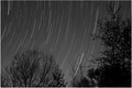
| 05/10/2006 10:00:22 PM | Skyhooksby MadMan2kComment: :::Critique clubb:::
hi, my name is christian, from the critique club. i hope the followiong will be helpful to you!
First Impression:
an interesting image, but i'm afraid the title is more arresting than the picture. (where do i know that phrase from???? this is going to drive me mad!)
Composition:
quite good, but i begin to find the tree on the left a bit distracting. i'd love to see more star tracks and less tree.
Technical:
the exposure is good, but i'd love to see more variation of tone in the sky. a deep black in the upper part would really make the start tracks pop, and help to balance the visual weight of the trees.
i'm wondering what some colour would look like. if the sky could be a rich blue black, that would be lovely, i think. it was advanced editing,a nd i'm sure it could be done somehow (i'm still a neophyte at photoshop). i think i find it just a bit too grey, it just seems a little...limp, when it should be jumping out at me.
Summary:
the start of a great image: with a bit more post processing, it could really shine.
well done, and keep shooting.
if you have questions about this critique, please pm me. | | Photographer found comment helpful. |
| 05/10/2006 07:12:53 PM | You can't judge a book by its coverby alexgarciaComment: hiya, alex, from the ctp2
First Impression:
very strong, clear and striking. with a nice subtle touch.
Composition:
excellent. the central title on the book cover draws the eye quickly, then the right thumb brings you down to the comic book.
Subject:
surprising, funny, and subtle. very good indeed. a great illustration of an old saying.
Technical:
very good. depth of field very effective, colour good, lighting good,it's all good, really. maybe a tiny bit of dodging on the comic book. not a lot, just to bring the punchiness up a bit.
Summary:
a very good image. i gave it a 7 in voting, which is pretty high for me.
well done, and keep shooting!
cheers,
c. | | Photographer found comment helpful. |
| 05/09/2006 10:15:49 PM | Snohomish Invitational GU-13 Finalsby margiemuComment: hiya margie, from the ctpii
First Impression:
a classic newspaper shot, with good movement.
Composition:
the central element (the three girls) is very good, they are dynamic, and have great interaction. but the background elements are very distracting, especially the people in the top left. we start to wonder what they're doing, and this completey draws out attention away from the action. the cropping is good, and the girls are in the perfect spots. well done to get the shot.
Technical:
i think it would pop more with a bit more contrast and saturation. not a whole lot, it still needs to be a naturalistic, but enough to give rich reds and blacks - they're a tiny bit faded.
there's a tutorial about blurring the background that would come in very handy here. if the fence and people were blurred, that would bring the focus back to the players, which is where it should be. a little bit of dodgging on the background might help too. again, not a lot, just enough to draw the eye in to the players.
i think you could also do a bit more sharpening, just a few strokes of usm, to try to crispit up a bit.
Summary:
a very good shot, with the potential to be much more. nicely done. Message edited by author 2006-05-10 21:35:31. | | Photographer found comment helpful. |
| 05/09/2006 05:04:43 PM | Desperate Phone Callby talikfComment: very good shot. could easliy be a poster, and the title works very well. too bad aobut the dq. next time, eh? | | Photographer found comment helpful. |
|
Showing 1381 - 1390 of ~1705 |
Home -
Challenges -
Community -
League -
Photos -
Cameras -
Lenses -
Learn -
Help -
Terms of Use -
Privacy -
Top ^
DPChallenge, and website content and design, Copyright © 2001-2025 Challenging Technologies, LLC.
All digital photo copyrights belong to the photographers and may not be used without permission.
Current Server Time: 04/18/2025 07:13:59 AM EDT.
|