| Image |
Comment |
| 04/07/2003 03:32:46 AM |
|
 Photographer found comment helpful. Photographer found comment helpful. |
| 04/07/2003 03:30:52 AM |
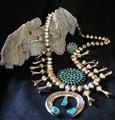
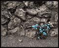
Lonelyby mbardeenComment: The contrast makes the color that much more significant. |
| Photographer found comment helpful. |
| 04/07/2003 03:29:32 AM |
|
| Photographer found comment helpful. |
| 04/07/2003 03:25:18 AM |
|
| Photographer found comment helpful. |
| 04/07/2003 03:14:54 AM |
Vivid Color!by magnetic9999Comment: Not bad, meets the challenge, I just think there is too much light on the right side of her face. |
| Photographer found comment helpful. |
| 04/06/2003 05:42:02 PM |
Racing Against Timeby jenaromComment: First, for anyone who didn't find this appropriate for "Time", I can't agree. This photo is perfect for "Time", in a much better way than any photos of a clock, watch, etc.. This is an excellent example of panning in photography, which is not always so easy. Very nice colors, focus (though focus not perfect), and lighting (seemed near perfect, but, were you using a polarizing filter on your lense? Seems like some glare could be eliminated). This is only my opinion, and I'm not an expert photographer, but, I didn't like the crop. I don't feel it added anything to the picture, it only subtracted the rear of this car, which, in my opinion, makes the car look slower, not faster. It still leaves an impression of "racing against time", and I think this is an excellent shot! I think you got a lower score (5.1684?!) than you deserved. I noticed alot of voters gave this 3's and 4's, I'm surprised. Oh, I forgot to say that this is your critique club critique. Message edited by author 2003-04-06 17:48:30. |
| Photographer found comment helpful. |
| 04/05/2003 01:33:25 AM |
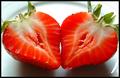
Heartsby pitsamanComment: Exquisite! It looks good enough to eat! Nice job on the focus, lighting and color (there is a little bit too much shadow in the lower right I think.) |
| Photographer found comment helpful. |
| 04/05/2003 01:30:36 AM |
Succulent Symmetryby ArtifactsComment: I almost submitted this exact same photo! Good job. Can I ask why you chose to position it sideways? |
| Photographer found comment helpful. |
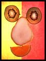
| 04/05/2003 01:25:22 AM |
Fruit Faceby jaygComment: He has that empty look in his eyes... Very nice colors! |
| Photographer found comment helpful. |
| 04/05/2003 01:21:50 AM |
Bona-fide Symmetryby IzadoraComment: What happened with the lighting (esp. at the bottom)? Why only black and white? Perfect example of symmetry! |
| Photographer found comment helpful. |
Home -
Challenges -
Community -
League -
Photos -
Cameras -
Lenses -
Learn -
Help -
Terms of Use -
Privacy -
Top ^
DPChallenge, and website content and design, Copyright © 2001-2025 Challenging Technologies, LLC.
All digital photo copyrights belong to the photographers and may not be used without permission.
Current Server Time: 04/21/2025 10:37:13 PM EDT.