| Image |
Comment |
| 11/01/2006 09:39:35 AM |
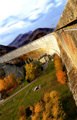
The Fallby pepitoidComment: I like the composition a lot but not the angle of the shot. I feel like I'm falling to the left to try to see the photo. It has dramatic effect, but it takes away from the image. |
 Photographer found comment helpful. Photographer found comment helpful. |
| 11/01/2006 09:36:37 AM |
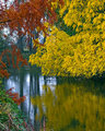
Ponderby alanbataarComment: As a viewer, I would have preferred to see the opposite of this where the beautiful folliage was in focus and the foreground was out of focus as a silohuette. |
| Photographer found comment helpful. |
| 11/01/2006 09:35:31 AM |
Peace Valley Parkby MRubilloComment: I like the unique crop, not sure if others will. This is definitely a landscape in portrait per the challenge, but the subject matter doesn't really have enough color contrast to draw my eye to anything in particular. I think it may have been just a little too late in the season so this composition missed some possible good colors in the trees. Of course that too would have been out of the submission timeline. I just think the composition needs a little work. Score: 5. |
| Photographer found comment helpful. |
| 11/01/2006 09:33:29 AM |
Colors of Fallby bcobleComment: This one would do very well in the reflective challenge that was just released too. This is a very nice shot. Well done. I love the yellow folliage. I'm not crazy about the Depth of field on the redish leaves as the come off blurry (as they would if focus is on the yellow) but they are such a rich color that my eye is taken to them as another strong subject but finds them out of focus which is slightly disappointing. Overall score: 8 |
| Photographer found comment helpful. |
| 10/30/2006 12:17:04 PM |
|
| Photographer found comment helpful. |
| 10/30/2006 10:49:44 AM |
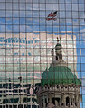
Flying Proudby ElaineComment: Very nice, one of my top 3 in the challenge. I bit abstract and just overall, a great creative entry with nice colors.
Very happy to give this one a 10. |
| Photographer found comment helpful. |
| 10/30/2006 10:45:26 AM |
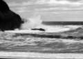
Crashing Wavesby KarenNfldComment: I think if there were more whitecaps out on the distance of the ocean, wind would be conveyed better rather than the basic tides of the ocean. It is a nice composition and it makes a nice b/w image.
Score: 5. |
| Photographer found comment helpful. |
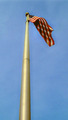
| 10/30/2006 10:43:45 AM |
Old Glory Flys At North Wind Tailby dv_rockComment: The striped ropes come off as being oversharpened though it probably has to do with thin lines in the photo. There are so many ropes though that it is a little distracting as they seem to consume a lot of the composition.My eye is drawn to all the ropes on the right rather than Old Glory on the left.
Score: 5. |
| Photographer found comment helpful. |
| 10/30/2006 10:42:22 AM |
Seconds before flying off Mt. Fujiby NerdJNerdBirdComment: Okay, this one is funny. I don't normally like the super-processed images that take what I consider reality out of the equation, but the color choices and creative title help this one. Normally would get a 5 on my scale, but this one goes for a 7. |
| Photographer found comment helpful. |
| 10/30/2006 10:40:50 AM |
the world breathesby elmomarieComment: The composition is good and the choice to have the flag display wind is nice. The pole and flag both come off as a bit fuzzy.
Score: 5. |
| Photographer found comment helpful. |
Home -
Challenges -
Community -
League -
Photos -
Cameras -
Lenses -
Learn -
Help -
Terms of Use -
Privacy -
Top ^
DPChallenge, and website content and design, Copyright © 2001-2025 Challenging Technologies, LLC.
All digital photo copyrights belong to the photographers and may not be used without permission.
Current Server Time: 04/18/2025 06:15:48 PM EDT.