| Image |
Comment |
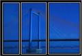
| 11/15/2005 07:44:56 PM |
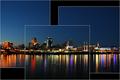
Cable Stay in Blueby lkn4truthComment: I think the glaring black and white borders detract from the shot quite a bit. A thinner and perhaps darker (gray rather than white) border would probably help to emphasize the shot. |
 Photographer found comment helpful. Photographer found comment helpful. |
| 11/15/2005 07:42:27 PM |
|
| Photographer found comment helpful. |
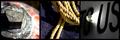
| 11/15/2005 07:36:02 PM |
The Industryby singeComment: I really like the first two images - great color and contrast. The third image feels a bit off. The bright white pulls my eyes off the other images and gives the whole kind of an unbalanced feeling. I'm not really sure I know what industry this is referring to, either. |
| Photographer found comment helpful. |
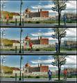
| 11/15/2005 07:24:04 PM |
Life Passingby muur88Comment: I really like the progression of these photos. So simple but there's something really cool about it. The photos are a tad bit busy but not bad. Good job. |
| Photographer found comment helpful. |
| 11/15/2005 07:20:40 PM |
Pineconesby ElaineComment: I like the layout you've chosen but I think I'd prefer the top righthand photo to be more different from the larger photo than it is. Those two photos also seem to be a bit out of focus. |
| Photographer found comment helpful. |
| 11/15/2005 07:18:57 PM |
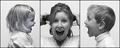
Devotionby sajinComment: Nice progression. I love that photo in the middle with her huge tongue and her cub just looks so conquered. Very cute. |
| Photographer found comment helpful. |
| 11/15/2005 07:16:22 PM |
Caught in the Middleby DrAchooComment: Haha, very cute. Graphically, I think I'd prefer a bit more space between the photos, but I realize you're confined to a relatively small space for challenges. |
| Photographer found comment helpful. |
| 11/15/2005 07:15:03 PM |
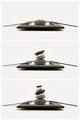
Zenby nico_blueComment: Love the simplicity. The progression serves the triptych format well. |
| Photographer found comment helpful. |
| 11/15/2005 07:12:39 PM |
|
| Photographer found comment helpful. |
| 11/15/2005 07:07:35 PM |
Peek a Booby M.O.C.Comment: A nice macro by the division looks more like lines drawn through the photo than an actual splitting. The subject itself doesn't seem to lend itself all that well to the triptych format - it makes the legs seem to be cut off of the body. |
| Photographer found comment helpful. |
Home -
Challenges -
Community -
League -
Photos -
Cameras -
Lenses -
Learn -
Help -
Terms of Use -
Privacy -
Top ^
DPChallenge, and website content and design, Copyright © 2001-2025 Challenging Technologies, LLC.
All digital photo copyrights belong to the photographers and may not be used without permission.
Current Server Time: 04/19/2025 05:08:30 AM EDT.