| Image |
Comment |
| 08/06/2002 03:02:00 PM |
|
 Photographer found comment helpful. Photographer found comment helpful. |
| 08/13/2002 03:58:00 PM |
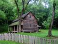
The Tipton Place by indigo997Comment: Yea, Cades Cove!!! I thought that's where it was, but I was afraid of sounding like an idiot. I wanted to get out there, too, but just couldn't get the time!! |
| Photographer found comment helpful. |
| 08/06/2002 05:37:00 PM |
The Tipton Placeby indigo997Comment: I like your colors and the detail of the wood. I think it would seem more balanced if the house were in the right side of the frame instead of the left. |
| Photographer found comment helpful. |
| 08/06/2002 03:00:00 PM |
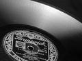
78 rpmby floydComment: I really like the way this is framed. I almost think it needs to be just a hair to the left though, to feel more balanced to me. I really like the bw. karmat |
| Photographer found comment helpful. |
| 08/02/2002 10:51:00 PM |
Got Money?by MeggieComment: It seems a touch overexposed to me and that causes two other problems, think. One, the money is a little bright. Two, the cup is almost out of focus, it seems because of the glare in some spots. i like the idea -- want to loan me a couple of those? :-) karma |
| Photographer found comment helpful. |
| 08/02/2002 10:48:00 PM |
ENRON HQ - address pending...by clickerComment: I love the humor behind this, the colors, focus, etc. Maybe you should have had someone at a desk or something as a silhouette. karmat |
| Photographer found comment helpful. |
| 08/02/2002 05:02:00 PM |
Wall Street Stressby psychephylaxComment: I think the vodka bottle needs to be a little more to the right, just for balance. other wise good shot, and neat idea. karmat |
| Photographer found comment helpful. |
| 08/02/2002 04:38:00 PM |
Down the drainby SwashbucklerComment: A tighter crop to fix the lower left and maybe some white balancing (it has an orange cast to me) would have helped this picture I think. karmat |
| Photographer found comment helpful. |
| 07/29/2002 02:12:00 PM |
No Time & Fast Changing Technologyby spillerComment: I like the colors in this, and the idea is good. I think, however, you almost have two separate pictures going on. I would have preferred it without the watch. karmat |
| Photographer found comment helpful. |
| 08/02/2002 04:22:00 PM |
DrOWned Corporationby sulamkComment: I really like the colors and composition of this shot. Without the title, it would have taken me sometime to figure it out, I guess. At first had it scored rather low, upon second glance, I will bump it up. It really is a nice picture. karmat |
| Photographer found comment helpful. |
Home -
Challenges -
Community -
League -
Photos -
Cameras -
Lenses -
Learn -
Help -
Terms of Use -
Privacy -
Top ^
DPChallenge, and website content and design, Copyright © 2001-2025 Challenging Technologies, LLC.
All digital photo copyrights belong to the photographers and may not be used without permission.
Current Server Time: 04/11/2025 04:28:30 AM EDT.