| Image |
Comment |
| 06/25/2006 04:45:03 PM |
|
 Photographer found comment helpful. Photographer found comment helpful. |
| 06/25/2006 07:10:32 AM |
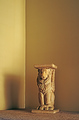
Persian Pedistal at Duskby chaliceComment by DanSig: [[trading post]]
I guess the score says it all..
the lack of the empty room feeling makes this image bad for the challenge, to use a wider lens and skow more of the room would have been much better.
the framing of the room is good, the statue should have been a bit further to the right, just to give the image a rule of third composition.
lighting is a bit harsh, the dark shadow is not helping the image, if using tabletop lamps for lighting try to stretch a white cloth, bedsheet or something and shine the light away from the subject onto the white cloth, that way you will get a much softer light, and it will be much whiter to. |
| Photographer found comment helpful. |
| 06/25/2006 06:47:31 AM |
A Glass of Wine with a Bottle to Goby chaliceComment by DanSig: [[trading post]]
first, the image is too dark, it looks like the bottle and glass is floating in the darkness.
the bottle needs some spotlight to show the edges of the bottle.
the image looks oversharpened, what I think is bubbles in the glass looks like floating dirt.
and I think the image is overprocessed, a big part of the glass is completely white, even if both the glass and wine is transparent.
and I think the composition is a bit off.. the bottleneck is lower than the base of the bottle, that makes the weight in the image very odd, like there is no gravity.
but it's still a good try, play more with the wine and glass and eventually you'll get a good picture. |
| Photographer found comment helpful. |
| 06/25/2006 06:38:33 AM |
Architectural Colorsby chaliceComment by DanSig: [[trading post]]
there are a few flaws that makes this a bad architecture picture,
composition is bad, the image splits to close to the center, the building in the background covers more than 50% of the frame and is therefore the main subject, even though I think the building on the right should be the main subject.
you show to small part of the building for it to be recognised, it's ok to show a small part, but that part must have something really special for it to work, and something unique so you can recognise the building from that small part.
lighting is good, no harsh shadows on the red building.
there are a lot of lines, vertical, horizontal and diagonal, wich makes this image so much better than if the walls were smooth.
I think your score is fair for an image like this. |
| 06/25/2006 03:18:27 AM |
|
| Photographer found comment helpful. |
| 06/25/2006 01:04:37 AM |
|
| Photographer found comment helpful. |
| 06/24/2006 09:33:13 AM |
|
| Photographer found comment helpful. |
| 06/23/2006 08:08:27 PM |
|
| Photographer found comment helpful. |
| 06/23/2006 02:23:43 PM |
|
| Photographer found comment helpful. |
| 06/23/2006 08:22:37 AM |
|
| Photographer found comment helpful. |
Home -
Challenges -
Community -
League -
Photos -
Cameras -
Lenses -
Learn -
Help -
Terms of Use -
Privacy -
Top ^
DPChallenge, and website content and design, Copyright © 2001-2025 Challenging Technologies, LLC.
All digital photo copyrights belong to the photographers and may not be used without permission.
Current Server Time: 04/23/2025 06:34:29 AM EDT.