| Image |
Comment |
| 05/18/2006 07:23:59 AM |
Night Light for the Wearyby chaliceComment by DanSig: [[trading post]]
I like the lighing, and the subject is good, but that concrete bin is not helping the image, if you'd crop that away then the bench would be close to the frame and coposition would be much better. |
 Photographer found comment helpful. Photographer found comment helpful. |
| 05/18/2006 07:21:53 AM |
Dad's Patricide Comedyby chaliceComment by DanSig: [[trading post]]
this image could be better, the whitebalance is off, the image is too warm. to make an image like this work the knife must have it's real color, it has to be silver and shiny :)
and I don't like the reflection in the glasses, it's really distracting.
|
| Photographer found comment helpful. |
| 05/18/2006 07:18:33 AM |
Silk Flower Rhythmby chaliceComment by DanSig: [[trading post]]
the flowers make a mice subject, but all that wood all over the image is way to distracting.
a closer crop at the top arch to make the image square would help alot.
lighting is good and it's a well thought of an executed, too bad about the bad crop. |
| Photographer found comment helpful. |
| 05/18/2006 07:14:54 AM |
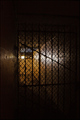
Secret WWII-Era Prison Discoveredby chaliceComment by DanSig: [[trading post]]
there´s nothing much I can say about this image, the score tells the story..
there is nothing in this image exept for a fence, and that is not interesting.
I like the lighting though to bad you can see the light source. |
| Photographer found comment helpful. |
| 05/17/2006 08:24:07 PM |
Night Light for the Wearyby chaliceComment by chalice: Thanks for the kind comments. The dark line on the stone wall is the shadow of the lamp post (note that the post is lit on the front side and casts its own shadow to the background). As I understand the rules for this shot, dodge and burn is not allowed, so I couldn't figure out a way to get rid of the shadow without lightening the whole photo too much. |
| 05/17/2006 07:45:18 PM |
Night Light for the Wearyby chaliceComment by Melethia: Trading Post comment
First - congrats on a new personal best score!! This is a good night shot that tells a story. I like the inclusion of the dark space in front balanced by the tree leaves along the top. The only distraction is the shadow or dark section running up the wall from the bench - not sure if it IS a shadow or where the wall has been stained. Still, the overall impact of this shot is very good. Well seen, well executed. |
| Photographer found comment helpful. |
| 05/17/2006 05:10:22 PM |
Night Light for the Wearyby chaliceComment by Kelli: Trading post...
Congrats on your highest score! This is a great image. I didn't look at the entries on this challenge, so I can't gage in relation to others but to me it conveys a story, is shot at night and is different than the norm. So, it probably should have scored higher. That said... it's not a happy, feel good picture either. And it's a subject most would prefer to ignore. So to get that high with this type of image says it's very well done. If you were to edit this for a print, my only suggestion would be to lighten up that shadow that seems to be hitting him down the middle. |
| Photographer found comment helpful. |
| 05/17/2006 02:41:02 PM |
|
| Photographer found comment helpful. |
| 05/17/2006 11:20:27 AM |
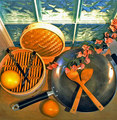
Asian Contemporary Still Lifeby chaliceComment by ragamuffingirl: This is another one that I'm wondering why the flowers are in the picture in the way that they are. Are you planning on cooking them? However, the color of the flowers are pleasing to look at. I would have given a 10, but because I'm confused about the purpose of the flowers, I give a 9. |
| Photographer found comment helpful. |
| 05/17/2006 05:09:40 AM |
Night Light for the Wearyby chaliceComment by ericwoo: --Trading Post--
First of all, congrats on your highest scoring photograph to date!! I like your choice of subjects here. Many of us shot the city skyline, which I have personally gotten too comfortable with. You didn't. You chose a subject that was a bit out of the box, and it works well. My only critique is that the shadow running down the middle of the frame is very distracting. Perhaps a better position for the shot would have gotten this one into the top 30 or so. |
| Photographer found comment helpful. |
Home -
Challenges -
Community -
League -
Photos -
Cameras -
Lenses -
Learn -
Help -
Terms of Use -
Privacy -
Top ^
DPChallenge, and website content and design, Copyright © 2001-2025 Challenging Technologies, LLC.
All digital photo copyrights belong to the photographers and may not be used without permission.
Current Server Time: 04/22/2025 03:19:59 PM EDT.