| Image |
Comment |
| 05/03/2007 10:44:34 AM |
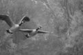
B&W - Day 3by mkComment by mawear: I'm torn between liking the paint feeling and not. I think the geese being focused and the background blurred might have worked better. Not that that auto focus works everytime. :) I also agree that color might work a bit better for the effect. With the b/w there sin't a whole lot of contrast here. |
 Photographer found comment helpful. Photographer found comment helpful. |
| 05/03/2007 10:27:00 AM |
B&W - Day 3by mkComment by CapeSail: I know what you mean, I constantly miss getting the whole bird in the frame. IMO it seems kind of flat. I think the Painted look, looks good sometimes but more for color photo's. |
| Photographer found comment helpful. |
| 05/03/2007 10:20:23 AM |
B&W - Day 3by mkComment by mk: Originally posted by MAK:
Sorry maybe its me but it seems totally OOF (out of focus) if that was your intention then i feel it was too much, I understand that some people like to get a softness by being slightly OOF but on my monitor it looks quite a way off.. I do apologise. |
Definitely not you...it's very out of focus. :) It appeals to me despite that (and maybe because of it) but I know that it won't be everyone's bag (and perhaps nobody else's). No need for apologies, I much prefer honest feedback to insincere praise. Message edited by author 2007-05-03 10:25:48. |
| 05/03/2007 10:11:01 AM |
B&W - Day 3by mkComment by MAK: Sorry maybe its me but it seems totally OOF (out of focus) if that was your intention then i feel it was too much, I understand that some people like to get a softness by being slightly OOF but on my monitor it looks quite a way off.. I do apologise. |
| Photographer found comment helpful. |
| 05/03/2007 07:23:59 AM |
|
| Photographer found comment helpful. |
| 05/03/2007 03:23:41 AM |
|
| Photographer found comment helpful. |
| 05/03/2007 02:04:21 AM |
Saraby mkComment by eamurdock: This is a nice picture, of a pretty model... skin looks good to me, and the blakc shirt/background makes her stand out nicely. Her features seem maybe a little flat; perhaps a slight turn of the head or some cross lighting would help? |
| Photographer found comment helpful. |
| 05/02/2007 09:58:49 PM |
|
| Photographer found comment helpful. |
| 05/02/2007 09:34:42 PM |
B&W - Day 2by mkComment by skewsme: Now I have no troubles with goofy foci, but you know that if you want it to look sharper, you get rid of them gummy yellows. Yah, you prolly know. I like the understatedness of this shot. It's pleased just to be itself. |
| Photographer found comment helpful. |
| 05/02/2007 08:06:34 PM |
B&W - Day 2by mkComment by sherpet: Now this is really awesome in everyway.....
Perfect balance of light and dark, and I love the softness of the flowers....... |
| Photographer found comment helpful. |
Home -
Challenges -
Community -
League -
Photos -
Cameras -
Lenses -
Learn -
Help -
Terms of Use -
Privacy -
Top ^
DPChallenge, and website content and design, Copyright © 2001-2025 Challenging Technologies, LLC.
All digital photo copyrights belong to the photographers and may not be used without permission.
Current Server Time: 04/23/2025 04:08:18 AM EDT.