|
|
|
Showing 111 - 120 of ~239 |
| Image |
Comment |
| 11/11/2003 04:10:16 AM | Fading consequenceby qwerty_314Comment: the black pawns are too cluttered and your shadows tend to fade out the meaning of your work rather than any consequences of the game. Your title sparks interest mainly because it seems that the picture is hiding some sort of meaning. work harder to bring that meaning out. be creative and unafraid to explore what you want to do with your camera. once you've got an idea of how to capture your meaning, satisfy yourself further by playing with spacing. |
| 11/11/2003 04:03:40 AM | A Small Aubergineby gandersComment: Very cool blend of textures. Try to make the background more contrasting within itself. also, the photo is basically black and white, so go ahead and take the final step of actually making it black and white. the redness of the core messes it up. if you want to keep it in color, consider a background as such: wrapped partially in a clothe slightly darker than the color of the core. make sure the cloth has a towel-y texture. |  Photographer found comment helpful. Photographer found comment helpful. |
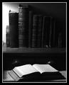
| 11/11/2003 04:01:04 AM | Literatureby Firstrich1Comment: this picture is, in my opinion, the most classic and archetypical symbol of still life. black and white, intellectual, great lighting, perfect focus. this picture could benefit from a larger resolution and maybe a slightly brighter filter, but i'll give you the 10 for being the only person to take a classic, almost cliched example and breathe it to life. | | Photographer found comment helpful. |
| 11/11/2003 03:58:50 AM | Bent Shadow (Corollary to "Unbent Shadow" from the "Shadows II" Challenge.)by GolferDDSComment: I just think that this is the embodiment of this genre, this contest. Still life. But still life moves, still life has motion and character and personality. Your picture is so simple but so intriguing. The textures you used are awesome, just awesome. one of the reasons you won't win is because of the writing on the back of the fork, but who am i to judge the whole competition. good luck! | | Photographer found comment helpful. |
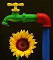
| 11/11/2003 03:57:10 AM | Sunflower by thelselComment: Well, I don't like the drip coming from the faucet. And you definitely shouldn't win this competition because there are pictures that exemplify still life better than this one, and are more beautiful than this one. That being said, this is by far the best use of color I've ever seen in a photograph in my life. You've gotta enter this into another contest, one dealing with color, or fun images, or flowers, or something. I'd work on a background for this picture, if possible. | | Photographer found comment helpful. |
| 11/11/2003 03:41:42 AM | get the party started !by miss parkerComment: This is better suited for the "cruise ship brochure" contest. This contest is as much about design as subject. This is pathetic in terms of design. and it's boring in terms of subject matter.
i'm sorry again for the offense. here's a little bit more in terms of constructive criticism: you have talent, you sure do. the colors in this are very vivid, and they didn't necessarily get that way on their own. use color to your advantage while taking into account that too much color can damage your photo. in my opinion, this photo was already doomed from the start because of the subject matter. it seems more at home in a cruise ship brochure because of it's tropical theme. if this is what you like photographing, don't let me stop you. however, i'm not going to sugar coat this: i will always give photos like these low scores. i just don't like them. |
| 11/11/2003 03:30:34 AM | Unityby ShannonComment: This scene looks very authentic...I see this setup everywhere I go [sarcasm liberally sprinkled throughout]. Get real! To further define my comments: this is very contrived. I'm sure you know that; it's probably your point. I just don't like contrived photos--these pretty scenes that look like they should be in brochures or holiday catalogs. Merely opinion. |
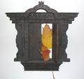
| 11/11/2003 03:29:23 AM | Doorway To No Whereby RoosterComment: why. to go into greater detail as requested: I don't know what this photograph seeks to do. it looks to be the face of an old cuckoo clock or something of that nature, with leaves. no background, just pure white. i'm so confused by your choice, and yet i can't be carried away by its beauty or its design, because it's not beautiful and it's poorly designed. the stem's showing, the colors clash, there's no lighting, no spacial recognition, no grasp of texture. play around with this subject more, but here's the trick: don't be afraid to step outside yourself. you obviously are very creative (hopefully you know what the setup of this picture means), so seek to convey your meaning through unique design. if the setup in fact has no meaning, you have to work extra hard to make people think it has meaning. i can't find the connection between leaves and clocks off the top of my head, but maybe you can if you were to explore your subject more creatively through the lens of your camera. | | Photographer found comment helpful. |
| 11/11/2003 03:22:07 AM | | | Photographer found comment helpful. |
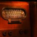
| 11/11/2003 03:15:35 AM | The Golden Age of Radioby kirbicComment: I wish I was there to take pictures of this too. Alas, I have to settle for your flawed design elements (edited for the sake of critiscism). What I mean by this is the following: this is perfect subject matter. it's vintage. it's in beautiful condition. now, in my opinion, you need to work more on the design. first off, the rosey stain of the wood bleeds into the picture so much as to become overpowering. hopefully that's what you were going for; if not, you've got a lot of work to do. i would have taken this photo in black and white, with heavy contrasts, from an angle that stressed the technological design and not the beauty of the wood. you get a 5 also because the photograph is hazy, which makes no sense if you're trying to focus on the intricacies of the wood. too much or too little was done to this picture. | | Photographer found comment helpful. |
|
Showing 111 - 120 of ~239 |
Home -
Challenges -
Community -
League -
Photos -
Cameras -
Lenses -
Learn -
Help -
Terms of Use -
Privacy -
Top ^
DPChallenge, and website content and design, Copyright © 2001-2025 Challenging Technologies, LLC.
All digital photo copyrights belong to the photographers and may not be used without permission.
Current Server Time: 03/13/2025 05:56:16 AM EDT.
|