| Image |
Comment |
| 06/07/2002 11:05:00 AM |
|
| 05/28/2002 11:10:00 AM |
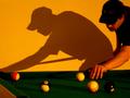
Minnesota Skinny On A Runby maknbaconComment: "minnesota skinny"...LMAO!!! A little blurry. Looks like you took this photo with the flash off and no tripod. Not sure if you wanted that yellow tinge to the whole picture. If not, you might want to turn on your white balance. Did you move that background right up against the pool table for this shot? |
| 05/28/2002 10:52:00 AM |
Hatsby randy3yComment: Would've been nice to see a little more of the girl's eyes/expression. Might've tried a fill flash. I like the way the various colours of the hats and shirts frame the faces. |
| 05/28/2002 10:58:00 AM |
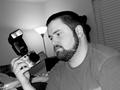
frustrationby mnewmanComment: I want that lens adapter, filter and flash!!! :) I like the angle of the picture. I don't like that thing behind the head on the right. The bed (?) behind the hand is also distracting because there is so much stuff on it. I might've framed down and to the left a little so that your eyes were higher and your head was a little more to the right. Good facial expression though. |
| 05/28/2002 11:18:00 AM |
Emmaby AleciaComment: Might've tried a reflector to bounce a little more light onto her face. Might've composed the shot so the background was all blue, that way her hair would have a really nice halo effect. Looks good when the shoulders are angled to the camera like that. |
| 05/28/2002 11:57:00 AM |
Expressionsby pnichollsComment: Should've used a fill flash so you could see the expressions. Good composition though. |
| 05/28/2002 11:03:00 AM |
The Little Peopleby doogbullComment: Too much glare on the "faces" though. Might've tried taking a shot with the flash off or diffusing the lighting. The shadows beside the fingers are too strong. Might've tried moving the hand away from the background, using no flash, or diffusing the lighting. Might've chose a better background. Something that a family might be standing in front of. e.g. a church. Extra points for creativity though. |
| 05/28/2002 11:25:00 AM |
Hydrabad Princessby bruster54Comment: The teeth are in better focus than the eyes....portraits should always have the eyes in razor-sharp focus. Lighting and background is nice and the background colour complements the clothing colour. The spot light on the background seems to be a little too bright on the right side of the head. Might've lit the face a little more with a light reflector. |
 Photographer found comment helpful. Photographer found comment helpful. |
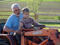
| 05/28/2002 10:42:00 AM |
tractor 101by lecookComment: Good lighting, good composition. I find the word "KUBOTA" a little distracting because of it's size and colour. Not much you could do about that I guess. Great people-shot! |
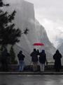
| 05/28/2002 10:46:00 AM |
Yosemite Diehardsby debcardComment: I like the red umbrella, kinda makes it look like the rest of the picture has been desaturated. I might've cropped to the bottom of the curb to cut out the "parking" word and to put a little more focus on the vastness of that mountain in the back. The tree on the left seems to help frame the mountains nicely while the right side is left open for the eye to leave the frame. |
Home -
Challenges -
Community -
League -
Photos -
Cameras -
Lenses -
Learn -
Help -
Terms of Use -
Privacy -
Top ^
DPChallenge, and website content and design, Copyright © 2001-2025 Challenging Technologies, LLC.
All digital photo copyrights belong to the photographers and may not be used without permission.
Current Server Time: 03/12/2025 08:13:28 AM EDT.