| Image |
Comment |
| 09/12/2004 05:57:35 AM |
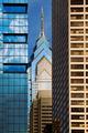
Market Streetby banmornComment: there is a lot that i admire about this image. i love the geometric qualities of the composition, it's very isometric in appearance which is quite different. colours are pleasantly spread across the shot too, moving from blue to a sany cream with the central buildings comprising both. and the building on the far left is gorgeous - i would be most tempted to get lots of shots of that one. technically, i think this is a wonderful piece. emotionally though it doesn't do all that much for me, but i'm not sure why. it is a very strong, visually appealling shot, but with something missing. no idea what. still - 8. |
 Photographer found comment helpful. Photographer found comment helpful. |
| 09/10/2004 11:38:26 AM |
Good with food.by divernickComment: and on its own. and frozen on a stick... it's a nice picture, features a very lovely deep red (red wine is a lovely colour), but the overall composition doesn't get me excited, i'm afraid. only criticisms is that there is slightly too much white compared to the red, and the angle of the shot might feel more "right" if the bottle was tilted rather than the picture (the top of the liquid bit being horizontal (or parallel with the top and bottom of the frame) would suit the way it's looked at - if that makes any sense). only other minor thing is it's a shame you can't clone out little white dots - totally unfair rule that in my mind. still, it's a very nice clear, pin-sharp focused image. that makes me crave a drop of rioja... 7. |
| Photographer found comment helpful. |
| 09/10/2004 09:25:10 AM |
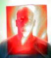
Portraitby jetsonComment: this is odd, scary, bizarre and very interesting. it is a very unusual concept... figuring out where the lighting is leaves me somewhat befuddled. though it will no doubt give me nightmares tonight (i'll be avoiding the cheese) it's certainly a good concetual piece of art - it's slightly normalised (for want of a better term) by the fact that the shoulders indicate being shorn in a fairly standard sweater - makes it a bit less other-worldly... very original. 8. |
| Photographer found comment helpful. |
| 09/10/2004 08:23:32 AM |
|
| Photographer found comment helpful. |
| 09/10/2004 08:11:46 AM |
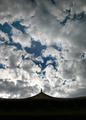
Imperial Heavenly Palaceby khkaiComment: nice arse! (well, i think it looks like a lovely ladies back and bum. i can't be the only one who has said this).
sky is very pleasant and interesting to look at, but then focus should be on the travel-type stuff, and a silhouette of a roof (no matter how pleasingly suggestive it might be) doesn't really scream "put me in a travel guide". with the architecture that is evident from this shot, i think a little less emphasis on the sky might improve your overall score. for me, a 4. |
| Photographer found comment helpful. |
| 09/10/2004 08:01:40 AM |
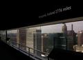
Long Way To Goby kevinfComment: what is it about iceland? the shot isn't even in iceland, and yet there the bleeders are! ;) it's a cute shot, possibly a little on the sarcastic side (maybe it's not the intention?) but doesn't really say travel guide to me. good in-joke though. 5. |
| 09/10/2004 07:59:29 AM |
Destination Unknownby jmsetzlerComment: I really do like this - i do so love stairs! unfortunately the wonkiness of the shot is very distracting, and could easily be fixed with a moderate amount of rotation. also, a bit of light in the lower left flight might have lessened the oppressive blackness in this portion. i like the almost-sepia tones and the graininess though, and the "unknown" light at the top works very well. 6. |
| 09/10/2004 07:37:56 AM |
Gone Swimmingby OlyuziComment: nice shot - though the umbrella would have been brilliant for this weeks open challenge. water is very enticing, must confess - though the beach is a bit on the grey side... 6. |
| Photographer found comment helpful. |
| 09/10/2004 07:29:27 AM |
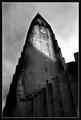
Iceland biggest church, Hallgrimskirkjaby JohannesFrankComment: i can only assume it's appreciate your church week in iceland - there are loads of the buggers this week. it's very dramatic and gothicesque though - i think the B&W works well and i love the light cast on the tower. the sky is very ominous and powerful, though the halo around the top of the tower reduces the impact a little bit. i wonder how it would look more landscaped in orientation though - one can't help think that the dreaded rule-of-thirds might be a viable thing here... it's still very captivating though - kind of film-noir esque hammer horror type thing (half expect lightning bolts and a powerful score to accompany the picture - sequal to van helsing or similar could be filmed here). excellent lighting. 9. |
| Photographer found comment helpful. |
| 09/10/2004 07:23:23 AM |
Compassby divernickComment: nice picture - colours are particularly pleasant. However, composition wise it's a bit odd - not sure having the left portion cut off and the right side of the surface it's resting on quite works. also, north in the southwest position and the arrow pointing west is a bit disorientating. i think there are certain unwritten protocols with photographing compassessess (compaii?) that have to be considered. dunno. overall the picture is very nice, colours ARE lovely and the focus unquestionably good. fits the challenge also. 6. |
| Photographer found comment helpful. |
Home -
Challenges -
Community -
League -
Photos -
Cameras -
Lenses -
Learn -
Help -
Terms of Use -
Privacy -
Top ^
DPChallenge, and website content and design, Copyright © 2001-2025 Challenging Technologies, LLC.
All digital photo copyrights belong to the photographers and may not be used without permission.
Current Server Time: 04/21/2025 10:31:20 PM EDT.