| Image |
Comment |
| 10/25/2005 12:52:50 AM |
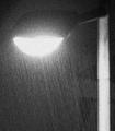
Lit up rainby pacpintoComment: I'm not sure how others are going to feel about this, since it doesn't really seem to be your standard DPC fair, but I love it - it's very abstract feeling, and it definitely meets the challenge. Good call going with b&w on this, and I like the out of focus feel - great work! |
 Photographer found comment helpful. Photographer found comment helpful. |
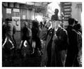
| 10/25/2005 12:51:11 AM |
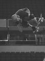
Neal Hendrixby michael_pComment: Composition is good, and you've got the action very nicely frozen. I'm seeing an appropriate amount of grain; overall, it meets the challenge. However, I'd really like to see this either a) with considerably more contrast, or b) with some colour. Actually, some wild contrast AND colour would look pretty great, too :) As it is, your subject and background are kind of battling each other for attention - and this is a better shot than that! Good luck, this is a nice action capture. |
| Photographer found comment helpful. |
| 10/25/2005 12:04:07 AM |
Twilight Timeby RKTComment: This is just gorgeous. Your toning is spectacular, and the composition is perfect - the contrast is just right, and everything is sharp without going overboard. Beautiful work. |
| Photographer found comment helpful. |
| 10/24/2005 06:33:20 PM |
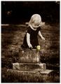
Mother's Grief...Mother's Joyby DrAchooComment: Beautiful - this is one of the rare occasions where I like selective desaturation. Your toning is perfect here, too - this could easily be too heavy of a sepia tone, but for this contrasty of a photograph, it works beautifully. The grain is perfect - you have a very moody, emotive shot here. Well done. |
| Photographer found comment helpful. |
| 10/24/2005 06:32:10 PM |
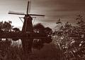
ANNO 1738by PhilosComment: This shot has a lot of appeal with the deep DOF and the nice contrast; the grain is well done and suitable to the image. I do, however, feel that the sepia tone is a bit heavy, and it makes it difficult to really get the details.. they're just not standing out like they could with a slightly greener, less saturated tone. Otherwise, this looks great - I love the light. |
| Photographer found comment helpful. |
| 10/24/2005 06:28:48 PM |
Why won't you let me sleep?by ggbudgeComment: There's some great grain here, and I really like the composition - not fond of how out of focus it is, though, and I would really prefer that the selective desaturation be total desaturation. Your contrast is great, the subject is adorable, and overall the shot is definitely appealing - nice image! The only thing I really don't like is the oversaturated blue. Good luck, you've met the challenge well :) |
| Photographer found comment helpful. |
| 10/24/2005 06:00:31 PM |
The Night Touristby e301Comment: I love this shot. The grain, the background motion, the clarity of the subject, and the composition all make this interesting and moody; the atmosphere is just fantastic in this. Excellent work. |
| Photographer found comment helpful. |
| 10/24/2005 05:37:58 PM |
Rebel by gaurawaComment: Stunning use of grain to add impact to this shot without losing any detail. Composition is excellent, and the contrast couldn't be better. Fantastic work! |
| Photographer found comment helpful. |
| 10/06/2005 12:11:19 AM |
Purple Hazeby RikkiComment: Looks just a tad overprocessed somehow - maybe it's the compression? I see some haloing around the edges that doesn't quite work, and some minor lost details. That aside, the colours are fantastic, and the composition is excellent. I'd love to see a little more natural detail in the flower - this would be absolutely fantastic that way. Even still, I think it would've done well; I'd have scored it 7 or 8ish. |
| Photographer found comment helpful. |
| 10/06/2005 12:05:12 AM |
Portrait Attemptby mocabelaComment: Originally posted by kpriest:
I think it's pretty good. I like that it's a "landscape" oriented portrait. a little different. Lighting / contrast might be a touch harsh or maybe just a little overexposed on one side of the face. Great job though! |
Yeah, the window was on the side, so the light source was hitting unevenly. Plus, he's extremely pale. ;) I did some in the standard portrait fashion, but I liked the landscape one better :) Thanks for the feedback! |
Home -
Challenges -
Community -
League -
Photos -
Cameras -
Lenses -
Learn -
Help -
Terms of Use -
Privacy -
Top ^
DPChallenge, and website content and design, Copyright © 2001-2025 Challenging Technologies, LLC.
All digital photo copyrights belong to the photographers and may not be used without permission.
Current Server Time: 04/15/2025 06:04:22 AM EDT.