| Image |
Comment |
| 09/13/2004 01:19:35 AM |
Pot Porri sticksby trainComment: Love the arrangement and colours. Excllent exposure. I feel though that it could have been cropped a wee bit on the right. Great job still. 9 |
| 09/13/2004 01:16:22 AM |
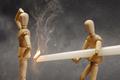
mmmmmm...barbqueby DarkRiderComment: Hilarious! Don't like the way you have cropped the figures from their knees. But, brilliant idea and great exposure. 9 |
 Photographer found comment helpful. Photographer found comment helpful. |
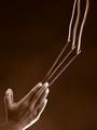
| 09/13/2004 01:14:45 AM |
metamorphosisby brunasComment: Beautiful image. Subject could have been placed a bit to the left. Good job. 9 |
| Photographer found comment helpful. |
| 09/13/2004 01:13:52 AM |
|
| Photographer found comment helpful. |
| 09/13/2004 01:13:26 AM |
|
| Photographer found comment helpful. |
| 09/13/2004 01:12:31 AM |
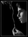
Holy Smokeby PhilosComment: Great, idea, composition & exposure. Beautiful image. Bit unure about the softening. Still .. 10 |
| Photographer found comment helpful. |
| 09/08/2004 03:53:17 AM |
|
| Photographer found comment helpful. |
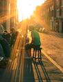
| 09/05/2004 05:22:42 PM |
A Night Callby SavirComment: I am not going into any technical details. But I love the moment in time you have chosen to capture and I think you have a great eye. If you see things like this and work on shots, you will for sure capture great images. Well done. Best of luck. |
| Photographer found comment helpful. |
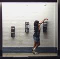
| 09/05/2004 05:16:25 PM |
At the Libraryby basia03Comment: This one made me stop and have a good look. I love al lthe framing aspects of this image. The only bit I am not really sure about is the angle you have chosen. Well, not just the angle, but the angle combined with the title. I guess it boils down to how we're used to seeing a library.
I think you have done a brilliant job and wish you all the best. |
| Photographer found comment helpful. |
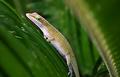
| 09/05/2004 05:12:56 PM |
Ignore me - I'm just a leaf!by dswebbComment: I love the 'framing' in this image. I am but a bit uneasy about not seeing the whole body. Well, of course, you don't need to show the whole body. But the crop or composition isn't right for me. If it was somewhere in the frame where it had some space to move around, I think it would look better. Again, for framing, I really like how you have approached it. |
Home -
Challenges -
Community -
League -
Photos -
Cameras -
Lenses -
Learn -
Help -
Terms of Use -
Privacy -
Top ^
DPChallenge, and website content and design, Copyright © 2001-2025 Challenging Technologies, LLC.
All digital photo copyrights belong to the photographers and may not be used without permission.
Current Server Time: 04/22/2025 12:34:41 AM EDT.