|
|
|
Showing 191 - 200 of ~455 |
| Image |
Comment |
| 02/09/2006 10:20:23 AM | Waveby gurlwithapenComment: This may have worked better for me if the added curl was in focus. |  Photographer found comment helpful. Photographer found comment helpful. |
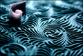
| 02/07/2006 12:58:37 PM | bassistby arsenalComment: Hi! Here’s a comment from the Critique Club.
First Impression:
Nice B&W. Interesting motion blur. What are those lines on the fingers?
Composition:
Found the pic too dark. Too much negative space. (After reviewing your site, I see this is your style) Interesting capture with the bottom right corner of the guitar in motion, but the top left was steady. Don’t know if it would have looked better if only the strings and the fingers were in blur.
It wasn’t until after I took a good second look, that I realized what the lines were on the fingers. Neat capture!
Subject:
I think the picture would appeal to a limited audience. The darkness and blur would also limit the appeal.
I think you captured what you wanted to! I like the detail in the steady fingers. I like the detail in the non-motion area. It works well with the blurred areas.
Technical:
Can’t say a lot technically. The lighting & DOF work for you. I also don’t think you have a lot of options with the camera you used.
Suggestions:
More of the neck, to the right may have reduced the negative space. (Not sure of the proper name)
Summary:
Interesting picture, technically ok, but not a subject or a capture to evoke a WOW from the majority of the voters in this “Best of 2005” challenge.
| | Photographer found comment helpful. |
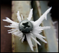
| 02/06/2006 01:18:43 PM | Covered with iceneedlesby lastefComment: Hi! Here’s a comment from the Critique Club.
First Impression:
Very centered. The “Phillips” star in the screw “marks” the spot and keeps drawing my eyes. The top two dark corners were the second place my eyes went, before I focused in on the ice. The ice actually lead my eye to the top right corner.
Composition:
Background and the screw head compete for visual attention with the ice. The ice is not the dominant subject. I’m assuming you wanted the ice as the subject and not the screw.
Subject:
I agree with your comment! I visited your portfolio, and saw some very nice pictures. My guess is that you didn’t have a lot of options with this picture in terms of capturing the ice crystals. Good eyes to see this, even better, you had the camera to capture it! :-)
Technical:
More depth of field would have brought all of the ice in focus, or move the focus point back to one of the ice crystals. Lighting is flat, with no sparkle in the ice.
Summary:
The ice crystals are neat, and make an interesting picture, unfortunately, you entered the Best of 2005, a very tough challenge for this type of picture.
|
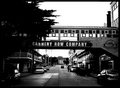
| 01/31/2006 12:45:56 PM | Cannery Rowby kmbr2001Comment: Hi! Here’s a comment from the Critique Club.
First Impression:
My eyes went to the black trees, the white sky, then the road area and the sign. The dark trees and white sky kept drawing my eyes away from the road. Very distracting.
Composition:
Very central oriented. May have been more interesting if you reduced the sky and included more of the road. Either move back or point down. I like the way the road leads my eyes down to the end.
Subject:
Met the challenge, but you may have focused more on the sign than the road.
Technical:
Since you didn’t include any details or text on what you were trying to achieve, I can only comment on what I see. Picture has a lot of contrast with very little detail. You lost a lot of detail in the shadows. The road perspective was effective so cropping the trees and sky may have helped.
Summary:
Picture has potential with some additional post processing steps. The road component is working, but the trees and sky compete for attention.
| | Photographer found comment helpful. |
| 01/20/2006 03:34:27 PM | Oasisby bkctComment: Looks like a great picture, but it is too small to really judge. Refer to tutorials for downloading. ( bet you have a lot of this comment!) |
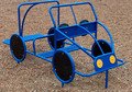
| 01/19/2006 01:00:32 PM | Children's Driver's Edby rayg544Comment: Hi! Here’s a comment from the Critique Club.
First Impression: Burst of blue colour! Eye drawn to the black wheels, yellow eyes and then back to the center.
Composition: Car is very centered. Takes up the whole picture. Car by it’s self is a bit boring. Don’t know what you had to exclude, but if you had put the car in more context with its surroundings, it may have helped. It’s cropped to tight. The background provides good contrast, but does not add interest.
Subject: You captured a very colourful object. I feel you met the challenge.
Technical: Excellent colours. The blue and yellow are very vivid. Picture could be a little more sharp. Don’t know if it’s a result of a soft focus, or shake. (1/125 should have been fast enough). With no comments, I don’t know what post processing you did if any. I would have suggested a bit of Un Sharpen Mask. DOF look good
Summary: Nice capture of colour. Context and positioning would have helped to generate a more interesting picture.
|
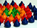
| 01/18/2006 12:39:21 PM | just kissesby AzCKellyComment: Hi! Here’s a comment from the Critique Club.
First Impression: Nice color, lots of colorâ€Â¦too much color. Eyes are drawn to the green ring and then orange, red and blue.
Composition: Given the vivid colors, the image is a little busy. Two rings with a center may have been more effective. In this case less may have been better.
Subject: Think you met the challenge, definitely a burst of color!
Technical: Very good colors, very vivid. Nice lighting. Excellent focus. Sharp detail. Material kisses are sitting on has some distracting colors. Outside the blue ring, there is a blue tone. As you go inside the blue ring it goes much whiter, and material texture is more prominent. Texture is due to DOF, not sure why there was a color shift.
Suggestions: As this was a “studio shot” Try with fewer rings. See if there is more impact, or take a wider shot. Don’t crop so close
Summary: Nice picture, lots of color with sharp detail.
| | Photographer found comment helpful. |
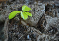
| 01/18/2006 10:39:01 AM | Rebirthby nidiciComment: Hi! Here’s a comment from the Critique Club.
First Impression: Eye drawn to the bright green leaves, then moves over to the right corner, down and then back to the leaves.
Composition: Good placement of the green leaves, and an effective background. Nice contrast. After looking at it a little longer, my eye keeps getting drawn to the dark spot just right of the plant. Looks like an “eye.” My mind is trying to see a head in the bark!
Subject: Think you met the challenge well.
Technical: Picture lacks sharpness. As if the focus is off. The leaves need to be more crisp. They look flat. Color is there, but not the plant detail. DOF looks good. This could be as a result of the ISO:400, or the file size you submitted. Reviewing your file size, I see you didn’t take advantage of the 640 max dimension, and your file size was well below the 150k allowed. (624 X 437, 115k)
Summary: Nice picture! Good eye and kudos for having your camera handy! I think you captured the theme well. Good burst of color on a grey/black background! Better detail on the green leaves would have helped.
| | Photographer found comment helpful. |
| 01/17/2006 11:41:56 AM | Shack in Wyomingby SCI 009Comment: First reaction, I liked the shot, then I noticed a funny horizen line. Looks like you cloned something out on the left side of the barn | | Photographer found comment helpful. |
| 01/13/2006 03:42:11 PM | Ligths in the cityby armandusComment: Hi! Here’s a comment from the Critique Club.
Note: I commented on this picture during the voting. By luck, I drew your picture as part of the Critique Club! So here goes, a little more feedback.
First impression: Too small! Nice picture, but too small! I like the leading lines and the colours. Your eye follows the light lines from left to right up through the picture, into the sky at the two flared street lights, and then you notice the guard rail in the lower right corner. Nice composition.
In terms of technical and post processing comments, you have made my job tough!
I can only guess that at f22 your DOF would have been excellent. Since you didn’t give any post processing comments, I can’t comment on what you did, even if I could see the detail. :-)
As mentioned numerous times in the previous comments, refer to tutorial at //www.dpchallenge.com/tutorial.php?TUTORIAL_ID=26. Your file was only 160x240 and 42k.
I’m positive you would have scored much higher with this entry if it was closer to the 150k file size.
|
|
Showing 191 - 200 of ~455 |
Home -
Challenges -
Community -
League -
Photos -
Cameras -
Lenses -
Learn -
Help -
Terms of Use -
Privacy -
Top ^
DPChallenge, and website content and design, Copyright © 2001-2025 Challenging Technologies, LLC.
All digital photo copyrights belong to the photographers and may not be used without permission.
Current Server Time: 04/08/2025 12:57:17 AM EDT.
|