| Image |
Comment |
| 07/19/2006 07:03:07 PM |
|
 Photographer found comment helpful. Photographer found comment helpful. |
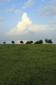
| 07/18/2006 09:25:52 PM |
Cloudsby LenaComment: Don't you just love those big, fluffy looking clouds? I know I do. To put more emphasis on the clouds, you might consider cropping out the large amount of grass in the foreground and having the majority of your picture be the sky. |
| Photographer found comment helpful. |
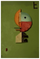
| 07/18/2006 06:29:55 PM |
Kitchen Kandinskyby sibelingComment: I like the arrangement that you have made with the slices of various colour foods. The bits in the corners add wonderfully to the composition. The lighting is rather flat though and does nothing to enhance the overall presentation, IMO. |
| Photographer found comment helpful. |
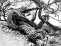
| 07/08/2006 05:36:47 PM |
tree2.jpgby faidoiComment: Of the 3 trees, I like this one the best. The angle seems to give you better shadows and highlights and draw your eye into the shot. Gotta love those gnarly old tree roots! |
| Photographer found comment helpful. |
| 07/02/2006 11:55:47 PM |
|
| Photographer found comment helpful. |
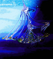
| 07/02/2006 11:53:57 PM |
Sailing towards calmer waterby KelliComment: I like the idea you are going for. The glass ship is getting overwhelmed by the strength of the background and so it loses effectiveness. |
| Photographer found comment helpful. |
| 07/02/2006 11:50:59 PM |
Seatbelts Saveby ordinarywordsComment: Good message. If your intent was to depict an arm after an accident, I would think it would be more effective to have the hand in a more relaxed position to give a feeling of unconsciousness and no muscle control. |
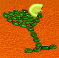
| 07/02/2006 11:47:35 PM |
... (with a twist) of lemonby shalrathComment: Cute idea. Perhaps a softer lighting and a darker colour background would make the glass more appealing The flat light does not do anything to enhance the shot. |
| Photographer found comment helpful. |
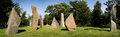
| 06/30/2006 01:56:02 AM |
wheeler-ageofstone-web800.jpgby wheeleddComment: Interesting job on the stitching but I notice the rock shadows are not all going in the same direction. Did you mirror some of the shots to stitch them? Good colour intensity and nice clarity on the rocks. |
| Photographer found comment helpful. |
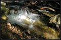
| 06/19/2006 10:31:13 AM |
falls_color.jpgby justin_hewlettComment: I like this one the best of the water shots. The colours are more real and the highlight on the water, rather than looking blown out, looks to me exactly like a single ray of sun making it down to that spot and shining across the water. Strong shadows and contrasts. |
| Photographer found comment helpful. |
Home -
Challenges -
Community -
League -
Photos -
Cameras -
Lenses -
Learn -
Help -
Terms of Use -
Privacy -
Top ^
DPChallenge, and website content and design, Copyright © 2001-2025 Challenging Technologies, LLC.
All digital photo copyrights belong to the photographers and may not be used without permission.
Current Server Time: 03/16/2025 02:07:39 AM EDT.