| Image |
Comment |
| 01/29/2003 05:45:33 AM |
The Unheardby AntithesisComment: I think this photo would be much more interesting if I could see or at least suspect what's going on behind the door! Or am I missing something? |
| 01/29/2003 05:42:19 AM |
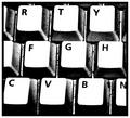
Keysby nathaliedooComment: I've joined this site about a week ago and I've already seen several pictures of keyboards. Please, no more pictures of keyboards! Get away from your computer before you start taking photos! No offence intended to the photographer, I'm just pleading for more original subjects... |
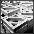
| 01/27/2003 05:09:05 PM |
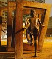
Jumping through squaresby jab119Comment: Nice angle of view and good choice of subject but I would have liked to see less depth of field. IMO this way the background is too distracting. It seems the area is floodlit by a large lamppost - the picture would have come out better at night I think, or during the day when it's turned off. Keep going! |
| 01/27/2003 05:03:41 PM |
Caught in a block of iceby camelotnorthComment: I can see it's a block of ice, but I think the square shape doesn't come out very well. A bit less cropping would have done it maybe. |
 Photographer found comment helpful. Photographer found comment helpful. |
| 01/27/2003 05:00:41 PM |
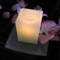
A candle and an orchidby shohnComment: Very romantic, but I would have liked to see the flame of the candle, and I would have liked to have a better view of the orchids! Nice try though! |
| Photographer found comment helpful. |
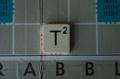
| 01/27/2003 04:59:11 PM |
T-Square(d)by RoseytoneComment: The lighting of this picture is poor. A "cast shadow" from the tile is nice but the light source is too diffuse in this case. And why did you crop the picture the way you did? |
| 01/27/2003 04:50:05 PM |
By the tonby jjbeguinComment: The "grainy" effect adds to the atmosphere of this photo. Almost looks like graphic art! |
| 01/27/2003 03:31:56 PM |
Artificial Heartby ndsComment: This picture tells the story of a bruised and battered heart that happens to be a "no entry" sign. It's old and scratched but going strong; it is even resisting the force of the growing tree. I think unlike a lot of the other pictures in this challenge this picture has a story to tell, and as such (imho of course) it has been severely underrated! Congratulations! |
| Photographer found comment helpful. |
| 01/27/2003 03:16:20 PM |
Lacquerware Abstractionby jitamsComment: The shadow adds beautifully to the "square" theme. Nicely balanced composition. Congratulations with this beautiful photo! |
| Photographer found comment helpful. |
| 01/27/2003 02:53:13 PM |
|
Home -
Challenges -
Community -
League -
Photos -
Cameras -
Lenses -
Learn -
Help -
Terms of Use -
Privacy -
Top ^
DPChallenge, and website content and design, Copyright © 2001-2025 Challenging Technologies, LLC.
All digital photo copyrights belong to the photographers and may not be used without permission.
Current Server Time: 03/12/2025 02:48:27 PM EDT.