| Image |
Comment |
| 05/10/2004 09:21:22 PM |
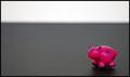
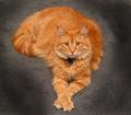
Here, piggy, piggy, piggy...by cynicznyComment: For those who asked:
1. The two-tone background doesn't 'signify' anything, I just wanted something other than just plain black and to perhaps show some depth. I can see how it might distract the eye.
2. The pig is really that color. I didn't adjust the hue or saturation at all.
3. The "nothing to compare proportion to" comments puzzled me a bit because I was using the pig as a stand alone comparision. The stubby little legs and the really round tummy with the tiny little head smacked of comic proportions to me straight off. However, I understand that a lot of people were looking for side-by-side items to show proportions between two items.
4. Thanks to everyone who made a comment! |
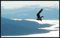
| 05/01/2004 12:17:37 AM |
Unassisted Flightby mbardeenComment: Great subject matter! The reflection on the snow is a bit bright, but I like the silhouette effect. Border adds to the photo. 8. |
 Photographer found comment helpful. Photographer found comment helpful. |
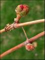
| 05/01/2004 12:14:36 AM |
Siblings - Growing Upby BibliophileComment: Great DOF! I like that you've made the bigger one in focus, as it represents that it is more important and should take center stage. What will it be when it opens? 9. |
| Photographer found comment helpful. |
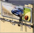
| 05/01/2004 12:12:59 AM |
Transitionsby garrywhite2Comment: Good subject choice - really represents proportion well. I like the angle of the photo and the fact that you've chosen a billboard on a building, as opposed to a freestanding one. It eliminates messy background noise. Classy border, too. 9. |
| Photographer found comment helpful. |
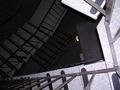
| 04/30/2004 09:46:40 PM |
Large Leoby TommyMoe21Comment: This cat is absolutely gorgeous! Your lighting is fantastic and I love the way Leo is looking at the camera - he looks like he's trying to send a telepathic message. =) |
| Photographer found comment helpful. |
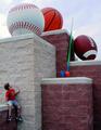
| 04/30/2004 09:41:39 PM |
From Prototype to Productionby JoelHSmithComment: Definitely shows proportion! Maybe cropping the left a little bit so it's about the same distance away as the right from the edge would be better. Also, I'm sure a million people have mentioned the annoying speck to the left of the smaller one? So ... what is it anyway?! 8. |
| 04/30/2004 09:38:22 PM |
Out of Proportionby L1Comment: Love the way the child is looking at the balls like he wants to jump up there and take them as his toys. Great show of proporations. 9. |
| Photographer found comment helpful. |
| 04/30/2004 09:36:07 PM |
|
| 04/30/2004 09:34:34 PM |
Freefallby KylieComment: The lighting is a bit too dark on the left and in the center to see the true proportions you're trying to capture. Clever idea, though! Message edited by author 2004-05-06 18:28:16. |
| Photographer found comment helpful. |
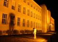
| 04/30/2004 09:33:07 PM |
Depressionby Mad-DComment: Love this idea! The color of the lights really makes this picture eerie, which matches with the posture to tell a story. Good job. 9. |
| Photographer found comment helpful. |
Home -
Challenges -
Community -
League -
Photos -
Cameras -
Lenses -
Learn -
Help -
Terms of Use -
Privacy -
Top ^
DPChallenge, and website content and design, Copyright © 2001-2025 Challenging Technologies, LLC.
All digital photo copyrights belong to the photographers and may not be used without permission.
Current Server Time: 03/12/2025 07:59:42 AM EDT.