| Image |
Comment |
| 05/06/2007 05:23:41 PM |
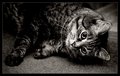
W e n z a (Day 2)by CalliopeKelComment: I also think this could be improved with a little more clean-up work and some contrast work as well... although to be honest, the whole composition is really something I'd just re-try.
The face is hilarious, but perhaps if it was done more towards the camera, so that she's got a connection with us, it would work better. |
 Photographer found comment helpful. Photographer found comment helpful. |
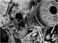
| 05/06/2007 05:20:39 PM |
Fervor (Day 1)by CalliopeKelComment: A good choice for the stark contrast here. Adds something to the photo in terms of mood. The grain is actually quite nice too.. nostalgic. |
| Photographer found comment helpful. |
| 05/06/2007 05:18:50 PM |
Climberby UrfaKComment: I agree with Art here, The whole post in the shot would have made it much more dynamic. It's not uninteresting at all really, as far as content, just need to play around with your angles, perspectives, and compositions a little. |
| Photographer found comment helpful. |
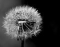
| 05/06/2007 05:13:29 PM |
Day Seven: I Blew It!by Art RoflmaoComment: A dandelion shot in B&W!??!?! HOW COULD YOU?!
hehe. Seriously though, It's kind of cool how you took this one on the side where it's opened up and bare. That's not your usual fluffy dandelion angle.
Oh.. and you have a line growing out of it :P |
| Photographer found comment helpful. |
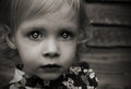
| 05/06/2007 05:11:29 PM |
Day 6by walrus451Comment: As others have mentioned, I find this a bit muddy in terms of contrast. Especially in her face and hair. This also helps point out the *slight* over-working of the eyes more than it needed to be IMO. Also, one tiny last nitpick.. the catchlights in her eyes. I'd do a little delicate work and try and get them to match up just a little better.
As for the subject itself, she's a gorgeous girl with a very intense look. Great composition (a personal favorite of mine, which I use a lot).
|
| Photographer found comment helpful. |
| 05/05/2007 06:07:57 PM |
Day 3 - Gazing Skywardby ArtysteComment: Originally posted by routerguy666:
Been trying to rotate through all my lenses for the challenge as well, but had no choice but to lean on the 24-105 two days in a row. Oh well.
Nice shot though, and this is not prompted by your comment, I don't care for the reddish hue lol. Trade hues with me? Come on man, don't bogart your hue. |
hahaha :) Hey, I never said that choosing a hue would work for *everyone*, just to think about what it means to yourself when you choose it ;) |
| 05/05/2007 04:37:44 PM |
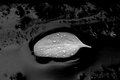
B&W - Day 5by mkComment: Just an unbelievably good conversion choice here. It gives an impression of this beautiful source of cleanliness and nature, floating in a sea of oil and industry.
J.R.R. Tolkien is applauding in his grave ;)
|
| Photographer found comment helpful. |
| 05/05/2007 04:35:49 PM |
day 5by cryanComment: I agree with the softness in this photo being a bit much, but I like the candid feel and the capture of the moment.
Megan chews her toenails too.. drives me *MAD*. |
| Photographer found comment helpful. |
| 05/05/2007 04:31:28 PM |
Day 5 - Musicby meneleComment: A great perspective, but given the subject, I would have loved to see a little more work here to get a better stark contrast. Whiter whites, especially. The photo is a little too dark and muddy to really stand out the notes like they ought to. This can either be done in post, or with the original shot through some better lighting. (In this case, you'd probably need a light-tent of some kind... but that's the subject of a whoooollee other project. hehe).
I'd suggest trying both curves and manually adjusting levels to get those whites to jump out some more. |
| Photographer found comment helpful. |
| 05/05/2007 02:52:41 PM |
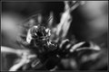
Day 05by darnokComment: I'm going to have to get a coupling ring to try this. I finally got a lens with the same thread as my 50mm f/1.7 (a 135mm). Probably won't be as good as a true macro lens (focusing distance is waaaay far), but I'd love to try it.
It's the motion on the wings here that really does it for me. While I think the subject at hand would be much better left in color (eg. it's not really a true B&W subject), you've done a pretty nice conversion. Unfortunately, a lot of the edge detail with the bee blends too well with the background because of the monochrome (where colors would have set it apart), showing that it's one of those subjects that just works better in color. IMO. |
| Photographer found comment helpful. |
Home -
Challenges -
Community -
League -
Photos -
Cameras -
Lenses -
Learn -
Help -
Terms of Use -
Privacy -
Top ^
DPChallenge, and website content and design, Copyright © 2001-2025 Challenging Technologies, LLC.
All digital photo copyrights belong to the photographers and may not be used without permission.
Current Server Time: 04/16/2025 01:06:03 AM EDT.