| Image |
Comment |
| 10/13/2008 05:24:09 AM |
macro_8713.jpgby HeiSchComment: I really like the angle you used here and the way you framed it. I'm not sure I like the speckled surface in the front, but if it were solid, maybe the bright yellow would be too overwhelming. I do feel like it distracts from the cool spongy textured tape part. |
 Photographer found comment helpful. Photographer found comment helpful. |
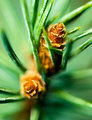
| 10/13/2008 05:16:17 AM |
07 - Pineby ErikVComment: At first I thought I didn't like the narrow DOF and having the lower cone so out of focus, but the more I look at it, the more I think it really enhances the paint-like quality of the image. The way the needles fade away, they really do look like brush strokes, and the cones almost start to look like flowers. The vibrancy is great, too. Cool shot. |
| Photographer found comment helpful. |
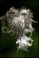
| 10/13/2008 05:10:23 AM |
Oct 06.jpgby Mr_PantsComment: I really like this shot. The contrast with the dark green background is lovely, and the soft tangles in the background really add movement and depth. Very nice composition. |
| Photographer found comment helpful. |
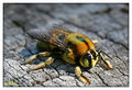
| 10/08/2008 04:57:34 PM |
BumbleBeeby GregoryBComment: I like how the wood grain is such an interesting texture, but how the muted color lets the bee still stand out. It's nice to see a bee someplace other than a flower for a change. Cool shot. |
| Photographer found comment helpful. |
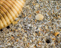
| 10/02/2008 09:02:03 PM |
Beach - 1by JuliBocComment: I like the idea here, and I like how you've included the larger pebble and the hole to give the eye some direction. I also find the large shell in the corner a welcome relief, since there is SO much going on in the rest of the image. I think for me, though, I would rather see more focus on either the large shell or the large pebble, because it looks like the focus is centered on the coarse sand in front of the pebble, which prevents my eye from really resting on the pebble, which makes the whole image a little overwhelming to look at, in my opinion, because, again, there's SO much going on with the texture and colors here. I do think this has the makings of a really lovely composition, but I would probably pare it down a little more. I think, for instance, if you'd cropped it so that the bottom right hole wasn't included, there would be proportionately more of the larger softer shapes and less of the crazy sand, and the image would feel more balanced. |
| Photographer found comment helpful. |
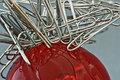
| 10/01/2008 07:25:22 PM |
Clip Headby JMartComment: I also like the subject choice, but I don't like how the clips and the red meet in the exact center of the frame. I'd rather it was more offset so we saw more red or more clips and not equal shares of each. |
| Photographer found comment helpful. |
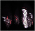
| 09/29/2008 09:29:50 PM |
I love to read!by michelaudetteComment: The very severe black and white here is extremely cold to me in a way that contradicts the intended message. |
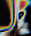
| 09/29/2008 09:22:40 PM |
Fear and hopeby Rino63Comment: The colors and shapes here are definitely interesting, but I would have liked a little more definition, even in an abstract image, to make the capture feel more intentional. |
| Photographer found comment helpful. |
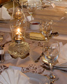
| 09/29/2008 09:19:31 PM |
Crystal Lightsby hahn23Comment: In my opinion, there's too much going on in this image between all the reflections and the details of the place settings. I think this would have been more interesting if you had created a more abstract image using just a couple of the pieces on the table. |
| Photographer found comment helpful. |
| 09/29/2008 09:15:38 PM |
1aby MollyComment: Not your typical cityscape. I like it. |
| Photographer found comment helpful. |
Home -
Challenges -
Community -
League -
Photos -
Cameras -
Lenses -
Learn -
Help -
Terms of Use -
Privacy -
Top ^
DPChallenge, and website content and design, Copyright © 2001-2025 Challenging Technologies, LLC.
All digital photo copyrights belong to the photographers and may not be used without permission.
Current Server Time: 03/10/2025 07:01:47 PM EDT.