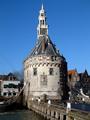
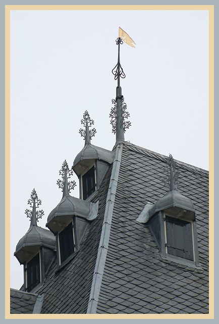
Building is "De Waag" of Hoorn, The Netherlands. They used to weigh cheese and other stuff there on huge scales. These are some of the many rooftop decorations. Some other buildings around the Rode Steen square have similar things, they liked to show off. You should see the building at the other side of the Rode Steen....
I work for a company that works with those slates and I can tell you, these little details are very expensive. We didn't make this tough, this is done by restauration specialists and the original by 16th and 17th century craftsmen.
The ornaments are Zinc but everything else is lead.
The lens was fitted with an UV & Polarizer filter. The polarizer took the glare of the wet slates and lead. First time that I put it to use. I set it up on a window below.
Autobracketed, this is 2/3 stop overexposed compared to the 0 reference metering.
There was little room for another angle, there are also a lot of wall decorations etc.
Digital processing: Arbitrary rotation for a horizon on the weathercock, rotation 90 ccw, cropped, resampled to 600xAAA, two canvas enlargments for the borders, one is set on the flag, the other on the lead. USM 100 .4 1, save for the web.
I had another one with a lot of spot processing to fill in missing slates, lead and sky, but I liked this more for the better tones. I personally like it how all the greys work together and how the goldplated flag is the cream on the creation. Another reason to choose this from a lot of shots from all over town is also the lines&angles.
This shot has no rule breaking editing, I don't think it needed it. :)
CC'er!: What do you think of the border colors?
Statistics
Place: 43 out of 86 Avg (all users): 5.8444 Avg (commenters): 6.6250 Avg (participants): 5.7692 Avg (non-participants): 6.0400 Views since voting: 1246 Votes: 90 Comments: 12 Favorites: 2 (view)
sorry i didn't get around to this challenge to vote and comment, but i just had to say i love the detailed information you've put in your photographer's comments. it's so interesting to read (a) about what you are looking at in the photo and (b) what went through the photographer's mind when planning and executing the photo and why he/she did this that and the other. i wish others would do more of that. thanks :)
oh, and on your photo, you have a great subject, and you took a technically sound photo. i like it. considering spot-editing was allowed (and is outside of the dpc challenges anyhow), did you consider cropping it into almost a vertical panorama by removing the right window (you have to clone a bit of it out so as to not crop too close to the flag). that might look good, too, because then you have just the little decorations on the left kind of working their way up to the flag. either way, good photo! :)
This was one of my favorites- top three!!! I guess I should have givien it a ten instead of a nine. I love the roof and I love what you did with it. I HATE borders usually but I think this one should be posted as an example of when a border is well done it really adds to the photo! Where did all the votes go? I was sure you'd get a ribbon.
The first thing that I noticed about this picture was the borders. They made me cringe violently for about 60 seconds. I must honestly say that I don't particularly like border to begin with, but well. if you HAVE to use borders, I would suggest using a very thin black or white border (1 pixel, perhaps?) around the picture before adding coloured borders.
When that whining is over width, I have to say I like your image. The crop on the left side leaves something to be desired, I feel, but overall the image is very good. Nice contrast, good sharpness and interesting composition. The thingies on the window overhangs are very dtailed, and they make me kind of lose focus: I would think that the intention would be to pull the attention to the "wimpeltje" (whatever that is called in English) on the spire.
I think, with the photo subject chosen, you could not have done a lot better. When that is said, I think I should probably say that I think you could have found more interesting subjects in that village.
Personally, I gave you a 5, because I couldn't quite make up my mind if I liked the image or not. strangely enough, I didn't know why then, and I don't really know why now. I'm sorry
Not crazy about the border, I would have definitely switched the gray one and the tan one. The architecture on this building is awesome, and you have showcased it beautifully. I like the composition that you chose, I think it works well.
Beautiful craftmanship. Wish this had been closer so we could see the details. Not sure if this was supposed to be a black and white or what. But I really like it. Just a shame it wasn't tighter on a window. Well done.
Beautiful composition on this photo. The soft light brings up all the details and subtelty of the old building. However, I think the border undermines the subtelty of the photo. A more neutral border would be more appropriate, I think.
They just don't make them like they used to! Nice cropping and you captured the theme of the challenge. The color of the border really distracts from the picture. No points off, but a solid dark blue might have worked more to your advantage.
great composition, i like the camera angle, i would have liked to have seen more color in the image and less on the border, or just less on the border.