| Author | Thread |
Comments Made During the Challenge  |
|
|
02/08/2003 08:55:26 PM |
| I like this alot, I do think that the whole image is a little overexposed,{to bright}. It could just be the difference between my monitor and yours. 7 Kevin |
|
|
|
02/08/2003 12:42:01 PM |
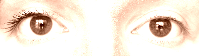
| I LOVE IT! It's so cool. The very subtle, overexposed look of the skin allows the eyelashes to take their place as the subject of the photo. The reflections in the eyes are big and bold, creating a sense of space on the other side of the camera that I like. I'm giving this 10. |
|
|
|
02/07/2003 03:23:21 PM |
| challenge met. i like the format for this photo, it focuses you right where you need to look. i think that's necessary, too, without your title i wouldn't have immediately caught on what the before and after is. did you consider flipping the photo so that you don't have after and before? i like the overexposure here, it works, again, it makes the viewer focus on the eyes. i also like that you have catchlights in the eyes, the drawback of that is that the camera and the tripod are clearly visible, which i find to be a distraction. i wonder if you could've positioned your camera in front of a wall and then have a light from one side to still achieve catchlights. still a nice entry :) |
|
|
|
02/05/2003 09:43:24 PM |
| nice idea but the difference is too subtle, esp with the over exposerd look |
|
|
|
02/04/2003 01:21:54 PM |
| the concept is nice, picture a little to washed out to see definition. |
|
|
|
02/04/2003 11:49:31 AM |
| Nice. A little too bright though and without the title I would have never guessed the before and after link. Sorry, no offense. |
|
|
|
02/03/2003 09:50:34 PM |
| Nice high key shot. Looks a little soft in fhe eyes though. No biggy. Good luck. Jacko. 8 |
|
|
|
02/03/2003 03:49:56 PM |
I would have likes to have seen just a little bit more difference in the eyes. Maybe you could have done a fake eye lash or something to have really made it stand out. Before I read the title I really didn't notice the difference. With that being said, I still really enjoyed seeing this photo. I really like the over saturation of it. Very Nice!
Thanks!
Bill Miller (wackybill) |
|
|
|
02/03/2003 01:54:58 PM |
| Would have shown up so much better in natural color. I really like the reflections in the eyes. The way it is it is too washed out, especially on the bottom part and the bridge of the nose. Great idea and concept just needs better execution and color choice. |
|
|
|
02/03/2003 10:45:20 AM |
| Nicely done and unique idea. As a female I appreciate the often amazing difference a little mascara does make. Your example is good but not dramatic enough. Yes, there is a change but I think it could of had more impact. Maybe you could of and added some eyeliner? I do however like this shot, and admire your work. Score 8. Justine |
|
|
|
02/03/2003 09:45:18 AM |
|
|
|
02/03/2003 05:35:10 AM |
Washout city. I do like this pic even witht he white out. It could be a little less washed out though to make it better. Well taken - Inspzil
|
|
|
|
02/03/2003 01:02:29 AM |
|
Home -
Challenges -
Community -
League -
Photos -
Cameras -
Lenses -
Learn -
Help -
Terms of Use -
Privacy -
Top ^
DPChallenge, and website content and design, Copyright © 2001-2025 Challenging Technologies, LLC.
All digital photo copyrights belong to the photographers and may not be used without permission.
Current Server Time: 04/12/2025 12:35:34 PM EDT.