| Author | Thread |
Comments Made During the Challenge  |
|
|
05/05/2002 10:09:00 PM |
| Cool shot. The colors are a bit bland though. |
|
|
|
05/05/2002 04:48:00 PM |
| Nice imaginative use of veryday objects. Great |
|
|
|
05/05/2002 12:01:00 PM |
| I really like this photo. Awesome use of space, and cool, soft colors. |
|
|
|
05/05/2002 10:16:00 AM |
| well it meets the challenge perfectly, the green light gives an interesting effect |
|
|
|
05/04/2002 10:24:00 PM |
| great angle, placement, awesome |
|
|
|
05/03/2002 08:35:00 PM |
|
|
|
05/03/2002 06:52:00 PM |
| Aesthetically ok, but not very interesting. |
|
|
|
05/03/2002 10:47:00 AM |
| Can't get my brain to interpret this as a vertical shot instead of just a horizontal shot. Strange... |
|
|
|
05/02/2002 07:35:00 AM |
| this has real depth. very well done. I would have prefered to see the board at more of an angle(tilting up) to give more of a feeling of height |
|
|
|
05/01/2002 11:18:00 PM |
|
|
|
05/01/2002 09:47:00 AM |
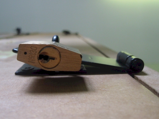
| Nice. Would be even nicer if all of the lock (including cast iron right above it) was in focus. |
|
|
|
05/01/2002 03:27:00 AM |
| Probably better in B/W, and cropped down to a 2:3 aspect ratio (can't decide if I like it better chopped from the top or bottom). Still, quite good. |
|
|
|
04/30/2002 03:37:00 PM |
| nice but it doesn't say "from the ground up to me", it could quite easily been taken on a horizontal surface |
|
|
|
04/30/2002 11:46:00 AM |
| I do like it, though I didn't think I did in thumbnail. Good depth of field. The color is very subtle and softens it up a bit, but I think in black and white it would have been too harsh, as it's not a very warm-fuzzy subject. Well done. |
|
|
|
04/30/2002 07:59:00 AM |
| Very cool. Only thing I would do different is angle the camera a little or raise or lower the subject to the third's line. |
|
|
|
04/30/2002 06:44:00 AM |
| great macro. To be picky, I don't like the light in the top corner - could've been cropped |
|
|
|
04/30/2002 04:55:00 AM |
| This is a nice perspective. I'm not sure if more depth of field would make this shot more appealing or not... |
|
|
|
04/29/2002 09:28:00 PM |
|
|
|
04/29/2002 08:21:00 PM |
| What a great perspective! It looks like there is too much something going on with the hinge, over saturation or something? I wish I could be more help there. |
|
|
|
04/29/2002 03:57:00 PM |
| I like this, needs to be a little lighter to see detail. |
|
|
|
04/29/2002 01:37:00 PM |
| very unique. the reflection of the light on the hinge is a nice touch |
|
|
|
04/29/2002 01:34:00 PM |
| Ooooooh! Very very very good! Sometimes I think that I am the only one who really appreciates manual focus - getting the foreground in heavy focus, and everything outside of that focal point blurry. Great great job! It took me a moment to catch on to what was happening, but your picture instantly grabbed my interest, and made me want to figure things out. Great texture on the hinge and padlock, and the door as well. The framing could have been just SLIGHTLY tighter, not too much, to keep the ceiling from filling up as much of the shot as it does. Nice overall :) |
|
|
|
04/29/2002 12:59:00 PM |
| You had your name in the title when you uploaded this, unless I'm mistaken, Jason Cuddy? It showed up when the page loaded....anyway back to the picture, nice shot of a lock, I would have liked it better if more of the door was in focus |
|
|
|
04/29/2002 10:18:00 AM |
| great closeup and change in ideas |
|
|
|
04/29/2002 09:35:00 AM |
| Great focus! The DOF makes it look like it is a mile long. |
|
|
|
04/29/2002 09:12:00 AM |
| unusual angle on a common subject |
|
|
|
04/29/2002 08:45:00 AM |
| good interpretation of the challenge, but not very interesting |
|
|
|
04/29/2002 08:24:00 AM |
| Clever way to meet the challenge. |
|
Home -
Challenges -
Community -
League -
Photos -
Cameras -
Lenses -
Learn -
Help -
Terms of Use -
Privacy -
Top ^
DPChallenge, and website content and design, Copyright © 2001-2025 Challenging Technologies, LLC.
All digital photo copyrights belong to the photographers and may not be used without permission.
Current Server Time: 03/12/2025 11:44:18 AM EDT.