| Author | Thread |
|
|
05/06/2002 01:10:00 PM |
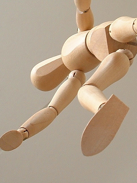
Thanks for the comments. I had to cut of the hand on the left to hide a seam in the ceiling (wich can still be seen near the elbow as well). It looks grainy because of the structure of teh ceiling and because the limps of the dummy are not sand-paperded and therefor have a rough grainy looking structure.
I wanted to use a van Gogh painting as a background, but it got stolen just before I was going to make the picture :-) |
|
|
|
05/06/2002 06:33:00 AM |
| great minds think alike, remie. i really like the angle you chose for your dummy : ) |
|
Comments Made During the Challenge  |
|
|
05/05/2002 11:57:00 PM |
| Cool angle, but sadly you have to compete with the other person who had your idea -- I like his choice of background better. Your tan background doesn't provide enough contrast for the subject. |
|
|
|
05/04/2002 10:19:00 PM |
|
|
|
05/02/2002 08:12:00 AM |
| I like the cropping on the right and top, but I don't think I would've clipped his hand as you did. |
|
|
|
05/01/2002 02:22:00 PM |
| The shot looks a little grainy (no pun intended!) to me. Were you taking at a lower resolution that your camera permits? I do like the perspective. |
|
|
|
05/01/2002 11:14:00 AM |
| Nice! The hand on the left is just a little cut off, but great focus and everything! |
|
|
|
05/01/2002 09:06:00 AM |
| This would probably make a really nice B/W, if you're into that. You just need to do something about the noise. Probably better rotated 90° CW, and I'd have included all of the hand. Otherwise nicely composed (guess I would have rotated the torso just a little CCW to straighten in out - makes the pose just a little weird). What's the shadow near the elbow? |
|
|
|
04/30/2002 04:09:00 PM |
|
|
|
04/30/2002 09:30:00 AM |
| What are the chances of that. Two submissions with the same exact model in them. I'll treat this as if I hadn't seen the other. Good idea, and excellent depth of field. I like that you obviously worked to make the background plain and even. The composition is good, the angle gives it a menacing effect. Bravo on a good idea well executed! |
|
|
|
04/30/2002 02:45:00 AM |
| Great idea and presentation for a picture |
|
|
|
04/30/2002 01:19:00 AM |
| There's a subtelty to the colours here that I like, as well as the positioning of the dummy, but as I said on the other dummy photo, those things are kinda cliched. |
|
|
|
04/29/2002 09:39:00 PM |
| Would be better with a Van Gough in the background. Sorry, coudn't resist. |
|
|
|
04/29/2002 08:40:00 PM |
| you can see her naughty parts. background color too similar to subject. |
|
|
|
04/29/2002 05:38:00 PM |
|
|
|
04/29/2002 03:02:00 PM |
| This is an interesting photo... I like the perspective here... i would also like it better if there was more foreground/background contrast to really enhance the presence of the wooden mannequin... |
|
|
|
04/29/2002 02:50:00 PM |
| How odd that we have two uniquely creative photos that are so similar! Your photo does a great job of getting the texture of the wood, but it seems kind of too sharp, like there are little speckles throughout the photo. As well, some of the wood seems to be slightly out of focus, such as the foot. I think with this picture, the image isn't very deep in terms of field of depth, and doesn't suggest an image that should have parts in and part sout of focus. Does that make sense? Nice and simple - good job :) |
|
|
|
04/29/2002 02:33:00 PM |
| I like this ... interesting twist! Seems a little grainy ... maybe increase your lighting? |
|
|
|
04/29/2002 02:21:00 PM |
|
|
|
04/29/2002 01:50:00 PM |
| Not the most original idea, but you have done it very well. I like the angle. |
|
|
|
04/29/2002 09:44:00 AM |
| i like the simplicity. although it seems, at least on my monitor, that this picture was over sharpened. |
|
|
|
04/29/2002 08:43:00 AM |
| good interpretation - cropped too tightly on the left though. Needs some sort of interesting background, maybe outside with sky/clouds ? |
|
|
|
04/29/2002 08:36:00 AM |
| The lighting is pretty nice and the figure really feels like it's in action, jumping off a wall or something. I do wish that the fraction of the hand on the left side wasn't cropped out, and I wonder why it looks so grainy? |
|
|
|
04/29/2002 07:08:00 AM |
| angle isn't quite right for me |
|
|
|
04/29/2002 03:34:00 AM |
| very clever... it saves damaging your camera.. like I almost did when my husband lost his balance... Oups! |
|
|
|
04/29/2002 12:48:00 AM |
| IKEA!! Excellent example of a great shot with limited resources. Good DOF, nice focus, like the lighting. Very nice! |
|
Home -
Challenges -
Community -
League -
Photos -
Cameras -
Lenses -
Learn -
Help -
Terms of Use -
Privacy -
Top ^
DPChallenge, and website content and design, Copyright © 2001-2025 Challenging Technologies, LLC.
All digital photo copyrights belong to the photographers and may not be used without permission.
Current Server Time: 03/12/2025 09:48:27 PM EDT.