| Author | Thread |
|
|
01/02/2006 12:57:07 AM |
|
|
|
05/19/2002 01:48:00 PM |
| i still dont understand how this didnt even make top 10 when it should have won. |
|
|
|
05/14/2002 04:40:00 PM |
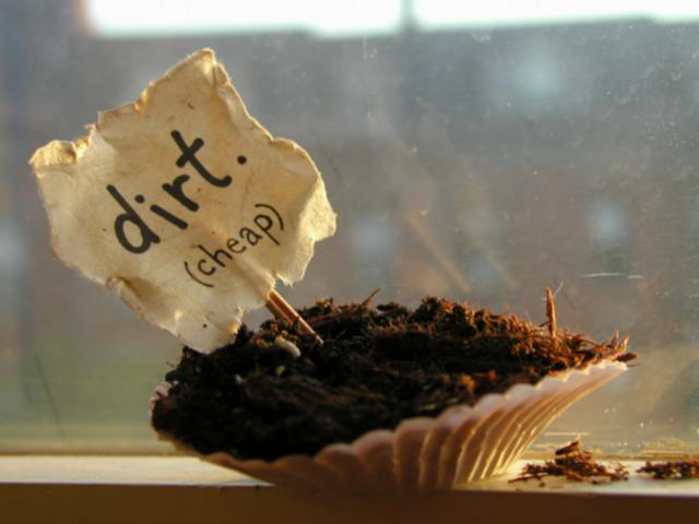
| the dirty window is the key to this shot. it holds the subject in and keeps the background from being a distraction. |
|
|
|
05/13/2002 08:47:00 AM |
It's perfection.
Every element works. The light, the imperfectins, the window.
It makes me feel as if its the anti-ad ad and if this was your intention it is perfect.
Now I want to see more of what you can do to make sure this wasn't a fluke ;-) |
|
|
|
05/13/2002 04:32:00 AM |
Thanks Drew...
Actually, this was my first entry and I am SO pleased that lots of people liked it. It's funny... I went back and forth on whether or not I should clean the window and decided in the end that it wasn't that big a deal and sort of added to the composition, so I left it. (Also, I slashed my leg on a piece of nearby furniture as I was stepping back from the window, so my priority was not quite with the photo at the time.) Thanks for all nice comments! :) |
|
|
|
05/13/2002 01:45:00 AM |
| I'm really disappointed this one didn't do better. I think the only thing I didn't like about the picture was the dirty window... but just an awesome shot otherwise. |
|
Comments Made During the Challenge  |
|
|
05/12/2002 11:59:00 PM |
| I love it. So very well done. |
|
|
|
05/12/2002 10:35:00 PM |
| very creative - i love it! |
|
|
|
05/12/2002 10:20:00 PM |
| I hope to see more photos of this nature and quality from you (and others) in the future. Great work. |
|
|
|
05/12/2002 08:40:00 PM |
|
|
|
05/12/2002 07:37:00 PM |
| perhaps more dirt, and less dirt-y window would help |
|
|
|
05/12/2002 03:27:00 PM |
|
|
|
05/12/2002 11:27:00 AM |
| Interesting play on words, and an original idea. |
|
|
|
05/12/2002 12:09:00 AM |
| Nice, but I'd like to see the dirt itself a little better |
|
|
|
05/11/2002 12:19:00 PM |
|
|
|
05/11/2002 07:57:00 AM |
| I'd prefer the foreground to be slightly better lit, but I can see that the window would have caused problems with reflections. Very original :o) |
|
|
|
05/10/2002 05:56:00 PM |
| Nearly flawless! Love the execution on this, andeven the dirty window/glass fits the sequence perfectly. |
|
|
|
05/10/2002 02:58:00 PM |
|
|
|
05/10/2002 12:49:00 AM |
| Very clever, but not especially well photographed. The dirty window, lack of detail in the shadows, and busy / blown out bg all detract. |
|
|
|
05/09/2002 12:00:00 PM |
| it's true, some people eat dirt. only thing i would have changed it not have that window so close that the reflection of your sale could be seen in it |
|
|
|
05/08/2002 11:45:00 PM |
| Bold and brave concept. But, doesn't make me want to buy the product! But, can I interest you in some super-duper window cleaner?!?! |
|
|
|
05/08/2002 09:43:00 PM |
|
|
|
05/08/2002 01:19:00 PM |
| I love it. What a great idea. |
|
|
|
05/08/2002 01:03:00 PM |
| I like the play on words, but the dirt is too shadowy. Needs more light on the dirt. |
|
|
|
05/08/2002 08:01:00 AM |
| mmm, a dirt cupcake. it's funny and clever. |
|
|
|
05/07/2002 11:42:00 PM |
| heh - got a laugh from me. don't think the glass works behind it though. |
|
|
|
05/07/2002 10:46:00 PM |
|
|
|
05/07/2002 09:30:00 PM |
| Very clever! It would have made a great shot with bettter exposure to pull out more of the detail in the subject and focus to improve on the sharpness. It appears to be taken in front of glass? There is too much distraction from the flaws in the glass for my tastes. Good effort nontheless. |
|
|
|
05/07/2002 09:10:00 PM |
|
|
|
05/07/2002 08:45:00 PM |
| Very humorous! Excellent subject, framing. Good focus (a little blurry on the edge of the shell) I like the slant of the sign offsetting the slope of the edge of the shell. |
|
|
|
05/07/2002 08:08:00 PM |
| love the concept, the lighting and the composition, wish to heck it was in focus |
|
|
|
05/07/2002 06:12:00 PM |
| Okay, this is my sense of humour exactly. I really like the creativity and imagination that went into this pic. Well done! |
|
|
|
05/07/2002 06:00:00 PM |
|
|
|
05/07/2002 02:28:00 PM |
|
|
|
05/07/2002 11:16:00 AM |
| That's true. Also for the background. Somewhere other than a dirty window with buildings and sky in the background would probably have been a better place to take this picture. Funny take on the challenge, I give you that! |
|
|
|
05/07/2002 08:22:00 AM |
| A+ for creativity! I would have cleaned the glass or gotten a better background, but still very nice. If you list this on Ebay, you might get a good price for it! |
|
|
|
05/07/2002 06:54:00 AM |
| funny idea. I'm not a fan of the dirty window |
|
|
|
05/07/2002 04:23:00 AM |
| The thumbnail for this one made me laugh out loud, and seeing the full version makes me love it more :). It's really nicely composed and photographed, and just overall funny in a cheeky way. A ten from me. |
|
|
|
05/07/2002 03:40:00 AM |
hahahahahah I love it
This is my challenge winner.
Others may think its too much of a comedy entry to win but its got my vote.
Maybe a little more light on the left side of the dirt but its great anyway |
|
|
|
05/07/2002 01:33:00 AM |
| Creative idea. But I don't like the dirty window as background. Also, I find the DOF too narrow. |
|
|
|
05/06/2002 11:37:00 PM |
A good idea..wish it had been mine.
The photo quality fits nicely too. |
|
|
|
05/06/2002 06:52:00 PM |
| i like it a lot. pretty clever. |
|
|
|
05/06/2002 03:16:00 PM |
| Not a very good photo by any measure but 10 for creativity! |
|
|
|
05/06/2002 01:39:00 PM |
| Seems to be not quite in focus but the idea is simple. If it was an advert it would definately stick in the mind. Good Job |
|
|
|
05/06/2002 01:32:00 PM |
| Oh wow! Excellent compo, great overall "worn" or worn out look. font on the paper is great.. Excellent! VERY interesting.. I'd hang this on my wall. Not sure why.. but I would. very cool. |
|
|
|
05/06/2002 01:27:00 PM |
| very cool idea, althougth the front of the photo is not in focus which hurts the overall composition. |
|
|
|
05/06/2002 01:03:00 PM |
| Creative. Good thinking. Love the lighting. Not sure how I feel about it being in front of that window with the water spots. Hmmmm |
|
|
|
05/06/2002 12:11:00 PM |
| Cute, very tongue in cheek! There is a lack of sharpnessdetail (so is my photo). Photo 8 Advert 9 Creativity 9 total 9 |
|
|
|
05/06/2002 11:57:00 AM |
LOL fun shot and done very well.
Top needs a little more crop. |
|
|
|
05/06/2002 11:39:00 AM |
| I have to give you points for humor. I like the added touch of having a little dirt to the right. But I have to deduct points because it's not selling anything to me, sorry. |
|
|
|
05/06/2002 10:40:00 AM |
| I really do not know what you are trying to sell here. |
|
|
|
05/06/2002 08:00:00 AM |
|
|
|
05/06/2002 03:53:00 AM |
| I'm not sure what's for sale here... |
|
|
|
05/06/2002 03:55:00 PM |
| nice conscept, humor good |
|
Home -
Challenges -
Community -
League -
Photos -
Cameras -
Lenses -
Learn -
Help -
Terms of Use -
Privacy -
Top ^
DPChallenge, and website content and design, Copyright © 2001-2025 Challenging Technologies, LLC.
All digital photo copyrights belong to the photographers and may not be used without permission.
Current Server Time: 03/13/2025 04:37:17 AM EDT.