| Author | Thread |
|
|
06/02/2005 06:30:01 AM |
Thanks boss for the valuable comments!
be around there for me!
i'd be needing ur help in my next pics for ur review!
thanks once again !
|
|
|
|
05/13/2005 12:30:20 PM |
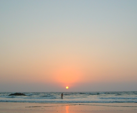
| This is a wonderful scene that could have rated higher. Suggestion: when you take photos like this, place your elements off center. As it is, the sun and the person is centered - your viewer's eye is locked in the center - and so the photo becomes static. Do an experiment: crop this to the right of the sun and the person - about an inch to the right. Also rotate the photo to level the horizon (you don't see horizons in a slant). In effect, you will have a vertical crop rather than horizontal crop. Compare the original with the result. |
|
 Photographer found comment helpful. Photographer found comment helpful. |
Comments Made During the Challenge  |
|
|
05/03/2005 12:40:30 PM |
| IMO, this is a little too small for the subject. |
|
|
|
05/03/2005 12:02:42 PM |
| Very strange photo. The sun and a man in in the middle (vertical) line but it works! I like this shot. It would be a little better if the horisont line would be straight. |
|
| Photographer found comment helpful. |
|
|
05/03/2005 08:23:31 AM |
|
|
|
05/02/2005 11:15:41 PM |
|
| Photographer found comment helpful. |
|
|
04/30/2005 01:23:37 PM |
| nice colors... nice horizon, the only thing that is a little setback is the rock on the left... i took a similar picture tho, and the hill in the back took away from my picture also, sometimes it cant be avoided, nice photo all the same... |
|
| Photographer found comment helpful. |
|
|
04/30/2005 09:23:43 AM |
| Nice idea. Find the subject too small |
|
| Photographer found comment helpful. |
|
|
04/30/2005 02:28:41 AM |
| fits minimalisim well, but something to make it more interesting would do more for me |
|
|
|
04/29/2005 06:39:57 PM |
| More beach would add for me. You got the sun. And see your subject. I like this. |
|
| Photographer found comment helpful. |
|
|
04/29/2005 12:26:49 PM |
| Nice wide-angle shot. For me it might have been better if the sun wasn�t quite so much in the middle of the frame. |
|
| Photographer found comment helpful. |
|
|
04/29/2005 05:43:12 AM |
| Beautiful photo in it's simplicity. I like the composition and the soft colours. Well done! |
|
|
|
04/28/2005 09:32:45 AM |
| This is a nice photograph. I love the colors seen throughout this image as well as the reflection of the sun off of the water. Nice work. |
|
| Photographer found comment helpful. |
|
|
04/28/2005 08:09:52 AM |
| So which one is it? The point of interest? The person? The sun? The rock? |
|
| Photographer found comment helpful. |
|
|
04/27/2005 09:53:30 PM |
| I like the simply picture thanks |
|
| Photographer found comment helpful. |
|
|
04/27/2005 04:42:25 PM |
| This is really beautiful and a PERFECT minimalist picture! The color tones are amazing, and your subject(s), the person & the sun, are very strong. One of my favorites for sure! 10 |
|
| Photographer found comment helpful. |
|
|
04/27/2005 04:34:39 PM |
| I wish the sun, the person and the center of the photo were not all quite so close together. I'd have cropped just a little to the right of the sun. |
|
| Photographer found comment helpful. |
|
|
04/27/2005 03:04:40 PM |
|
| Photographer found comment helpful. |
|
|
04/27/2005 02:02:45 PM |
| good example of minimalism |
|
| Photographer found comment helpful. |
|
|
04/27/2005 11:21:17 AM |
|
| Photographer found comment helpful. |
|
|
04/27/2005 06:10:57 AM |
|
| Photographer found comment helpful. |
|
|
04/27/2005 02:40:26 AM |
| There seem to be two subjects in this, both fuzzy, and minimalism really calls for the eye to be drawn to a distinct subject. The colors are pretty, but the sky is hazy. Increasing contrast a little might have helped. |
|
| Photographer found comment helpful. |
Home -
Challenges -
Community -
League -
Photos -
Cameras -
Lenses -
Learn -
Help -
Terms of Use -
Privacy -
Top ^
DPChallenge, and website content and design, Copyright © 2001-2025 Challenging Technologies, LLC.
All digital photo copyrights belong to the photographers and may not be used without permission.
Current Server Time: 03/12/2025 08:10:19 PM EDT.