| Author | Thread |
Comments Made During the Challenge  |
|
|
05/25/2002 07:15:00 PM |
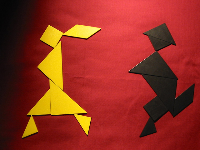
| Tangrams may be the playing equipment, but I agree, your game pre-dates them... |
|
|
|
05/25/2002 03:56:00 PM |
| good subject not sure I like the dark shadow on the LHS. |
|
|
|
05/25/2002 03:04:00 AM |
| Nice, simple graphic. More even lighting and an unwrinkled bg might have been more effective. Actually, the lighting kind of grows on me. |
|
|
|
05/23/2002 09:17:00 PM |
| creative and nice contrast |
|
|
|
05/23/2002 09:39:00 AM |
| A problem with your lighting, in that it doesn't fill the fame (whole left side, bottom and top right side). |
|
|
|
05/23/2002 09:34:00 AM |
| you get extra points for being unique |
|
|
|
05/23/2002 04:59:00 AM |
| Original, colourful I feel it it could of benefitted from better lighting, I find the darkness down the left distracting. |
|
|
|
05/22/2002 07:29:00 PM |
| Interesting image... I'm not familiar with this game though... I'm not really excited about the dark streak down the left side of the frame... good job! |
|
|
|
05/22/2002 07:10:00 PM |
| wow, It took me a few seconds to see. |
|
|
|
05/22/2002 05:47:00 PM |
Kinda interesting, basic photo is good. I question the lighting used. No suggestions. What draws the viewer in?
Photo 9 Creativity 7 Games 6 total 7 |
|
|
|
05/22/2002 06:57:00 AM |
| interesting, nice colors. too bad there's that shadow on the left. |
|
|
|
05/21/2002 09:53:00 PM |
| very good job, and seven peices on each, the light fall off on the left is somewhat distracting, along with the wrinkles on your backdrop, good idea though. |
|
|
|
05/21/2002 12:09:00 PM |
| Nice use of color and space. The background being rumpled is a little distracting IMO |
|
|
|
05/21/2002 10:41:00 AM |
| I think the two figures are too far apart. I would have moved the girl closer. Doing so would also give the figures somewhere to run to. Might also cover up the fold in your background too :) |
|
|
|
05/21/2002 10:30:00 AM |
| Nicely composed but the shadow on the left is really irritating. |
|
|
|
05/20/2002 05:50:00 PM |
|
|
|
05/20/2002 02:37:00 PM |
|
|
|
05/20/2002 01:45:00 PM |
| looks like fun to me, I like the lighting on this - makes it appear they ran into a room/area and are running out of it. :) good job. |
|
|
|
05/20/2002 01:13:00 PM |
|
|
|
05/20/2002 01:07:00 PM |
| I had those, except mine were dark red and black. I'm not sure about that shadow on the left. |
|
|
|
05/20/2002 11:19:00 AM |
|
|
|
05/20/2002 09:40:00 AM |
| i LOVE the lighting on this picture. the concept too is incredibly original : ) |
|
|
|
05/20/2002 07:35:00 AM |
straight up.
//fuck.org/~jon/photos/2000/2000-11-23-poundlost-tribute.jpg |
|
|
|
05/20/2002 01:02:00 AM |
| I miss that game, I invented it and made it legal back in the day |
|
Home -
Challenges -
Community -
League -
Photos -
Cameras -
Lenses -
Learn -
Help -
Terms of Use -
Privacy -
Top ^
DPChallenge, and website content and design, Copyright © 2001-2025 Challenging Technologies, LLC.
All digital photo copyrights belong to the photographers and may not be used without permission.
Current Server Time: 03/12/2025 01:04:24 PM EDT.