| Author | Thread |
|
|
05/13/2003 12:07:45 AM |
HAH, I see the mirror now, after the tenth look. I'm such a dolt. But it's a really good optical illusion. Cool idea.
|
|
 Photographer found comment helpful. Photographer found comment helpful. |
|
|
05/12/2003 09:35:27 AM |
Ooops, my mistake. Smarties is what M&Ms are called in Germany. :) As for the mirror, if you read the comment Lawrence posted on his picture, he describes using a mirror ...
Originally posted by Antithesis:
franziska, these are M&Ms. What is a smarty? As for the mirror thing, I can't see anything here that suggests that a mirror was involved, and Inede doesn't explain. The focus problem is throughout. I think it is a good idea and well set up, but let's get to the bottom of the photography part of it, please. |
|
|
| Photographer found comment helpful. |
|
|
05/12/2003 06:43:53 AM |
| franziska, these are M&Ms. What is a smarty? As for the mirror thing, I can't see anything here that suggests that a mirror was involved, and Inede doesn't explain. The focus problem is throughout. I think it is a good idea and well set up, but let's get to the bottom of the photography part of it, please. |
|
| Photographer found comment helpful. |
|
|
04/23/2003 12:41:35 PM |
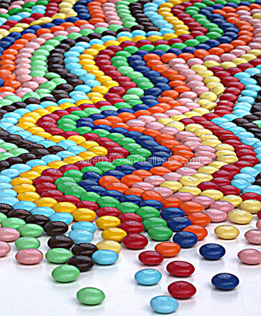
A Comment From The Critique Club
Hi Lawrence,
it's been a while, I finally get to critique one of your photos again :) I really like your idea for this photo and it is perfect for the candy challenge. You have bright colors and a great pattern that seems to be going on forever. I also like how the lines break up towards the foreground and there are just a couple of smarties lying there. Much more effective than just filling the whole photo with M&Ms.
It's the technical side of things that let you down a bit . . . the comments were pretty consistent on that one and you already posted something about it, too. Focusing is hard for mirrors (I've done a couple of mirror shots myself), but I don't think that was really your problem. Your focus was either not quite right or you overprocessed the image afterwards (maybe a little of both?). Have you tried taking the original and just going through post-processing again to see if the photo looked better with less sharpening?
Regardless, DPCers don't often give high scores for photos where there are obvious technical imperfections, the score you got speaks volumes for the creative idea and setup and that the impact of the photo can to a point override the technical concerns. I certainly like your colorful creative approach to M&Ms a lot, I might just have to go out and buy a pack or so and see what I can come up with :)
Keep coming up with those great ideas for the challenges!
Please let me know if you have any questions or comments about this review.
Franziska.
Edited to change "smarties" to "M&Ms" :)
Message edited by author 2003-05-12 09:54:34. |
|
| Photographer found comment helpful. |
|
|
04/21/2003 06:29:24 AM |
| Wow, 51 comments! Thanks everyone for your remarks. I wish I had more time to work on this one and get the focus better as that seems to be the overriding problem with my picture. I had difficulty getting the proper lighting, finally moving my M&M's outside but it was too cloudy. The picture didn't take as many M&M's as it appears as I used a mirror to give it that appearance. There in lies some of my problem with focus. I agree that it is oversharp. It makes it look like I took a picture of a picture, but that is not the case. Thanks again for everyone's suggestions. |
|
|
|
04/21/2003 12:34:59 AM |
| Is this a real photo? Photo of a print/painting? It just looks fake. Is it just extremely oversharpened? |
|
| Photographer found comment helpful. |
Comments Made During the Challenge  |
|
|
04/20/2003 12:25:27 AM |
| Nice job with the mosaic...maybe a teeny bit over-sharp for my taste. |
|
| Photographer found comment helpful. |
|
|
04/19/2003 11:01:14 PM |
| Very cool shot, one of my favorites. Color, composition, focus and concept all work really well for me. Shot looks very well thought out; good work! |
|
| Photographer found comment helpful. |
|
|
04/19/2003 10:41:08 PM |
| Excellent composition! Its just the picture quality is not very good. And the focus is off. |
|
| Photographer found comment helpful. |
|
|
04/19/2003 03:35:41 PM |
| some efforts must have gone too arranging the sweets, nice colours too |
|
| Photographer found comment helpful. |
|
|
04/19/2003 02:56:51 PM |
wow, lots of work, for sure! Good idea too!
|
|
| Photographer found comment helpful. |
|
|
04/18/2003 11:30:41 PM |
| Unbelievable set up! Although a bit out of focus I feel it really works here. Lvoe the color, concept, definately meets challenge! good job, high score :) |
|
| Photographer found comment helpful. |
|
|
04/18/2003 11:10:01 PM |
| Isn't this considered someone else's art? It looks like a painting. |
|
| Photographer found comment helpful. |
|
|
04/18/2003 02:50:42 PM |
| Wonderful colors and pattern here. The lighting is well done, too, illuminating the colors but not over saturating them. I wish these candies were all in better focus. |
|
| Photographer found comment helpful. |
|
|
04/18/2003 08:37:30 AM |
|
| Photographer found comment helpful. |
|
|
04/17/2003 09:00:53 PM |
| How long did this take to set-up.. |
|
| Photographer found comment helpful. |
|
|
04/17/2003 04:18:52 PM |
| gosh, wonderful try....alot of work....wish it had more focus...and less contrast...great idea though.. |
|
| Photographer found comment helpful. |
|
|
04/17/2003 02:27:27 PM |
| Neat idea! Looks like a lot of work went into this. The photo seems sharp enough, but something's wrong (too saturated? a little grainy? Too bright? Pastelized?{I think I just made up that word - has the feel of being made more pastel} I'm just not sure). I do like how the patter seems to "die off" in the front. Sorry, but this clarity issue keeps bothering me, score downgrade from 8 to 7. Rob the Swash |
|
| Photographer found comment helpful. |
|
|
04/17/2003 08:59:10 AM |
| So how long did that take to do? Shame there so fuzzy, or maybe this was deliberate or to much sharpening. I feel this could have been so much better. |
|
| Photographer found comment helpful. |
|
|
04/17/2003 05:22:20 AM |
| Pattern could be improve....since so much time and effort was already put in to this....nice colours... |
|
| Photographer found comment helpful. |
|
|
04/17/2003 04:47:14 AM |
| It looks like you spent a lot of time setting this one up and I admire that, however it's either out of focus or the graininess has taken over. It really hurts my eyes. |
|
| Photographer found comment helpful. |
|
|
04/16/2003 10:43:59 PM |
| This had to take a bit of time to arrange..... 'A' for effort. I couldn't personally tell what filters/enhancements were used, but it does have a 'waxy' appearance (different effect) - did you use extra sharpening? Nicely composed as well. Super job! |
|
| Photographer found comment helpful. |
|
|
04/16/2003 09:33:04 PM |
| What a lot of effort. Well done. |
|
| Photographer found comment helpful. |
|
|
04/16/2003 09:28:01 PM |
| wow you went to a LOT of work! good job! |
|
| Photographer found comment helpful. |
|
|
04/16/2003 06:44:44 PM |
| The entire picture seems a little grainy to me, but great colors and set up. I like how they "scatter" at the bottom of the frame. |
|
| Photographer found comment helpful. |
|
|
04/16/2003 09:41:54 AM |
| how long did it take to set this shot up? |
|
| Photographer found comment helpful. |
|
|
04/16/2003 01:45:52 AM |
a good one for 'colour!!
well done! |
|
| Photographer found comment helpful. |
|
|
04/16/2003 12:40:07 AM |
| I wish the focus was a little sharper, but Im giving you a 9 for the sheer time it took to sort and arrange all these M&Ms. Pretty colors. |
|
| Photographer found comment helpful. |
|
|
04/15/2003 04:26:25 PM |
|
| Photographer found comment helpful. |
|
|
04/15/2003 01:56:03 PM |
| Looks a little too PS'd for me. (changed my mind on the 9, now 10.) |
|
| Photographer found comment helpful. |
|
|
04/15/2003 12:23:23 PM |
| very strong composition... something looks a little odd with the image quality here... dunno if it's post processing or not... - setzler |
|
| Photographer found comment helpful. |
|
|
04/15/2003 12:09:06 PM |
| Wow! that must have taken some effort and some patience... |
|
| Photographer found comment helpful. |
|
|
04/15/2003 10:51:26 AM |
| Great concept, good colors. There is something about the filter, thought that is distracting. |
|
| Photographer found comment helpful. |
|
|
04/15/2003 02:46:41 AM |
| This had to take some time. Hope you had help. Great presenttion. 8 |
|
| Photographer found comment helpful. |
|
|
04/15/2003 01:41:51 AM |
| This looks more like it was drawn with colored pencils than photographed, but its nice |
|
| Photographer found comment helpful. |
|
|
04/15/2003 12:16:33 AM |
| Wow! I can see a lot of planning went into this! Beautiful pattern and colors. Good job! |
|
| Photographer found comment helpful. |
|
|
04/14/2003 10:36:28 PM |
| WOW. You took a lot of time and care in creative this. Seems like there\'s a little too much flash and contrast applied. |
|
| Photographer found comment helpful. |
|
|
04/14/2003 09:17:29 PM |
| This is soooo coool. Ack the only problem is the quality of the pic. There's something wrong, maybe cropped it too much? Too bad, this would be awesome at full quality/resolution! Still gets a 7. Would be a 10 probably otherwise! |
|
| Photographer found comment helpful. |
|
|
04/14/2003 08:42:20 PM |
| I love this - I can't imagine the hours it took to create this photo! Very well done! |
|
| Photographer found comment helpful. |
|
|
04/14/2003 07:56:55 PM |
AMAZING!!!A CONTENDER FOR THE BLUE RIBBON....(JUST NOTICED...THE RESOLUTION IS BAD! it might hurts your score here). if i can only gave you a ten votes of 10s...i want to see it with a ribbon after the challenge.
nice colour, absolutely beautiful concept/idea
a perfect composition. GREAT IMAGE...Good luck. |
|
| Photographer found comment helpful. |
|
|
04/14/2003 06:55:29 PM |
| Wonderful shot. How long did it take to set up all those M&M's? Great colors & contrast. I like the pattern you arranged them in. It could be a litttle more in focus. Great job. 9. |
|
| Photographer found comment helpful. |
|
|
04/14/2003 04:09:50 PM |
| looks a little over saturated or something. Excellent composition but imagine it with smooth colors and sharp, crisp edges. With the time it took to set something like this up, I'd think you'd have a lot of different shots of it. Maybe this was a camera limitation? Time for a DSLR.. ;) |
|
| Photographer found comment helpful. |
|
|
04/14/2003 09:42:32 AM |
| this one is a winner in my eyes... |
|
| Photographer found comment helpful. |
|
|
04/14/2003 06:59:24 AM |
| WOW! Must have taken you forever to set up!!! :-) And I hope you have friends to help you eat them all!! |
|
| Photographer found comment helpful. |
|
|
04/14/2003 05:16:16 AM |
| That looks like a lot of work. Unfortunately the execution of this pic was not the greatest. Its not focused properly and pretty grainy. From the thumbnail I thought this would win. Great idea, but just not a great photo too. |
|
| Photographer found comment helpful. |
|
|
04/14/2003 04:40:08 AM |
| How long did this take you? Seems a little unsharp, but good nevertheless. I wonder how it would look on a dark surface. |
|
| Photographer found comment helpful. |
|
|
04/14/2003 04:32:30 AM |
| I dont even want to think about how much time you spent on this. Not sure what you did post processing, but I think it would have been better with less adjustments |
|
| Photographer found comment helpful. |
|
|
04/14/2003 03:42:26 AM |
|
| Photographer found comment helpful. |
|
|
04/14/2003 01:47:16 AM |
| The candy looks over saturated but the composition is dynamic. |
|
| Photographer found comment helpful. |
|
|
04/14/2003 01:40:44 AM |
|
| Photographer found comment helpful. |
|
|
04/14/2003 01:39:38 AM |
| Tops for your idea, patience, and lovely colors. |
|
| Photographer found comment helpful. |
|
|
04/14/2003 12:59:27 AM |
| Wow! This looks like it took a long time to set up. Nice job! |
|
| Photographer found comment helpful. |
|
|
04/14/2003 12:39:12 AM |
| Jeez, that musta taken a while.... Colors look weird.. Very noisy too. |
|
| Photographer found comment helpful. |
|
|
04/14/2003 12:24:52 AM |
| Sea of M&M's. This set-up had to take a long time. The ultra sharp focus made for an interesting effect, however, it gave it more of a computer graphic feel than photography, if you get my point. |
|
| Photographer found comment helpful. |
|
|
04/14/2003 12:17:22 AM |
| wow you took a tremendous amount of time setting that up.. exposure level is great, but it needs sharper focus... something about it, maybe the processing that makes it look almost painted rather than a photograph... sharp focus and less processing would have made this a 10 |
|
| Photographer found comment helpful. |
|
|
04/14/2003 12:14:35 AM |
| Nice compostion. Nice color. Not too sure about the ?filter used? |
|
| Photographer found comment helpful. |